Layout and Panels Tutorial

This tutorial is dedicated to show how GUI elements get positioned and sized in relation to their container. Layout is a critical component of an application's usability on a wide range of devices. Also we will discover the variety of containers available to use in NoesisGUI.
Element Positioning
The FrameworkElement class exposes several properties that are used to precisely position child elements. This topic discusses four of the most important properties: HorizontalAlignment, Margin, Padding, and VerticalAlignment. The effects of these properties are important to understand, because they provide the basis for controlling the position of elements in NoesisGUI.
Alignment
Alignment determines how child elements are placed within the allocated space of the parent element. In other words, it determines the position on the space that was provided to the element. There are two types of alignment: HorizontalAlignment and VerticalAlignment.
HorizontalAlignment
The HorizontalAlignment property declares the horizontal alignment characteristics to apply to child elements. The following table shows each of the possible values of the HorizontalAlignment property.
| Member | Description |
|---|---|
| Left | Child elements are aligned to the left of the parent element's allocated layout space. |
| Center | Child elements are aligned to the center of the parent element's allocated layout space. |
| Right | Child elements are aligned to the center of the parent element's allocated layout space. |
| Stretch (Default) | Child elements are stretched to fill the parent element's allocated layout space. Explicit Width and Height values take precedence. |
<StackPanel xmlns="http://schemas.microsoft.com/winfx/2006/xaml/presentation"
  Orientation="Horizontal" HorizontalAlignment="Center" VerticalAlignment="Center">
  <Border Width="100" Height ="100" Margin="5" BorderBrush="Black" BorderThickness="1">
    <Button Content="Left" HorizontalAlignment="Left" VerticalAlignment="Center"/>
  </Border>
  <Border Width="100" Height ="100" Margin="5" BorderBrush="Black" BorderThickness="1">
    <Button Content="Center" HorizontalAlignment="Center" VerticalAlignment="Center"/>
  </Border>
  <Border Width="100" Height ="100" Margin="5" BorderBrush="Black" BorderThickness="1">
    <Button Content="Right" HorizontalAlignment="Right" VerticalAlignment="Center"/>
  </Border>
  <Border Width="100" Height ="100" Margin="5" BorderBrush="Black" BorderThickness="1">
    <Button Content="Stretch" HorizontalAlignment="Stretch" VerticalAlignment="Center"/>
  </Border>
</StackPanel>

VerticalAlignment
The VerticalAlignment property describes the vertical alignment characteristics to apply to child elements. The following table shows each of the possible values for the VerticalAlignment property.
| Member | Description |
|---|---|
| Top | Child elements are aligned to the top of the parent element's allocated layout space. |
| Center | Child elements are aligned to the center of the parent element's allocated layout space. |
| Bottom | Child elements are aligned to the bottom of the parent element's allocated layout space. |
| Stretch (Default) | Child elements are stretched to fill the parent element's allocated layout space. Explicit Width and Height values take precedence. |
<StackPanel xmlns="http://schemas.microsoft.com/winfx/2006/xaml/presentation"
  Orientation="Horizontal" HorizontalAlignment="Center" VerticalAlignment="Center">
  <Border Width="100" Height ="100" Margin="5" BorderBrush="Black" BorderThickness="1">
    <Button Content="Top" HorizontalAlignment="Center" VerticalAlignment="Top"/>
  </Border>
  <Border Width="100" Height ="100" Margin="5" BorderBrush="Black" BorderThickness="1">
    <Button Content="Center" HorizontalAlignment="Center" VerticalAlignment="Center"/>
  </Border>
  <Border Width="100" Height ="100" Margin="5" BorderBrush="Black" BorderThickness="1">
    <Button Content="Bottom" HorizontalAlignment="Center" VerticalAlignment="Bottom"/>
  </Border>
  <Border Width="100" Height ="100" Margin="5" BorderBrush="Black" BorderThickness="1">
    <Button Content="Stretch" HorizontalAlignment="Center" VerticalAlignment="Stretch"/>
  </Border>
</StackPanel>

Margin
Margin determines the distance between one control to the boundary of the cell where it is placed. It can be uniform or you can specify the value of all its sides. For instance, Margin="20" means that the properties left, top, right and bottom are all set to 20. Margin="20,10,0,10" assigns a left margin of 20, a top margin of 10, a right margin of 0 and a bottom one of 10.
<StackPanel xmlns="http://schemas.microsoft.com/winfx/2006/xaml/presentation"
Orientation="Horizontal" HorizontalAlignment="Center" VerticalAlignment="Center">
<Border Width="150" Height ="50" Margin="5" BorderBrush="Black" BorderThickness="1">
<Button Content="Margin="0,0,0,0"" Margin="0"/>
</Border>
<Border Width="150" Height ="50" Margin="5" BorderBrush="Black" BorderThickness="1">
<Button Content="Margin="20,5,10,5"" Margin="20,5,10,5"/>
</Border>
</StackPanel>

Padding
A padding is the space between control's border and the content within it. With this property you can change the default padding of any control.
<StackPanel xmlns="http://schemas.microsoft.com/winfx/2006/xaml/presentation"
Orientation="Horizontal" HorizontalAlignment="Center" VerticalAlignment="Center">
<Border Width="150" Height ="50" Margin="5" BorderBrush="Black" BorderThickness="1">
<Button Content="Padding="0,0,0,0"" Padding="0"/>
</Border>
<Border Width="150" Height ="50" Margin="5" BorderBrush="Black" BorderThickness="1">
<Button Content="Padding="5,20,5,10"" Padding="5,20,5,10"/>
</Border>
</StackPanel>

Containers
In NoesisGUI interfaces are built combining containers and controls that form a hierarchical visual tree. There are four kind of containers: Content Containers, Items Containers, Decorators and Panels.
Content Containers
ContentControl
Controls that hold a single child Content. The content can be a string, an object or even another UIElement. Examples: Button, Label and ToolTip.
<StackPanel xmlns="http://schemas.microsoft.com/winfx/2006/xaml/presentation"
  Orientation="Horizontal" HorizontalAlignment="Center" VerticalAlignment="Center">
  <Border Width="150" Height ="50" Margin="5">
    <Button Content="Press me"/>
  </Border>
  <Border Width="150" Height ="50" Margin="5">
    <Button HorizontalContentAlignment="Stretch" VerticalContentAlignment="Stretch" Padding="15">
      <Rectangle Fill="Red"/>
    </Button>
  </Border>
  <Border Width="150" Height ="50" Margin="5">
    <Label Content="A Label control" HorizontalAlignment="Center" VerticalAlignment="Center"/>
  </Border>
</StackPanel>

HeaderedContentControl
A HeaderedContentControl is basically the same as a ContentControl but with a Header part which renders a header for the content. Examples: GroupBox, Expander and TabItem.
<StackPanel xmlns="http://schemas.microsoft.com/winfx/2006/xaml/presentation"
  Orientation="Horizontal" HorizontalAlignment="Center" VerticalAlignment="Center">
  <Border Width="150" Height ="90" Margin="5">
    <GroupBox Header="Group" HorizontalContentAlignment="Stretch" VerticalContentAlignment="Stretch">
      <Rectangle Fill="Red" Margin="10"/>
    </GroupBox>
  </Border>
  <Border Width="150" Height ="90" Margin="5">
    <Expander Header="Expander" padding="16">
      <Rectangle Fill="Red" Width="100" Height="35"/>
    </Expander>
  </Border>
  <Border Width="150" Height ="90" Margin="5">
    <TabControl HorizontalContentAlignment="Stretch" VerticalContentAlignment="Stretch">
      <TabItem Header="Tab">
        <Rectangle Fill="Red" Margin="10"/>
      </TabItem>
    </TabControl>
  </Border>
</StackPanel>

Items Containers
ItemsControl
Controls that hold multiple Items. Examples: ListBox, ListView and TreeView.
<StackPanel
  xmlns="http://schemas.microsoft.com/winfx/2006/xaml/presentation"
  xmlns:x="http://schemas.microsoft.com/winfx/2006/xaml"
  Orientation="Horizontal" HorizontalAlignment="Center" VerticalAlignment="Center">
  <StackPanel.Resources>
    <Style x:Key="CyanHeader" TargetType="GridViewColumnHeader">
      <Setter Property="Background" Value="Cyan"/>
      <Setter Property="Foreground" Value="Navy"/>
    </Style>
    <DataTemplate x:Key="CheckHeader" DataType="GridViewColumnHeader">
      <StackPanel Orientation="Horizontal">
        <CheckBox/>
        <TextBlock Text="{Binding Header}"/>
      </StackPanel>
    </DataTemplate>
    <DataTemplate x:Key="RefText">
      <Border Background="#8080FFFF" BorderBrush="Navy" BorderThickness="1" Padding="6,2" CornerRadius="2">
        <TextBlock Text="{Binding Name}" Foreground="Navy" FontWeight="Bold"/>
      </Border>
    </DataTemplate>
    <DataTemplate x:Key="StockText">
      <Border x:Name="Bd" Background="LightBlue" Padding="6,2" CornerRadius="2">
        <TextBlock x:Name="Txt" Text="{Binding IsEnabled}" Foreground="SlateGray"/>
      </Border>
      <DataTemplate.Triggers>
        <Trigger SourceName="Txt" Property="Text" Value="False">
          <Setter TargetName="Bd" Property="Background" Value="Pink"/>
          <Setter TargetName="Txt" Property="Foreground" Value="Red"/>
        </Trigger>
      </DataTemplate.Triggers>
    </DataTemplate>
  </StackPanel.Resources>

  <Border Width="150" Height ="200" Margin="5">
    <StackPanel>
      <TextBlock Text="Seasons:"/>
      <ListBox>
        <TextBlock Text="Spring"/>
        <TextBlock Text="Summer"/>
        <TextBlock Text="Autumn"/>
        <TextBlock Text="Winter"/>
      </ListBox>
    </StackPanel>
  </Border>
  <Border Width="400" Height ="200" Margin="5">
    <ListView>
      <ListView.View>
        <GridView>
          <GridViewColumn Header="#Ref"
              CellTemplate="{StaticResource RefText}"
              HeaderContainerStyle="{StaticResource CyanHeader}"/>
          <GridViewColumn Header="Product" Width="140"/>
          <GridViewColumn Header="Price €" Width="60"
              DisplayMemberBinding="{Binding ActualWidth, StringFormat=F2}"/>
          <GridViewColumn Header="Available"
              HeaderTemplate="{StaticResource CheckHeader}"
              CellTemplate="{StaticResource StockText}"/>
        </GridView>
      </ListView.View>
      <TextBlock x:Name="ID20041" Text="Alfalfa meal" Margin="5,0"/>
      <TextBlock x:Name="ID13494" Text="Blood meal" Margin="5,0"/>
      <TextBlock x:Name="ID83471" Text="Greensand mix" Margin="5,0" IsEnabled="False"/>
      <TextBlock x:Name="ID27856" Text="Calcium lime" Margin="5,0"/>
      <TextBlock x:Name="ID74865" Text="Chilean nitrate" Margin="5,0"/>
      <TextBlock x:Name="ID47286" Text="Cotton seed" Margin="5,0"/>
      <TextBlock x:Name="ID27456" Text="Epsom salt" Margin="5,0" IsEnabled="False"/>
      <TextBlock x:Name="ID24583" Text="Feather meal" Margin="5,0"/>
      <TextBlock x:Name="ID24659" Text="Humates" Margin="5,0"/>
    </ListView>
  </Border>
</StackPanel>

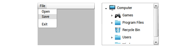
HeaderedItemsControl
Containers which can hold many arbitrary elements as content with a specific Header. Examples: MenuItem, ToolBar and TreeViewItem.
<StackPanel xmlns="http://schemas.microsoft.com/winfx/2006/xaml/presentation"
  Orientation="Horizontal" HorizontalAlignment="Center" VerticalAlignment="Center">
  <Border Width="150" Height ="200" Margin="5">
    <DockPanel Background="Gray" LastChildFill="False">
      <Menu DockPanel.Dock="Top">
        <MenuItem Header="File">
          <MenuItem Header="Open"/>
          <MenuItem Header="Save"/>
          <Separator/>
          <MenuItem Header="Exit"/>
        </MenuItem>
      </Menu>
    </DockPanel>
  </Border>
  <Border Width="200" Height ="200" Margin="5">
    <TreeView Width="500" Height="400">
      <TreeViewItem>
        <TreeViewItem.Header>
          <StackPanel Orientation="Horizontal">
            <Image Source="Images/monitor.png" Width="24" Height="24"/>
            <TextBlock Text="Computer" VerticalAlignment="Center" Margin="4,0,0,0"/>
          </StackPanel>
        </TreeViewItem.Header>
        <TreeViewItem>
          <TreeViewItem.Header>
            <StackPanel Orientation="Horizontal">
              <Image Source="Images/game_pad.png" Width="24" Height="24"/>
              <TextBlock Text="Games" VerticalAlignment="Center" Margin="4,0,0,0"/>
            </StackPanel>
          </TreeViewItem.Header>
          <TreeViewItem>
            <TreeViewItem.Header>
              <StackPanel Orientation="Horizontal">
                <Image Source="Images/folder.png" Width="24" Height="24"/>
                <TextBlock Text="Duck Hunt" VerticalAlignment="Center" Margin="4,0,0,0"/>
              </StackPanel>
            </TreeViewItem.Header>
          </TreeViewItem>
          <TreeViewItem>
            <TreeViewItem.Header>
              <StackPanel Orientation="Horizontal">
                <Image Source="Images/folder.png" Width="24" Height="24"/>
                <TextBlock Text="Bouncing Ball" VerticalAlignment="Center" Margin="4,0,0,0"/>
              </StackPanel>
            </TreeViewItem.Header>
          </TreeViewItem>
        </TreeViewItem>
        <TreeViewItem>
          <TreeViewItem.Header>
            <StackPanel Orientation="Horizontal">
              <Image Source="Images/folder.png" Width="24" Height="24"/>
              <TextBlock Text="Program Files" VerticalAlignment="Center" Margin="4,0,0,0"/>
            </StackPanel>
          </TreeViewItem.Header>
          <TreeViewItem>
            <TreeViewItem.Header>
              <StackPanel Orientation="Horizontal">
                <Image Source="Images/folder.png" Width="24" Height="24"/>
                <TextBlock Text="Cognition" VerticalAlignment="Center" Margin="4,0,0,0"/>
              </StackPanel>
            </TreeViewItem.Header>
          </TreeViewItem>
        </TreeViewItem>
        <TreeViewItem>
          <TreeViewItem.Header>
            <StackPanel Orientation="Horizontal">
              <Image Source="Images/recycle_bin.png" Width="24" Height="24"/>
              <TextBlock Text="Recycle Bin" VerticalAlignment="Center" Margin="4,0,0,0"/>
            </StackPanel>
          </TreeViewItem.Header>
        </TreeViewItem>
        <TreeViewItem>
          <TreeViewItem.Header>
            <StackPanel Orientation="Horizontal">
              <Image Source="Images/folder.png" Width="24" Height="24"/>
              <TextBlock Text="Users" VerticalAlignment="Center" Margin="4,0,0,0"/>
            </StackPanel>
          </TreeViewItem.Header>
          <TreeViewItem>
            <TreeViewItem.Header>
              <StackPanel Orientation="Horizontal">
                <Image Source="Images/folder.png" Width="24" Height="24"/>
                <TextBlock Text="Administrator" VerticalAlignment="Center" Margin="4,0,0,0"/>
              </StackPanel>
            </TreeViewItem.Header>
          </TreeViewItem>
          <TreeViewItem>
            <TreeViewItem.Header>
              <StackPanel Orientation="Horizontal">
                <Image Source="Images/folder.png" Width="24" Height="24"/>
                <TextBlock Text="John Doe" VerticalAlignment="Center" Margin="4,0,0,0"/>
              </StackPanel>
            </TreeViewItem.Header>
          </TreeViewItem>
        </TreeViewItem>
        <TreeViewItem>
          <TreeViewItem.Header>
            <StackPanel Orientation="Horizontal">
              <Image Source="Images/folder.png" Width="24" Height="24"/>
              <TextBlock Text="Windows" VerticalAlignment="Center" Margin="4,0,0,0"/>
            </StackPanel>
          </TreeViewItem.Header>
          <TreeViewItem>
            <TreeViewItem.Header>
              <StackPanel Orientation="Horizontal">
                <Image Source="Images/folder.png" Width="24" Height="24"/>
                <TextBlock Text="Fonts" VerticalAlignment="Center" Margin="4,0,0,0"/>
              </StackPanel>
            </TreeViewItem.Header>
          </TreeViewItem>
          <TreeViewItem>
            <TreeViewItem.Header>
              <StackPanel Orientation="Horizontal">
                <Image Source="Images/folder.png" Width="24" Height="24"/>
                <TextBlock Text="Media" VerticalAlignment="Center" Margin="4,0,0,0"/>
              </StackPanel>
            </TreeViewItem.Header>
          </TreeViewItem>
          <TreeViewItem>
            <TreeViewItem.Header>
              <StackPanel Orientation="Horizontal">
                <Image Source="Images/folder.png" Width="24" Height="24"/>
                <TextBlock Text="Resources" VerticalAlignment="Center" Margin="4,0,0,0"/>
              </StackPanel>
            </TreeViewItem.Header>
            <TreeViewItem>
              <TreeViewItem.Header>
                <StackPanel Orientation="Horizontal">
                  <Image Source="Images/folder.png" Width="24" Height="24"/>
                  <TextBlock Text="Themes" VerticalAlignment="Center" Margin="4,0,0,0"/>
                </StackPanel>
              </TreeViewItem.Header>
            </TreeViewItem>
          </TreeViewItem>
          <TreeViewItem>
            <TreeViewItem.Header>
              <StackPanel Orientation="Horizontal">
                <Image Source="Images/folder.png" Width="24" Height="24"/>
                <TextBlock Text="System32" VerticalAlignment="Center" Margin="4,0,0,0"/>
              </StackPanel>
            </TreeViewItem.Header>
          </TreeViewItem>
        </TreeViewItem>
      </TreeViewItem>
    </TreeView>
  </Border>
</StackPanel>
Decorators
Decorators apply effects onto or around a single Child element. Examples: Border, BulletDecorator and Viewbox.
<StackPanel xmlns="http://schemas.microsoft.com/winfx/2006/xaml/presentation"
  Orientation="Horizontal" HorizontalAlignment="Center" VerticalAlignment="Center">
  <Border Width="150" Height="100" Margin="5">
    <Border Background="Silver" BorderBrush="Black" BorderThickness="2" CornerRadius="5" Padding="10" Margin="10">
      <Rectangle Fill="Red" Width="60" Height="25"/>
    </Border>
  </Border>
  <Border Width="150" Height="100" Margin="5">
    <BulletDecorator Margin="10" VerticalAlignment="Center">
      <BulletDecorator.Bullet>
        <Ellipse Width="14" Height="14" Fill="Silver" Stroke="Black" StrokeThickness="3"/>
      </BulletDecorator.Bullet>
      <TextBlock Text="Bullet decorator" Margin="5,0,0,0"/>
    </BulletDecorator>
  </Border>
  <Border Width="225" Height="100" Margin="5">
    <Viewbox Width="200" Margin="10">
      <TextBlock Text="Inside a Viewbox" FontSize="8" Background="Pink" Padding="5,2"/>
    </Viewbox>
  </Border>
</StackPanel>

Viewbox
Viewbox provides an easy mechanism to scale arbitrary content within a given space. By default, Viewbox stretches in both dimensions to fill the shape given to it (like most controls). But it also has a Stretch property to control how its single child gets scaled within its bounds. A second property of Viewbox, StretchDirection, controls whether you only want to use it to shrink content or enlarge content (as opposed to doing either).
NOTE
Viewbox is the ideal container to make your application Resolution Independent
<Page xmlns="http://schemas.microsoft.com/winfx/2006/xaml/presentation">
  <Grid Background="Gray" ShowGridLines="True">
    <Grid.RowDefinitions>
      <RowDefinition Height="*"/>
      <RowDefinition Height="3*"/>
      <RowDefinition Height="*"/>
    </Grid.RowDefinitions>
    <Grid.ColumnDefinitions>
      <ColumnDefinition Width="*"/>
      <ColumnDefinition Width="3*"/>
      <ColumnDefinition Width="*"/>
    </Grid.ColumnDefinitions>

    <Viewbox Grid.Column="0" Grid.Row="0" Stretch="Uniform">
      <Grid>
        <Rectangle Fill="Green" />
        <Label Content="Top left" />
      </Grid>
    </Viewbox>
    <Viewbox Grid.Column="0" Grid.Row="2" Stretch="Uniform">
      <Grid Background="Yellow">
        <Label Content="Bottom left"/>
      </Grid>
    </Viewbox>
    <Viewbox Grid.Column="2" Grid.Row="0" Stretch="Uniform">
      <Grid Background="Red">
        <Label Content="Top right"/>
      </Grid>
    </Viewbox>
    <Viewbox Grid.Column="2" Grid.Row="2" Stretch="Uniform">
      <Grid Background="Blue">
        <Label Content="Bottom right"/>
      </Grid>
    </Viewbox>
    <Viewbox Grid.Column="1" Grid.Row="1" Stretch="Uniform">
      <Grid Background="White">
        <Label Content="Center"/>
      </Grid>
    </Viewbox>
  </Grid>
</Page>

Panels
NoesisGUI contains six main built-in panels who are, in increasing order of complexity and usefulness: Canvas, StackPanel, UniformGrid, WrapPanel, DockPanel and Grid.
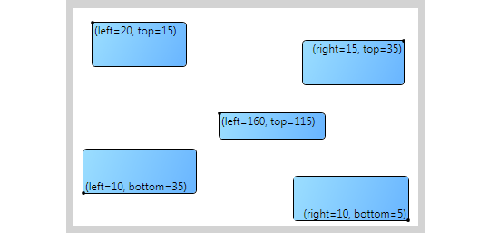
Canvas
Canvas is a special layout panel that distributes elements with absolute position, that is, using x and y coordinates. When used within a canvas, an element is not restricted to anything, it can overlaps other controls. The rendering order is determined by how the elements are declared in the XAML. This sequence can be altered by using the Panel.ZIndex property.
Canvases do not enforce any restriction to their elements. So the width and height of individual elements must be specified. You can use the attached properties Canvas.Left or Canvas.Right and Canvas.Top or Canvas.Bottom to specify the distance to the chosen side of the parent.
<Grid
    xmlns="http://schemas.microsoft.com/winfx/2006/xaml/presentation"
    xmlns:x="http://schemas.microsoft.com/winfx/2006/xaml"
    xmlns:d="http://schemas.microsoft.com/expression/blend/2008"
    xmlns:mc="http://schemas.openxmlformats.org/markup-compatibility/2006"
    mc:Ignorable="d"
    Background="LightGray"
    TextElement.Foreground="Black"
    Margin="10" HorizontalAlignment="Center" VerticalAlignment="Center">

  <Grid.Resources>
    <LinearGradientBrush x:Key="BgBrush" StartPoint="0,0" EndPoint="1,1">
      <GradientStop Offset="0" Color="#FF9BDEFF"/>
      <GradientStop Offset="1" Color="#FF69B5FF"/>
    </LinearGradientBrush>
  </Grid.Resources>

  <Grid.RowDefinitions>
    <RowDefinition Height="Auto"/>
    <RowDefinition/>
  </Grid.RowDefinitions>

  <StackPanel Orientation="Horizontal" HorizontalAlignment="Center" Margin="0,8,0,0">
    <TextBlock Text="Canvas size: "/>
    <TextBlock Text="{Binding ActualWidth, ElementName=Canvas}"/>
    <TextBlock Text="x"/>
    <TextBlock Text="{Binding ActualHeight, ElementName=Canvas}"/>
  </StackPanel>
  <Canvas x:Name="Canvas" Width="380" Height="240" Grid.Row="1" Background="White" Margin="8">
    <Border BorderBrush="Black" BorderThickness="1" Height="50" CornerRadius="0,4,4,4" Background="{DynamicResource BgBrush}" Canvas.Left="20" Canvas.Top="15">
      <Grid>
        <StackPanel Orientation="Horizontal" Margin="2,0,10,0" HorizontalAlignment="Left" VerticalAlignment="Top">
          <TextBlock Text="(left="/>
          <TextBlock Text="{Binding (Canvas.Left), RelativeSource={RelativeSource AncestorType={x:Type Border}}}"/>
          <TextBlock Text=", top="/>
          <TextBlock Text="{Binding (Canvas.Top), RelativeSource={RelativeSource AncestorType={x:Type Border}}}"/>
          <TextBlock Text=")"/>
        </StackPanel>
        <Ellipse Fill="Black" Stroke="#00000000" Width="4" Height="4" HorizontalAlignment="Left" VerticalAlignment="Top" StrokeThickness="0" Margin="-2,-2,0,0"/>
      </Grid>
    </Border>
    <Border BorderBrush="Black" BorderThickness="1" Height="50" CornerRadius="4,0,4,4" Background="{DynamicResource BgBrush}" Canvas.Right="15" Canvas.Top="35">
      <Grid>
        <StackPanel Orientation="Horizontal" Margin="10,0,2,0" HorizontalAlignment="Right" VerticalAlignment="Top">
          <TextBlock Text="(right="/>
          <TextBlock Text="{Binding (Canvas.Right), RelativeSource={RelativeSource AncestorType={x:Type Border}}}"/>
          <TextBlock Text=", top="/>
          <TextBlock Text="{Binding (Canvas.Top), RelativeSource={RelativeSource AncestorType={x:Type Border}}}"/>
          <TextBlock Text=")"/>
        </StackPanel>
        <Ellipse Fill="Black" Stroke="#00000000" Width="4" Height="4" HorizontalAlignment="Right" VerticalAlignment="Top" StrokeThickness="0" Margin="0,-2,-2,0"/>
      </Grid>
    </Border>
    <Border BorderBrush="Black" BorderThickness="1" Height="50" CornerRadius="4,4,4,0" Background="{DynamicResource BgBrush}" Canvas.Left="10" Canvas.Bottom="35">
      <Grid>
        <StackPanel Orientation="Horizontal" Margin="2,0,10,0" HorizontalAlignment="Left" VerticalAlignment="Bottom">
          <TextBlock Text="(left="/>
          <TextBlock Text="{Binding (Canvas.Left), RelativeSource={RelativeSource AncestorType={x:Type Border}}}"/>
          <TextBlock Text=", bottom="/>
          <TextBlock Text="{Binding (Canvas.Bottom), RelativeSource={RelativeSource AncestorType={x:Type Border}}}"/>
          <TextBlock Text=")"/>
        </StackPanel>
        <Ellipse Fill="Black" Stroke="#00000000" Width="4" Height="4" HorizontalAlignment="Left" VerticalAlignment="Bottom" StrokeThickness="0" Margin="-2,0,0,-2"/>
      </Grid>
    </Border>
    <Border BorderBrush="Black" BorderThickness="1" Height="50" CornerRadius="4,4,0,4" Background="{DynamicResource LightBlueBackground}" Canvas.Right="10" Canvas.Bottom="5">
      <Grid Background="{DynamicResource BgBrush}">
        <StackPanel Orientation="Horizontal" Margin="10,0,2,0" HorizontalAlignment="Right" VerticalAlignment="Bottom">
          <TextBlock Text="(right="/>
          <TextBlock Text="{Binding (Canvas.Right), RelativeSource={RelativeSource AncestorType={x:Type Border}}}"/>
          <TextBlock Text=", bottom="/>
          <TextBlock Text="{Binding (Canvas.Bottom), RelativeSource={RelativeSource AncestorType={x:Type Border}}}"/>
          <TextBlock Text=")"/>
        </StackPanel>
        <Ellipse Fill="Black" Stroke="#00000000" Width="4" Height="4" HorizontalAlignment="Right" VerticalAlignment="Bottom" StrokeThickness="0" Margin="0,0,-2,-2"/>
      </Grid>
    </Border>
    <Border BorderBrush="Black" BorderThickness="1" Height="30" CornerRadius="0,4,4,4" Background="{DynamicResource BgBrush}" Canvas.Left="160" Canvas.Top="115">
      <Grid>
        <StackPanel Orientation="Horizontal" Margin="2,0,10,0" HorizontalAlignment="Left" VerticalAlignment="Top">
          <TextBlock Text="(left="/>
          <TextBlock Text="{Binding (Canvas.Left), RelativeSource={RelativeSource AncestorType={x:Type Border}}}"/>
          <TextBlock Text=", top="/>
          <TextBlock Text="{Binding (Canvas.Top), RelativeSource={RelativeSource AncestorType={x:Type Border}}}"/>
          <TextBlock Text=")"/>
        </StackPanel>
        <Ellipse Fill="Black" Stroke="#00000000" Width="4" Height="4" HorizontalAlignment="Left" VerticalAlignment="Top" StrokeThickness="0" Margin="-2,-2,0,0"/>
      </Grid>
    </Border>
  </Canvas>
</Grid>
StackPanel
StackPanel is a container where child elements are arranged in a single line that is oriented horizontally or vertically. The orientation is defined by the property Orientation which can take two valid values:
- Vertical: This is the default orientation. Child items are placed vertically one after another from top to bottom.
- Horizontal: Here the items are placed from left to right one after another.
<Grid
    xmlns="http://schemas.microsoft.com/winfx/2006/xaml/presentation"
    xmlns:x="http://schemas.microsoft.com/winfx/2006/xaml"
    xmlns:d="http://schemas.microsoft.com/expression/blend/2008"
    xmlns:mc="http://schemas.openxmlformats.org/markup-compatibility/2006"
    mc:Ignorable="d"
    Background="LightGray"
    TextElement.Foreground="Black"
    Margin="10" HorizontalAlignment="Center" VerticalAlignment="Center">

  <Grid.Resources>
    <LinearGradientBrush x:Key="HorBrush" StartPoint="0,0" EndPoint="1,0">
      <GradientStop Offset="0" Color="#FF9BDEFF"/>
      <GradientStop Offset="1" Color="#FF69B5FF"/>
    </LinearGradientBrush>
    <LinearGradientBrush x:Key="VerBrush" StartPoint="0,0" EndPoint="0,1">
      <GradientStop Offset="0" Color="#FF9BDEFF"/>
      <GradientStop Offset="1" Color="#FF69B5FF"/>
    </LinearGradientBrush>
  </Grid.Resources>

  <Grid.ColumnDefinitions>
    <ColumnDefinition Width="*"/>
    <ColumnDefinition Width="4"/>
    <ColumnDefinition Width="Auto"/>
    <ColumnDefinition Width="200"/>
  </Grid.ColumnDefinitions>

  <Grid.RowDefinitions>
    <RowDefinition Height="Auto"/>
    <RowDefinition Height="Auto"/>
    <RowDefinition Height="*"/>
  </Grid.RowDefinitions>
  <TextBlock Text="Horizontal StackPanels" HorizontalAlignment="Center" Grid.ColumnSpan="2" Margin="0,8,0,0"/>
  <StackPanel x:Name="StackPanel1" Background="White" Margin="8,8,8,0" Grid.Row="1" Orientation="Horizontal" HorizontalAlignment="Center" d:LayoutOverrides="Height" >
    <Border BorderBrush="Black" BorderThickness="1" CornerRadius="8" Background="{DynamicResource HorBrush}" Margin="4" Padding="0" Width="40" Height="80"/>
    <Border BorderBrush="Black" BorderThickness="1" CornerRadius="8" Background="{DynamicResource HorBrush}" Margin="4" Padding="0" Width="40" Height="25" VerticalAlignment="Top"/>
    <Border BorderBrush="Black" BorderThickness="1" CornerRadius="8" Background="{DynamicResource HorBrush}" Margin="4" Padding="0" Width="40" Height="25"/>
    <Border BorderBrush="Black" BorderThickness="1" CornerRadius="8" Background="{DynamicResource HorBrush}" Margin="4" Padding="0" Width="40" Height="25" VerticalAlignment="Bottom"/>
    <Border BorderBrush="Black" BorderThickness="1" CornerRadius="8" Background="{DynamicResource HorBrush}" Margin="4" Padding="0" Width="80"/>
  </StackPanel>
  <StackPanel x:Name="StackPanel2" Background="White" Margin="8" Grid.Row="2" Orientation="Horizontal" HorizontalAlignment="Center" >
    <Border BorderBrush="Black" BorderThickness="1" CornerRadius="8" Background="{DynamicResource HorBrush}" Margin="4" Padding="0" Width="40" Height="80"/>
    <Border BorderBrush="Black" BorderThickness="1" CornerRadius="8" Background="{DynamicResource HorBrush}" Margin="4" Padding="0" Width="40" Height="25" VerticalAlignment="Top"/>
    <Border BorderBrush="Black" BorderThickness="1" CornerRadius="8" Background="{DynamicResource HorBrush}" Margin="4" Padding="0" Width="40" Height="25"/>
    <Border BorderBrush="Black" BorderThickness="1" CornerRadius="8" Background="{DynamicResource HorBrush}" Margin="4" Padding="0" Width="40" Height="25" VerticalAlignment="Bottom"/>
    <Border BorderBrush="Black" BorderThickness="1" CornerRadius="8" Background="{DynamicResource HorBrush}" Margin="4" Padding="0" Width="80"/>
  </StackPanel>
  <Rectangle Fill="#80808080" Grid.RowSpan="3" StrokeThickness="0" Grid.Column="1"/>
  <TextBlock Text="Vertical StackPanels" HorizontalAlignment="Center" Grid.ColumnSpan="2" d:LayoutOverrides="GridBox" Grid.Column="2" Margin="0,8,0,0"/>
  <StackPanel x:Name="StackPanel3" Background="White" Margin="8" Grid.Row="1" HorizontalAlignment="Center" VerticalAlignment="Center" Grid.Column="2" Grid.RowSpan="2" >
    <Border BorderBrush="Black" BorderThickness="1" CornerRadius="8" Background="{DynamicResource VerBrush}" Margin="4" Padding="0" Width="80" Height="40"/>
    <Border BorderBrush="Black" BorderThickness="1" CornerRadius="8" Background="{DynamicResource VerBrush}" Margin="4" Padding="0" HorizontalAlignment="Left" Width="25" Height="40"/>
    <Border BorderBrush="Black" BorderThickness="1" CornerRadius="8" Background="{DynamicResource VerBrush}" Margin="4" Padding="0" HorizontalAlignment="Center" Width="25" Height="40"/>
    <Border BorderBrush="Black" BorderThickness="1" CornerRadius="8" Background="{DynamicResource VerBrush}" Margin="4" Padding="0" HorizontalAlignment="Right" Width="25" Height="40"/>
    <Border BorderBrush="Black" BorderThickness="1" CornerRadius="8" Background="{DynamicResource VerBrush}" Margin="4" Padding="0" Height="80"/>
  </StackPanel>
  <StackPanel x:Name="StackPanel4" Background="White" Margin="0,8,8,8" Grid.Row="1" VerticalAlignment="Center" Grid.Column="3" d:LayoutOverrides="GridBox" Grid.RowSpan="2" >
    <Border BorderBrush="Black" BorderThickness="1" CornerRadius="8" Background="{DynamicResource VerBrush}" Margin="4" Width="80" Height="40"/>
    <Border BorderBrush="Black" BorderThickness="1" CornerRadius="8" Background="{DynamicResource VerBrush}" Margin="4" HorizontalAlignment="Left" Width="25" Height="40"/>
    <Border BorderBrush="Black" BorderThickness="1" CornerRadius="8" Background="{DynamicResource VerBrush}" Margin="4" HorizontalAlignment="Center" Width="25" Height="40"/>
    <Border BorderBrush="Black" BorderThickness="1" CornerRadius="8" Background="{DynamicResource VerBrush}" Margin="4" HorizontalAlignment="Right" Width="25" Height="40"/>
    <Border BorderBrush="Black" BorderThickness="1" CornerRadius="8" Background="{DynamicResource VerBrush}" Margin="4" Height="80"/>
  </StackPanel>
</Grid>

UniformGrid
UniformGrid control provides a similar layout to that given by the Grid layout control. Its child controls are organized into a tabular structure of rows and columns. Unlike the Grid control, you don't have fine-grained control of the layout. The column widths and row heights cannot be modified. These sizes are set automatically to ensure that all columns are the same width and all rows are of an equal height. In addition, where the Grid control permits you to specify a cell position for each child, the UniformGrid does not.
<Grid xmlns="http://schemas.microsoft.com/winfx/2006/xaml/presentation"
  xmlns:x="http://schemas.microsoft.com/winfx/2006/xaml"
  Height="200" Width="250">

  <UniformGrid>
    <Button Content="Button 1"/>
    <Button Content="Button 2"/>
    <Button Content="Button 3"/>
    <Button Content="Button 4"/>
  </UniformGrid>

</Grid>

WrapPanel
WrapPanel is almost similar to StackPanel, but it produces a new line when it reaches the edge of the panel. So if you resize the WrapPanel, the content will be automatically wrapped to the new line. Thus WrapPanel has additional flexibility to wrap elements when space matters.
Another difference is that WrapPanel determines the size based on the size of the content rather than considering it infinity as StackPanel does. You can also specify the size of the layout partition that is reserved by the WrapPanel for each child element by using the properties ItemWidth and ItemHeight. These properties take precedence over element's own width and height.
<Grid
    xmlns="http://schemas.microsoft.com/winfx/2006/xaml/presentation"
    xmlns:x="http://schemas.microsoft.com/winfx/2006/xaml"
    xmlns:d="http://schemas.microsoft.com/expression/blend/2008"
    xmlns:mc="http://schemas.openxmlformats.org/markup-compatibility/2006"
    mc:Ignorable="d"
    Background="LightGray"
    TextElement.Foreground="Black"
    Margin="10" HorizontalAlignment="Center" VerticalAlignment="Center">

  <Grid.Resources>
    <LinearGradientBrush x:Key="HorBrush" StartPoint="0,0" EndPoint="1,0">
      <GradientStop Offset="0" Color="#FF9BDEFF"/>
      <GradientStop Offset="1" Color="#FF69B5FF"/>
    </LinearGradientBrush>
    <LinearGradientBrush x:Key="VerBrush" StartPoint="0,0" EndPoint="0,1">
      <GradientStop Offset="0" Color="#FF9BDEFF"/>
      <GradientStop Offset="1" Color="#FF69B5FF"/>
    </LinearGradientBrush>
  </Grid.Resources>

  <Grid.ColumnDefinitions>
    <ColumnDefinition Width="250"/>
    <ColumnDefinition Width="4"/>
    <ColumnDefinition Width="Auto"/>
    <ColumnDefinition Width="170"/>
  </Grid.ColumnDefinitions>

  <Grid.RowDefinitions>
    <RowDefinition Height="Auto"/>
    <RowDefinition Height="75"/>
    <RowDefinition Height="170"/>
    <RowDefinition Height="Auto"/>
  </Grid.RowDefinitions>

  <TextBlock Text="Horizontal WrapPanels" HorizontalAlignment="Center" Grid.ColumnSpan="2" Margin="0,8,0,0" d:LayoutOverrides="GridBox"/>
  <WrapPanel x:Name="WrapPanel1" Background="White" HorizontalAlignment="Center" Margin="8,8,8,0" Orientation="Horizontal" Grid.Row="1" VerticalAlignment="Top" ItemWidth="{Binding SelectedItem.Content, ElementName=HorItemsWidth}" ItemHeight="{Binding SelectedItem.Content, ElementName=HorItemsHeight}">
    <Border BorderBrush="Black" BorderThickness="1" CornerRadius="8" Background="{DynamicResource HorBrush}" Margin="4" Padding="0" Width="40" Height="25"/>
    <Border BorderBrush="Black" BorderThickness="1" CornerRadius="8" Background="{DynamicResource HorBrush}" Margin="4" Padding="0" Width="40" Height="25" VerticalAlignment="Top"/>
    <Border BorderBrush="Black" BorderThickness="1" CornerRadius="8" Background="{DynamicResource HorBrush}" Margin="4" Padding="0" Width="40" Height="25"/>
    <Border BorderBrush="Black" BorderThickness="1" CornerRadius="8" Background="{DynamicResource HorBrush}" Margin="4" Padding="0" Width="40" Height="25" VerticalAlignment="Bottom"/>
    <Border BorderBrush="Black" BorderThickness="1" CornerRadius="8" Background="{DynamicResource HorBrush}" Margin="4" Padding="0" Width="40" Height="25"/>
    <Border BorderBrush="Black" BorderThickness="1" CornerRadius="8" Background="{DynamicResource HorBrush}" Margin="4" Padding="0" Width="40" Height="25"/>
  </WrapPanel>
  <WrapPanel x:Name="WrapPanel2" Background="White" Margin="8" Orientation="Horizontal" Grid.Row="2" ItemWidth="{Binding SelectedItem.Content, ElementName=HorItemsWidth}" ItemHeight="{Binding SelectedItem.Content, ElementName=HorItemsHeight}">
    <Border BorderBrush="Black" BorderThickness="1" CornerRadius="8" Background="{DynamicResource HorBrush}" Margin="4" Padding="0" Width="40" Height="25"/>
    <Border BorderBrush="Black" BorderThickness="1" CornerRadius="8" Background="{DynamicResource HorBrush}" Margin="4" Padding="0" Width="50" Height="25"/>
    <Border BorderBrush="Black" BorderThickness="1" CornerRadius="8" Background="{DynamicResource HorBrush}" Margin="4" Padding="0" Width="60" Height="25"/>
    <Border BorderBrush="Black" BorderThickness="1" CornerRadius="8" Background="{DynamicResource HorBrush}" Margin="4" Padding="0" Width="70" Height="25"/>
    <Border BorderBrush="Black" BorderThickness="1" CornerRadius="8" Background="{DynamicResource HorBrush}" Margin="4" Padding="0" Width="80" Height="25"/>
    <Border BorderBrush="Black" BorderThickness="1" CornerRadius="8" Background="{DynamicResource HorBrush}" Margin="4" Padding="0" Width="90" Height="25"/>
    <Border BorderBrush="Black" BorderThickness="1" CornerRadius="8" Background="{DynamicResource HorBrush}" Margin="4" Padding="0" Width="100" Height="25"/>
    <Border BorderBrush="Black" BorderThickness="1" CornerRadius="8" Background="{DynamicResource HorBrush}" Margin="4" Padding="0" Width="140" Height="25"/>
  </WrapPanel>
  <Rectangle Fill="#80808080" Grid.RowSpan="4" StrokeThickness="0" Grid.Column="1"/>
  <TextBlock Text="Vertical WrapPanels" HorizontalAlignment="Center" Grid.ColumnSpan="2" Grid.Column="2" Margin="0,8,0,0" d:LayoutOverrides="GridBox"/>
  <WrapPanel x:Name="WrapPanel3" Background="White" Margin="8" Grid.Row="1" Grid.Column="2" Grid.RowSpan="2" Orientation="Vertical" VerticalAlignment="Center" HorizontalAlignment="Center" ItemWidth="{Binding SelectedItem.Content, ElementName=VerItemsWidth}" ItemHeight="{Binding SelectedItem.Content, ElementName=VerItemsHeight}">
    <Border BorderBrush="Black" BorderThickness="1" CornerRadius="8" Background="{DynamicResource VerBrush}" Margin="4" Padding="0" Width="25" Height="40"/>
    <Border BorderBrush="Black" BorderThickness="1" CornerRadius="8" Background="{DynamicResource VerBrush}" Margin="4" Padding="0" HorizontalAlignment="Left" Width="25" Height="40"/>
    <Border BorderBrush="Black" BorderThickness="1" CornerRadius="8" Background="{DynamicResource VerBrush}" Margin="4" Padding="0" HorizontalAlignment="Center" Width="25" Height="40"/>
    <Border BorderBrush="Black" BorderThickness="1" CornerRadius="8" Background="{DynamicResource VerBrush}" Margin="4" Padding="0" HorizontalAlignment="Right" Width="25" Height="40"/>
    <Border BorderBrush="Black" BorderThickness="1" CornerRadius="8" Background="{DynamicResource VerBrush}" Margin="4" Padding="0" Height="40" Width="25"/>
    <Border BorderBrush="Black" BorderThickness="1" CornerRadius="8" Background="{DynamicResource VerBrush}" Margin="4" Padding="0" Height="40" Width="25"/>
  </WrapPanel>
  <WrapPanel x:Name="WrapPanel4" Background="White" Margin="0,8,8,8" Grid.Row="1" Grid.Column="3" Grid.RowSpan="2" Orientation="Vertical" ItemWidth="{Binding SelectedItem.Content, ElementName=VerItemsWidth}" ItemHeight="{Binding SelectedItem.Content, ElementName=VerItemsHeight}">
    <Border BorderBrush="Black" BorderThickness="1" CornerRadius="8" Background="{DynamicResource VerBrush}" Margin="4" Width="25" Height="40"/>
    <Border BorderBrush="Black" BorderThickness="1" CornerRadius="8" Background="{DynamicResource VerBrush}" Margin="4" Width="25" Height="50"/>
    <Border BorderBrush="Black" BorderThickness="1" CornerRadius="8" Background="{DynamicResource VerBrush}" Margin="4" Width="25" Height="60"/>
    <Border BorderBrush="Black" BorderThickness="1" CornerRadius="8" Background="{DynamicResource VerBrush}" Margin="4" Width="25" Height="70"/>
    <Border BorderBrush="Black" BorderThickness="1" CornerRadius="8" Background="{DynamicResource VerBrush}" Margin="4" Height="80" Width="25"/>
    <Border BorderBrush="Black" BorderThickness="1" CornerRadius="8" Background="{DynamicResource VerBrush}" Margin="4" Height="90" Width="25"/>
    <Border BorderBrush="Black" BorderThickness="1" CornerRadius="8" Background="{DynamicResource VerBrush}" Margin="4" Height="100" Width="25"/>
    <Border BorderBrush="Black" BorderThickness="1" CornerRadius="8" Background="{DynamicResource VerBrush}" Margin="4" Height="140" Width="25"/>
  </WrapPanel>
  <StackPanel Margin="8,0,8,8" Grid.Row="4" Orientation="Horizontal" >
    <TextBlock Text="Items:" VerticalAlignment="Center"/>
    <TextBlock Text="Width" VerticalAlignment="Center" Margin="4,2,0,0" FontSize="10"/>
    <ComboBox x:Name="HorItemsWidth" Margin="2,0,0,0" FontSize="10" VerticalAlignment="Center">
      <ComboBoxItem Content="Auto" IsSelected="True"/>
      <ComboBoxItem Content="20"/>
      <ComboBoxItem Content="80"/>
    </ComboBox>
    <TextBlock Text="Height" VerticalAlignment="Center" Margin="4,2,0,0" FontSize="10"/>
    <ComboBox x:Name="HorItemsHeight" Margin="2,0,0,0" FontSize="10" VerticalAlignment="Center">
      <ComboBoxItem Content="Auto" IsSelected="True"/>
      <ComboBoxItem Content="30"/>
      <ComboBoxItem Content="60"/>
    </ComboBox>
  </StackPanel>
  <StackPanel Margin="8,0,8,8" Grid.Row="4" Orientation="Horizontal" Grid.Column="2" Grid.ColumnSpan="3" >
    <TextBlock Text="Items:" VerticalAlignment="Center"/>
    <TextBlock Text="Width" VerticalAlignment="Center" Margin="4,2,0,0" FontSize="10"/>
    <ComboBox x:Name="VerItemsWidth" Margin="2,0,0,0" FontSize="10" VerticalAlignment="Center">
      <ComboBoxItem Content="Auto" IsSelected="True"/>
      <ComboBoxItem Content="20"/>
      <ComboBoxItem Content="80"/>
    </ComboBox>
    <TextBlock Text="Height" VerticalAlignment="Center" Margin="4,2,0,0" FontSize="10"/>
    <ComboBox x:Name="VerItemsHeight" Margin="2,0,0,0" FontSize="10" VerticalAlignment="Center">
      <ComboBoxItem Content="Auto" IsSelected="True"/>
      <ComboBoxItem Content="30"/>
      <ComboBoxItem Content="60"/>
    </ComboBox>
  </StackPanel>
</Grid>

DockPanel
DockPanel is the most widely used control to determine the layout of an application. It uses the attached property DockPanel.Dock to determine the position of each contained element. Valid values are Top, Bottom, Left and Right.
If the height or the width of the contained element is not specified it will take the whole available area.
<Grid
    xmlns="http://schemas.microsoft.com/winfx/2006/xaml/presentation"
    xmlns:x="http://schemas.microsoft.com/winfx/2006/xaml"
    xmlns:d="http://schemas.microsoft.com/expression/blend/2008"
    xmlns:mc="http://schemas.openxmlformats.org/markup-compatibility/2006"
    mc:Ignorable="d"
    Background="LightGray"
    TextElement.Foreground="Black"
    Margin="10" HorizontalAlignment="Center" VerticalAlignment="Center">

  <Grid.Resources>
    <LinearGradientBrush x:Key="BgBrush" StartPoint="0,0" EndPoint="1,1">
      <GradientStop Offset="0" Color="#FF9BDEFF"/>
      <GradientStop Offset="1" Color="#FF69B5FF"/>
    </LinearGradientBrush>
  </Grid.Resources>

  <Grid.RowDefinitions>
    <RowDefinition Height="Auto"/>
    <RowDefinition/>
    <RowDefinition Height="Auto"/>
  </Grid.RowDefinitions>

  <StackPanel Orientation="Horizontal" HorizontalAlignment="Center" Margin="0,8,0,0">
    <TextBlock Text="DockPanel size: "/>
    <TextBlock Text="{Binding ActualWidth, ElementName=DockPanel}"/>
    <TextBlock Text="x"/>
    <TextBlock Text="{Binding ActualHeight, ElementName=DockPanel}"/>
  </StackPanel>
  <DockPanel x:Name="DockPanel" Background="White" Height="240" Margin="8" Grid.Row="1" Width="380" LastChildFill="{Binding IsChecked, ElementName=LastChildFills}">
    <Border BorderBrush="Black" BorderThickness="1" CornerRadius="8" Background="{DynamicResource BgBrush}" DockPanel.Dock="Top" Margin="4" Padding="0">
      <Grid>
        <StackPanel Orientation="Horizontal" HorizontalAlignment="Center" VerticalAlignment="Center" Margin="8">
          <TextBlock Text="dock="/>
          <TextBlock Text="{Binding (DockPanel.Dock), RelativeSource={RelativeSource AncestorType={x:Type Border}}}"/>
        </StackPanel>
      </Grid>
    </Border>
    <Border BorderBrush="Black" BorderThickness="1" CornerRadius="8" Background="{DynamicResource BgBrush}" DockPanel.Dock="Bottom" Margin="4" Padding="0">
      <Grid>
        <StackPanel Orientation="Horizontal" HorizontalAlignment="Center" VerticalAlignment="Center" Margin="8">
          <TextBlock Text="dock="/>
          <TextBlock Text="{Binding (DockPanel.Dock), RelativeSource={RelativeSource AncestorType={x:Type Border}}}"/>
        </StackPanel>
      </Grid>
    </Border>
    <Border BorderBrush="Black" BorderThickness="1" CornerRadius="8" Background="{DynamicResource BgBrush}" Margin="4" Padding="0">
      <Grid>
        <StackPanel Orientation="Horizontal" HorizontalAlignment="Center" VerticalAlignment="Center" Margin="8">
          <TextBlock Text="dock="/>
          <TextBlock Text="{Binding (DockPanel.Dock), RelativeSource={RelativeSource AncestorType={x:Type Border}}}"/>
        </StackPanel>
      </Grid>
    </Border>
    <Border BorderBrush="Black" BorderThickness="1" CornerRadius="8" Background="{DynamicResource BgBrush}" DockPanel.Dock="Right" Margin="4" Padding="0">
      <Grid>
        <StackPanel Orientation="Horizontal" HorizontalAlignment="Center" VerticalAlignment="Center" Margin="8">
          <TextBlock Text="dock="/>
          <TextBlock Text="{Binding (DockPanel.Dock), RelativeSource={RelativeSource AncestorType={x:Type Border}}}"/>
        </StackPanel>
      </Grid>
    </Border>
    <Border BorderBrush="Black" BorderThickness="1" CornerRadius="8" Background="{DynamicResource BgBrush}" DockPanel.Dock="Top" Margin="4" Padding="0">
      <Grid>
        <StackPanel Orientation="Horizontal" HorizontalAlignment="Center" VerticalAlignment="Center" Margin="8">
          <TextBlock Text="dock="/>
          <TextBlock Text="{Binding (DockPanel.Dock), RelativeSource={RelativeSource AncestorType={x:Type Border}}}"/>
        </StackPanel>
      </Grid>
    </Border>
    <Border BorderBrush="Black" BorderThickness="1" CornerRadius="8" Background="{DynamicResource BgBrush}" DockPanel.Dock="{Binding SelectedItem.Content, ElementName=Positioning}" Margin="4" Padding="0">
      <Grid>
        <StackPanel HorizontalAlignment="Center" VerticalAlignment="Center" Margin="8">
          <TextBlock Text="Last Child" FontWeight="Bold"/>
          <StackPanel Orientation="Horizontal">
            <TextBlock Text="dock="/>
            <TextBlock Text="{Binding (DockPanel.Dock), RelativeSource={RelativeSource AncestorType={x:Type Border}}}"/>
          </StackPanel>
        </StackPanel>
      </Grid>
    </Border>
  </DockPanel>
  <StackPanel Grid.Row="2" Margin="8,0,8,8" Orientation="Horizontal">
    <TextBlock Text="Last Child:" Margin="0,0,16,0" VerticalAlignment="Center" FontWeight="Bold"/>
    <ComboBox x:Name="Positioning" Margin="0,0,4,0" VerticalAlignment="Center">
      <ComboBoxItem Content="Left" IsSelected="True"/>
      <ComboBoxItem Content="Right"/>
      <ComboBoxItem Content="Top"/>
      <ComboBoxItem Content="Bottom"/>
    </ComboBox>
    <TextBlock Text="Positioning" Margin="0,0,16,0" VerticalAlignment="Center"/>
    <CheckBox x:Name="LastChildFills" Content="Fill remaining space" IsChecked="False" VerticalAlignment="Center" Margin="0,0,8,0" Foreground="Black"/>
  </StackPanel>
</Grid>

As shown, the Dock property needs to be explicitly mentioned on each individual element. The sequence of declarations also plays a vital role. If you set the dock of two elements in a row to "Top" it means that those elements will appear vertically stacked.
A property called LastChildFill makes the remaining space to be filled with the last element. You can set it to false if you don't need it.
Grid
Grid is one of the most powerful panels. It can be used to form a table that fills the available space. You can use the properties RowDefinitions and ColumnDefinitions to define the rows and columns of the Grid. To size a cell the properties Height and Width of RowDefinition and ColumnDefinition respectively are used. Valid values are:
- Auto: The size is determined by the element you place within the table cell.
- Star: When you use star, it means the measurement will be done using a ratio. "2*" means double of "1*". So if you want to make two columns in 2:1 ratio you set the width to "2*" and "1*" respectively. The default value is a "1*".
- Absolute: You can also specify the absolute value of height and width in pixels.
Cell size can be restricted using MinHeight/MaxHeight for rows and MinWidth/MaxWidth for columns. These properties admit absolute values only.
To place elements inside the table cells the attached properties Grid.Row and Grid.Column are used. An element can also span a total number of rows and columns using the attached properties Grid.RowSpan and Grid.ColSpan respectively.
<Grid
    xmlns="http://schemas.microsoft.com/winfx/2006/xaml/presentation"
    xmlns:x="http://schemas.microsoft.com/winfx/2006/xaml"
    xmlns:d="http://schemas.microsoft.com/expression/blend/2008"
    xmlns:mc="http://schemas.openxmlformats.org/markup-compatibility/2006"
    mc:Ignorable="d"
    Background="LightGray"
    TextElement.Foreground="Black"
    Margin="10" HorizontalAlignment="Center" VerticalAlignment="Center">

  <Grid.Resources>
    <LinearGradientBrush x:Key="BgBrush" StartPoint="0,0" EndPoint="1,1">
      <GradientStop Offset="0" Color="#FF9BDEFF"/>
      <GradientStop Offset="1" Color="#FF69B5FF"/>
    </LinearGradientBrush>
  </Grid.Resources>

  <Grid.ColumnDefinitions>
    <ColumnDefinition Width="Auto"/>
    <ColumnDefinition/>
  </Grid.ColumnDefinitions>

  <Grid.RowDefinitions>
    <RowDefinition Height="Auto"/>
    <RowDefinition Height="Auto"/>
    <RowDefinition/>
  </Grid.RowDefinitions>

  <StackPanel Orientation="Horizontal" HorizontalAlignment="Center" Margin="0,8,0,0" Grid.ColumnSpan="2">
    <TextBlock Text="Grid size: "/>
    <TextBlock Text="{Binding ActualWidth, ElementName=Grid}"/>
    <TextBlock Text="x"/>
    <TextBlock Text="{Binding ActualHeight, ElementName=Grid}"/>
  </StackPanel>
  <Grid Grid.Column="1" Grid.Row="1" Margin="8,8,8,0">
    <Grid.ColumnDefinitions>
      <ColumnDefinition Width="100"/>
      <ColumnDefinition Width="87"/>
      <ColumnDefinition Width="*"/>
      <ColumnDefinition Width="2*"/>
    </Grid.ColumnDefinitions>
    <TextBlock Text="100" HorizontalAlignment="Center" VerticalAlignment="Center"/>
    <TextBlock Text="Auto" HorizontalAlignment="Center" VerticalAlignment="Center" Grid.Column="1"/>
    <TextBlock Text="*" HorizontalAlignment="Center" VerticalAlignment="Center" Grid.Column="2"/>
    <TextBlock Text="2*" HorizontalAlignment="Center" VerticalAlignment="Center" Grid.Column="3"/>
  </Grid>
  <Grid Grid.Column="0" Grid.Row="2" Margin="8,8,0,8">
    <Grid.RowDefinitions>
      <RowDefinition Height="140"/>
      <RowDefinition Height="90"/>
      <RowDefinition Height="*"/>
      <RowDefinition Height="2*"/>
    </Grid.RowDefinitions>
    <TextBlock Text="140" HorizontalAlignment="Center" VerticalAlignment="Center"/>
    <TextBlock Text="Auto" HorizontalAlignment="Center" VerticalAlignment="Center" Grid.Row="1"/>
    <TextBlock Text="0.333*" HorizontalAlignment="Center" VerticalAlignment="Center" Grid.Row="2"/>
    <TextBlock Text="0.667*" HorizontalAlignment="Center" VerticalAlignment="Center" Grid.Row="3"/>
  </Grid>
  <Grid x:Name="Grid" Width="500" Height="400" Grid.Row="2" Background="White" Margin="8" Grid.Column="1">
    <Grid.ColumnDefinitions>
      <ColumnDefinition Width="100"/>
      <ColumnDefinition Width="Auto"/>
      <ColumnDefinition Width="*"/>
      <ColumnDefinition Width="2*"/>
    </Grid.ColumnDefinitions>
    <Grid.RowDefinitions>
      <RowDefinition Height="140"/>
      <RowDefinition Height="Auto"/>
      <RowDefinition Height="0.3333*"/>
      <RowDefinition Height="0.6667*"/>
    </Grid.RowDefinitions>
    <Border BorderBrush="Black" BorderThickness="1" CornerRadius="8" Background="{DynamicResource BgBrush}" Margin="4" Padding="0">
      <StackPanel HorizontalAlignment="Center" VerticalAlignment="Center" Margin="8">
        <StackPanel Orientation="Horizontal" Margin="0" HorizontalAlignment="Left" VerticalAlignment="Center">
          <TextBlock Text="row="/>
          <TextBlock Text="{Binding (Grid.Row), RelativeSource={RelativeSource AncestorType={x:Type Border}}}"/>
        </StackPanel>
        <StackPanel Orientation="Horizontal" Margin="0" HorizontalAlignment="Left" VerticalAlignment="Center">
          <TextBlock Text="col="/>
          <TextBlock Text="{Binding (Grid.Column), RelativeSource={RelativeSource AncestorType={x:Type Border}}}"/>
        </StackPanel>
        <StackPanel Orientation="Horizontal" Margin="0" HorizontalAlignment="Left" VerticalAlignment="Center">
          <TextBlock Text="rowSpan="/>
          <TextBlock Text="{Binding (Grid.RowSpan), RelativeSource={RelativeSource AncestorType={x:Type Border}}}"/>
        </StackPanel>
        <StackPanel Orientation="Horizontal" Margin="0" HorizontalAlignment="Left" VerticalAlignment="Center">
          <TextBlock Text="colSpan="/>
          <TextBlock Text="{Binding (Grid.ColumnSpan), RelativeSource={RelativeSource AncestorType={x:Type Border}}}"/>
        </StackPanel>
      </StackPanel>
    </Border>
    <Border BorderBrush="Black" BorderThickness="1" CornerRadius="8" Background="{DynamicResource BgBrush}" Grid.Column="1" Margin="4" Padding="0">
      <StackPanel HorizontalAlignment="Center" VerticalAlignment="Center" Margin="8">
        <StackPanel Orientation="Horizontal" Margin="0" HorizontalAlignment="Left" VerticalAlignment="Center">
          <TextBlock Text="row="/>
          <TextBlock Text="{Binding (Grid.Row), RelativeSource={RelativeSource AncestorType={x:Type Border}}}"/>
        </StackPanel>
        <StackPanel Orientation="Horizontal" Margin="0" HorizontalAlignment="Left" VerticalAlignment="Center">
          <TextBlock Text="col="/>
          <TextBlock Text="{Binding (Grid.Column), RelativeSource={RelativeSource AncestorType={x:Type Border}}}"/>
        </StackPanel>
        <StackPanel Orientation="Horizontal" Margin="0" HorizontalAlignment="Left" VerticalAlignment="Center">
          <TextBlock Text="rowSpan="/>
          <TextBlock Text="{Binding (Grid.RowSpan), RelativeSource={RelativeSource AncestorType={x:Type Border}}}"/>
        </StackPanel>
        <StackPanel Orientation="Horizontal" Margin="0" HorizontalAlignment="Left" VerticalAlignment="Center">
          <TextBlock Text="colSpan="/>
          <TextBlock Text="{Binding (Grid.ColumnSpan), RelativeSource={RelativeSource AncestorType={x:Type Border}}}"/>
        </StackPanel>
      </StackPanel>
    </Border>
    <Border BorderBrush="Black" BorderThickness="1" CornerRadius="8" Background="{DynamicResource BgBrush}" Grid.Column="2" Margin="4" Padding="0">
      <StackPanel HorizontalAlignment="Center" VerticalAlignment="Center" Margin="8">
        <StackPanel Orientation="Horizontal" Margin="0" HorizontalAlignment="Left" VerticalAlignment="Center">
          <TextBlock Text="row="/>
          <TextBlock Text="{Binding (Grid.Row), RelativeSource={RelativeSource AncestorType={x:Type Border}}}"/>
        </StackPanel>
        <StackPanel Orientation="Horizontal" Margin="0" HorizontalAlignment="Left" VerticalAlignment="Center">
          <TextBlock Text="col="/>
          <TextBlock Text="{Binding (Grid.Column), RelativeSource={RelativeSource AncestorType={x:Type Border}}}"/>
        </StackPanel>
        <StackPanel Orientation="Horizontal" Margin="0" HorizontalAlignment="Left" VerticalAlignment="Center">
          <TextBlock Text="rowSpan="/>
          <TextBlock Text="{Binding (Grid.RowSpan), RelativeSource={RelativeSource AncestorType={x:Type Border}}}"/>
        </StackPanel>
        <StackPanel Orientation="Horizontal" Margin="0" HorizontalAlignment="Left" VerticalAlignment="Center">
          <TextBlock Text="colSpan="/>
          <TextBlock Text="{Binding (Grid.ColumnSpan), RelativeSource={RelativeSource AncestorType={x:Type Border}}}"/>
        </StackPanel>
      </StackPanel>
    </Border>
    <Border BorderBrush="Black" BorderThickness="1" CornerRadius="8" Background="{DynamicResource BgBrush}" Grid.Column="3" Margin="4" Padding="0">
      <StackPanel HorizontalAlignment="Center" VerticalAlignment="Center" Margin="8">
        <StackPanel Orientation="Horizontal" Margin="0" HorizontalAlignment="Left" VerticalAlignment="Center">
          <TextBlock Text="row="/>
          <TextBlock Text="{Binding (Grid.Row), RelativeSource={RelativeSource AncestorType={x:Type Border}}}"/>
        </StackPanel>
        <StackPanel Orientation="Horizontal" Margin="0" HorizontalAlignment="Left" VerticalAlignment="Center">
          <TextBlock Text="col="/>
          <TextBlock Text="{Binding (Grid.Column), RelativeSource={RelativeSource AncestorType={x:Type Border}}}"/>
        </StackPanel>
        <StackPanel Orientation="Horizontal" Margin="0" HorizontalAlignment="Left" VerticalAlignment="Center">
          <TextBlock Text="rowSpan="/>
          <TextBlock Text="{Binding (Grid.RowSpan), RelativeSource={RelativeSource AncestorType={x:Type Border}}}"/>
        </StackPanel>
        <StackPanel Orientation="Horizontal" Margin="0" HorizontalAlignment="Left" VerticalAlignment="Center">
          <TextBlock Text="colSpan="/>
          <TextBlock Text="{Binding (Grid.ColumnSpan), RelativeSource={RelativeSource AncestorType={x:Type Border}}}"/>
        </StackPanel>
      </StackPanel>
    </Border>
    <Border BorderBrush="Black" BorderThickness="1" CornerRadius="8" Background="{DynamicResource BgBrush}" Margin="4" Padding="0" Grid.Row="1" Grid.ColumnSpan="2">
      <StackPanel HorizontalAlignment="Center" VerticalAlignment="Center" Margin="8">
        <StackPanel Orientation="Horizontal" Margin="0" HorizontalAlignment="Left" VerticalAlignment="Center">
          <TextBlock Text="row="/>
          <TextBlock Text="{Binding (Grid.Row), RelativeSource={RelativeSource AncestorType={x:Type Border}}}"/>
        </StackPanel>
        <StackPanel Orientation="Horizontal" Margin="0" HorizontalAlignment="Left" VerticalAlignment="Center">
          <TextBlock Text="col="/>
          <TextBlock Text="{Binding (Grid.Column), RelativeSource={RelativeSource AncestorType={x:Type Border}}}"/>
        </StackPanel>
        <StackPanel Orientation="Horizontal" Margin="0" HorizontalAlignment="Left" VerticalAlignment="Center">
          <TextBlock Text="rowSpan="/>
          <TextBlock Text="{Binding (Grid.RowSpan), RelativeSource={RelativeSource AncestorType={x:Type Border}}}"/>
        </StackPanel>
        <StackPanel Orientation="Horizontal" Margin="0" HorizontalAlignment="Left" VerticalAlignment="Center">
          <TextBlock Text="colSpan="/>
          <TextBlock Text="{Binding (Grid.ColumnSpan), RelativeSource={RelativeSource AncestorType={x:Type Border}}}"/>
        </StackPanel>
      </StackPanel>
    </Border>
    <Border BorderBrush="Black" BorderThickness="1" CornerRadius="8" Background="{DynamicResource BgBrush}" Grid.Column="2" Margin="4" Padding="0" Grid.Row="1">
      <StackPanel HorizontalAlignment="Center" VerticalAlignment="Center" Margin="8">
        <StackPanel Orientation="Horizontal" Margin="0" HorizontalAlignment="Left" VerticalAlignment="Center">
          <TextBlock Text="row="/>
          <TextBlock Text="{Binding (Grid.Row), RelativeSource={RelativeSource AncestorType={x:Type Border}}}"/>
        </StackPanel>
        <StackPanel Orientation="Horizontal" Margin="0" HorizontalAlignment="Left" VerticalAlignment="Center">
          <TextBlock Text="col="/>
          <TextBlock Text="{Binding (Grid.Column), RelativeSource={RelativeSource AncestorType={x:Type Border}}}"/>
        </StackPanel>
        <StackPanel Orientation="Horizontal" Margin="0" HorizontalAlignment="Left" VerticalAlignment="Center">
          <TextBlock Text="rowSpan="/>
          <TextBlock Text="{Binding (Grid.RowSpan), RelativeSource={RelativeSource AncestorType={x:Type Border}}}"/>
        </StackPanel>
        <StackPanel Orientation="Horizontal" Margin="0" HorizontalAlignment="Left" VerticalAlignment="Center">
          <TextBlock Text="colSpan="/>
          <TextBlock Text="{Binding (Grid.ColumnSpan), RelativeSource={RelativeSource AncestorType={x:Type Border}}}"/>
        </StackPanel>
      </StackPanel>
    </Border>
    <Border BorderBrush="Black" BorderThickness="1" CornerRadius="8" Background="{DynamicResource BgBrush}" Grid.Column="3" Margin="4" Padding="0" Grid.Row="1" Grid.RowSpan="2">
      <StackPanel HorizontalAlignment="Center" VerticalAlignment="Center" Margin="8">
        <StackPanel Orientation="Horizontal" Margin="0" HorizontalAlignment="Left" VerticalAlignment="Center">
          <TextBlock Text="row="/>
          <TextBlock Text="{Binding (Grid.Row), RelativeSource={RelativeSource AncestorType={x:Type Border}}}"/>
        </StackPanel>
        <StackPanel Orientation="Horizontal" Margin="0" HorizontalAlignment="Left" VerticalAlignment="Center">
          <TextBlock Text="col="/>
          <TextBlock Text="{Binding (Grid.Column), RelativeSource={RelativeSource AncestorType={x:Type Border}}}"/>
        </StackPanel>
        <StackPanel Orientation="Horizontal" Margin="0" HorizontalAlignment="Left" VerticalAlignment="Center">
          <TextBlock Text="rowSpan="/>
          <TextBlock Text="{Binding (Grid.RowSpan), RelativeSource={RelativeSource AncestorType={x:Type Border}}}"/>
        </StackPanel>
        <StackPanel Orientation="Horizontal" Margin="0" HorizontalAlignment="Left" VerticalAlignment="Center">
          <TextBlock Text="colSpan="/>
          <TextBlock Text="{Binding (Grid.ColumnSpan), RelativeSource={RelativeSource AncestorType={x:Type Border}}}"/>
        </StackPanel>
      </StackPanel>
    </Border>
    <Border BorderBrush="Black" BorderThickness="1" CornerRadius="8" Background="{DynamicResource BgBrush}" Margin="4" Padding="0" Grid.Row="2" Grid.ColumnSpan="3">
      <StackPanel HorizontalAlignment="Center" VerticalAlignment="Center" Margin="8,4,8,3" Orientation="Horizontal">
        <StackPanel Orientation="Vertical" Margin="10,0,0,0">
          <StackPanel Orientation="Horizontal" Margin="0" HorizontalAlignment="Left" VerticalAlignment="Center">
            <TextBlock Text="row="/>
            <TextBlock Text="{Binding (Grid.Row), RelativeSource={RelativeSource AncestorType={x:Type Border}}}"/>
          </StackPanel>
          <StackPanel Orientation="Horizontal" Margin="0" HorizontalAlignment="Left" VerticalAlignment="Center">
            <TextBlock Text="col="/>
            <TextBlock Text="{Binding (Grid.Column), RelativeSource={RelativeSource AncestorType={x:Type Border}}}"/>
          </StackPanel>
        </StackPanel>
        <StackPanel Orientation="Vertical" Margin="10,0,0,0">
          <StackPanel Orientation="Horizontal" Margin="0" HorizontalAlignment="Left" VerticalAlignment="Center">
            <TextBlock Text="rowSpan="/>
            <TextBlock Text="{Binding (Grid.RowSpan), RelativeSource={RelativeSource AncestorType={x:Type Border}}}"/>
          </StackPanel>
          <StackPanel Orientation="Horizontal" Margin="0" HorizontalAlignment="Left" VerticalAlignment="Center">
            <TextBlock Text="colSpan="/>
            <TextBlock Text="{Binding (Grid.ColumnSpan), RelativeSource={RelativeSource AncestorType={x:Type Border}}}"/>
          </StackPanel>
        </StackPanel>
      </StackPanel>
    </Border>
    <Border BorderBrush="Black" BorderThickness="1" CornerRadius="8" Background="{DynamicResource BgBrush}" Margin="4" Padding="0" Grid.Row="3" Grid.ColumnSpan="4">
      <StackPanel HorizontalAlignment="Center" VerticalAlignment="Center" Margin="8,4,8,3" Orientation="Horizontal">
        <StackPanel Orientation="Vertical" Margin="10,0,0,0">
          <StackPanel Orientation="Horizontal" Margin="0" HorizontalAlignment="Left" VerticalAlignment="Center">
            <TextBlock Text="row="/>
            <TextBlock Text="{Binding (Grid.Row), RelativeSource={RelativeSource AncestorType={x:Type Border}}}"/>
          </StackPanel>
          <StackPanel Orientation="Horizontal" Margin="0" HorizontalAlignment="Left" VerticalAlignment="Center">
            <TextBlock Text="col="/>
            <TextBlock Text="{Binding (Grid.Column), RelativeSource={RelativeSource AncestorType={x:Type Border}}}"/>
          </StackPanel>
        </StackPanel>
        <StackPanel Orientation="Vertical" Margin="10,0,0,0">
          <StackPanel Orientation="Horizontal" Margin="0" HorizontalAlignment="Left" VerticalAlignment="Center">
            <TextBlock Text="rowSpan="/>
            <TextBlock Text="{Binding (Grid.RowSpan), RelativeSource={RelativeSource AncestorType={x:Type Border}}}"/>
          </StackPanel>
          <StackPanel Orientation="Horizontal" Margin="0" HorizontalAlignment="Left" VerticalAlignment="Center">
            <TextBlock Text="colSpan="/>
            <TextBlock Text="{Binding (Grid.ColumnSpan), RelativeSource={RelativeSource AncestorType={x:Type Border}}}"/>
          </StackPanel>
        </StackPanel>
      </StackPanel>
    </Border>
  </Grid>
</Grid>

Table of Contents