📘 Grid Element
🏘️ NoesisGUI ▸ 🏠 Noesis Studio ▸ 📘 Grid Element
Overview
The Grid Element is a powerful and versatile layout Element that can be divided up into an internal grid of Columns and Rows to which its children can be assigned.
Due to its ability to host an infinite amount of child Elements, The Grid Element is also often used to 'group' Elements together within a hierarchy.
Usage Guide
| 🌟 Strengths: | • Ability to contain unlimited children Elements.
• Ability to define Column-based and Row-based layouts.
• Ability to define Column and Row dimensions using 'Pixel', * 'Star' (Relative/Proportional), or 'Auto' (Adapts to dimensions of child Elements).
• Ability to assign children Elements to Columns/Rows and Column/Row Spans.
|
| 📝 Considerations: | • Limited styling options if using as a background element or panel.
|
| 📌 Typical Use Cases: | • Layouting
• Usage as a generic container for multiple Elements, as an equivalent to a 'Group' found in many Design tools.
|
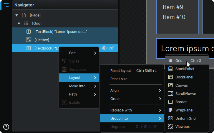
Grouping Elements Into a Grid
Elements can be instantly grouped into a new Grid by selecting one, or multiple Elements in 📘 Navigator Panel or on the 📘 Stage, and pressing Ctrl (Hold) + G .
Alternately, this can also be achieved by right-clicking on Elements and from the context menu, navigating to 'Layout', 'Group Into', then selecting 'Grid'.
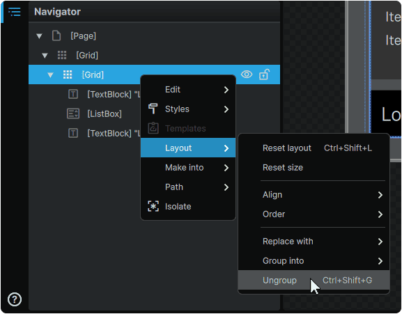
Elements can be ungrouped by pressing Ctrl (Hold) + Shift (Hold) + G.
Alternately, ungrouping can also be performed by right-clicking on a Grid and from its context menu, navigating to 'Layout', then selecting 'Ungroup'.
Grid Layout Setup
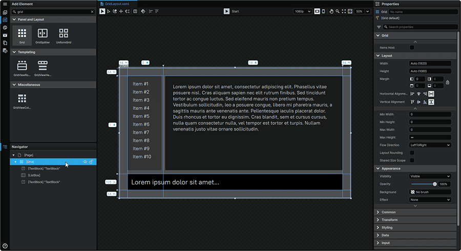
A Grid's Column and Row definitions can be set up either via 📑 On-Stage Configuration using the Grid's adorners, or through a 📑 Properties-Based Configuration. Both methods can be used in tandem, and any adjustment made via one mechanism, will reflect in the other.
On-Stage Configuration
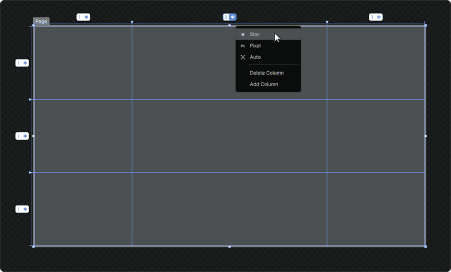
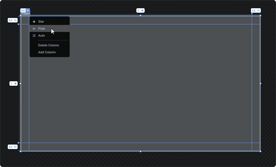
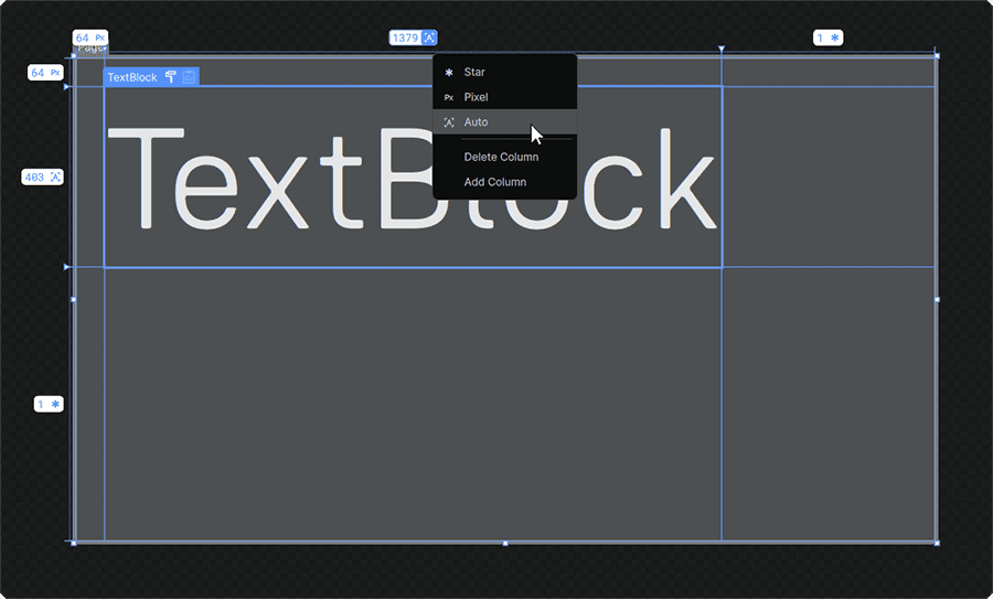
Columns and Rows can be added to a Grid Element, directly on-Stage by selecting it in the 📘 Navigator Panel or on the 📘 Stage, hovering over its right and top edge adorners, and clicking to add Columns and Rows respectively.
Columns or Rows can be removed at any time by clicking on an existing Column or Row's unit of measurement, and selecting 'Delete Column' or 'Delete Row' respectively.
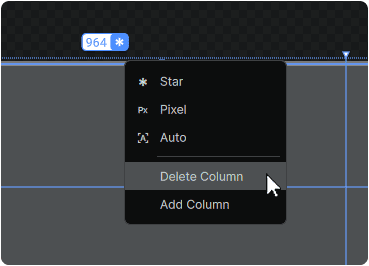
The width of each Column, and the height of each Row can be set by clicking-and-dragging the adorners separating each Column/Row, or by clicking on its value adorners and setting its 📑 Column and Row Sizing.
Properties-Based Configuration
A Grid's Column and Row definitions can equally be set in the Grid Element's Properties 📘 Properties Panel, and offers a selection of additional configuration options compared to the 📑 On-Stage Configuration.
Width
Height
|
Set the Width or Height of a Column or Row respectively, using any of the units for 📑 Column and Row Sizing
|
Min Width
Min Height
|
When a Column or Row dimension is set via 📑 The * ('Star') Unit or 📑 The 'Auto' Unit, sets the minimum width or height in pixels it is allowed to shrink down to.
|
Max Width
Max Height
|
When a Column or Row dimension is set via 📑 The * ('Star') Unit or 📑 The 'Auto' Unit, sets the maximum width or height in pixels it is allowed to expand up to.
|
Shared Size Group
|
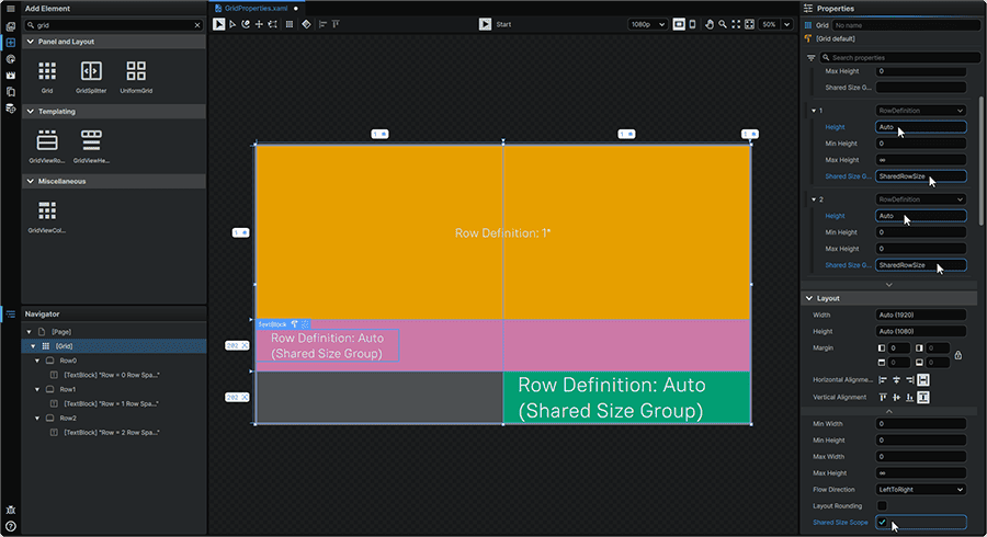
When multiple Column or Row dimensions are set via 📑 The 'Auto' Unit, assigning the same Shared Size Group name to multiple Columns or Rows, will result in all Columns or Rows of the same axis to expand to the size of the largest of the group members.
This option can be used in conjunction with the Shared Size Scope Property found across the framework's 📘 Panels & Layout Elements. Setting this Property to 'checked' defines all children Elements as having a shared common scope. This practice allows the same Shared Size Group names to be used across the children of multiple parent 📘 Panels & Layout Elements, whilst maintaining a tight control over which Elements within the Grid influence the sizing of others.
|
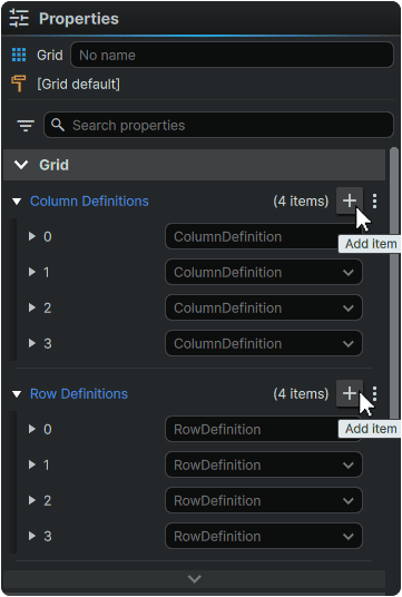
From the 📘 Properties Panel, additional Columns or Rows can be added to the Grid by clicking the + (Add Item) icon present in the header of each Column/Row Definitions section.
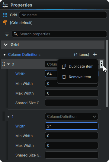
Any existing Column or Row definition can be duplicated or deleted by hovering over it, clicking on its ⋮ (3-Dot) menu icon, and selecting the desired operation.
Additionally, any existing Column or Row defintion can be re-ordered across its respective axis by hovering over it, clicking-and-dragging the individual item's ⋮⋮ (Drag) icon, and slotting it into a new position.
Column and Row Sizing
The space allocated to any Column or Row can be set via one of three units of measurement:
The * ('Star') Unit
The * ('Star') unit provides a proportional sizing solution in which each Column or Row is sized relative to other Columns or Rows along the same axis which are also sized in * ('Star') units.
Using this system, a Column set to 1* will be half the width of a Column set to 2*.
These internal proportions persist across various dimensions given to the Grid Element within a layout.
The Pixel Unit
The Pixel unit provides a sizing solution in which the dimensions of Columns/Rows are set in pixels.
Using this system, a Column set to measure 64px will always be 64px wide regardless of the overall dimensions of the Grid Element in a layout.
The 'Auto' Unit
The Auto unit provides a sizing solution in which the dimensions of a Column or Row will shrink or expand to the size of an Element within the Grid assigned to it.
Elements can be assigned to Columns or Rows using the techniques outlined in 📑 Assigning Elements To Grid Quadrants
Note
All three units of measurement can be mixed and matched within a single Grid layout.
Assigning Elements To Grid Quadrants
A Grid's Columns and Rows don't just serve as visual guides, but they also allow any any first-level child Elements of the Grid to be assigned to specific quadrants within it.
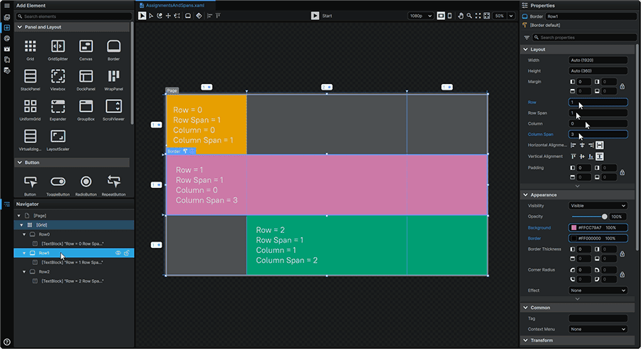
The placement of each child Element within the Grid's layout is controlled by two pairs of Properties:
Column
Row
|
Sets the starting position of the selected child Element within one of the Grid's quadrants.
The Column and Row Properties use zero-based numbering. Therefore the first Column of a Grid is defined as Column 0, and not Column 1.
|
Column Span
Row Span
|
Sets across how many Columns or Rows the selected Element spans.
Elements span starting from the quadrant the Element is positioned in via the Column or Row Properties.
In a layout with a FlowDirection Property of 'LeftToRight', child Elements span from the left to the right, whilst Elements in a layout set to 'RightToLeft', will start from the right, and span leftward.
|
Assigning Elements to quadrants within a Grid layout allows them to become fully responsive and adapt their footprint alongside any dimensional change to a Grid's total size, or to seamlessly adapt to changes in a Grid's Column and Row definitions: