📘 Studio Application Tour
🏘️ NoesisGUI ▸ 🏠 Noesis Studio ▸ 📘 Studio Application Tour
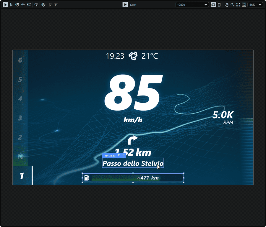
Zone Overview
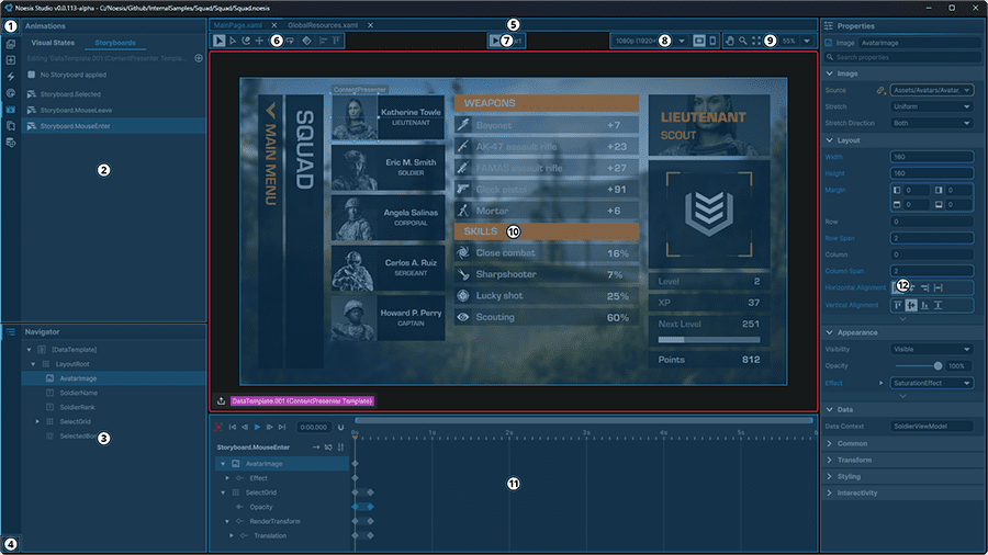
Zones
① Application Menu
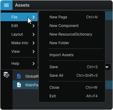
Access a range of application, Project, Page, Element, and view functions.
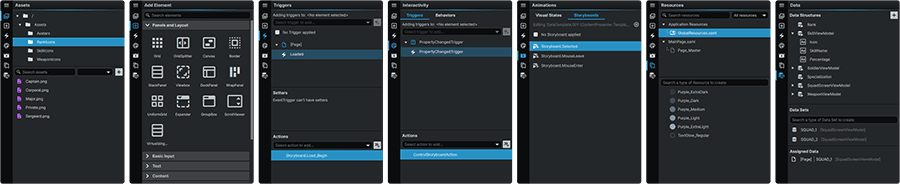
② Function Panels
Each tab gives access to panels encompassing the various primary functions of the application.
Note
Only one Function Panel can be active at a time.
Contains the 'Triggers', 'Behaviors', and 'Setters' tabs.
- Triggers allow the creation of custom events which can produce changes across the currently-active page or Element.
- Behaviors can be used to extend the functionality of elements without the need to write any code.
- Setters can be used to change a Property value within a Template or Style, as a result of either a Data value, or the value of another Property.
Note
Triggers, Behaviors, and Setters are scope-sensitive, meaning that only Triggers created within the currently-active Page or Element will display in the list.
Contains both the 'Visual States' and 'Storyboards' tabs.
- Visual States can be used to design individual states that a Page or Element could switch between, as well as the transitions between them.
- Storyboards can be used to animate elements present on the Stage.
Note
The Animation Panel content is scope-sensitive, meaning that only Visual States or Storyboards created within the currently-active Page or Element will display in the list.
A collection of common resources which can either be stored and accessed at the project, page, or element level.
Create, view, and manage data structures and data sets that can drive content, navigation, and interactivity.
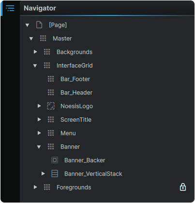
③ Navigator
The Navigator reflects the element hierarchy of the currently-active view. When viewing a page, the layers composing the Page will be displayed.
If an element's Template or Style is entered in 'edit' mode within a page, its hierarchy elements will be displayed, isolated from the elements of the page it is a part of.
Note
Layers are rendered in 'draw order', meaning that in a flat hierarchy of elements, the layer at the bottom of the list, will visually be atop of all other layers in the hierarchy.
Learn more about the 📘 Navigator Panel

⑤ Open Pages
A listing of all currently-open pages within the project.

⑥ Toolbox
A collection of tools used to manipulate, or create various elements on the currently-active Stage.
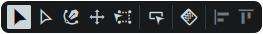
Learn more about the 📘 Toolbox.
⑦ Play/Stop
Starts/Stops Noesis Studio from rendering the currently-viewed Page in a mode that represents what the end-user will see and interact with. Play/Stop can be activated at any time via the Ctrl (Hold) + P shortcut.

Note
Any edits made to content during playback will not be visible until playback is stopped.
⑧ Stage Preview Toolbar
The way the Stage is presented can be changed to preview how an interface will display at different resolutions or aspect ratios.
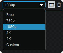
Learn more about the 📘 Stage Preview Toolbar.
⑨ View Toolbar
The View Toolbar offers various tools to move, zoom, and control the opened Page's fit within the application window.
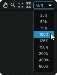
Learn more about the 📘 View Toolbar
⑩ Stage
In its default 'Editor Preview' mode, the Stage offers a real-time editable preview of the contents of the currently-active Page. In this mode, elements on the Stage can be interacted with and directly edited, either by adjusting properties in the Properties panel, or via a number of built-in adorners that appear on elements when selected.
When in 'Play' mode, activated by pressing the 📑 Play/Stop button, the interface being developed offers the ability to preview the interface from the perspective of the end-user, and to experience user-facing interactions.
⑪ Animation Timeline
The Animation Timeline offers system in which keyframes can be placed for individual elements, allowing for properties to be animated along a timeline.
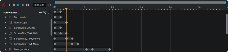
Note
This area only appears when a Visual State, a Visual State Transition, or a Storyboard is selected from the 📘 Animation Panel.
Learn more about the 📘 Animation Timeline
⑫ Properties
The Properties Panel allows customization of the appearance, functionality, and content of most selectable items within Noesis Studio. Properties are able to change between Visual States, Styles, Templates, Keyframes. They can also change on-the-fly as a result of a Trigger, a change in Data, or an in-game event.
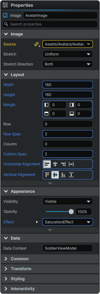
Learn more about the 📘 Properties Panel.