

📘 Triggers
🏘️ NoesisGUI ▸ 🏠 Noesis Studio ▸ 📘 Working With Interactivity ▸ 📘 Triggers
Overview
The Triggers system allows creators to inject a dynamic and reactive layer to any composition, through which various user-driven or system-driven events can be custom-configured to produce a range of changes within an interface.
Noesis Studio offers a wide range of 📑 Trigger Types, and 📑 Action Types which can be paired, and set up, to both listen to, and change, almost any part of the UI, completely on-the-fly in real-time.
Anatomy of a Trigger
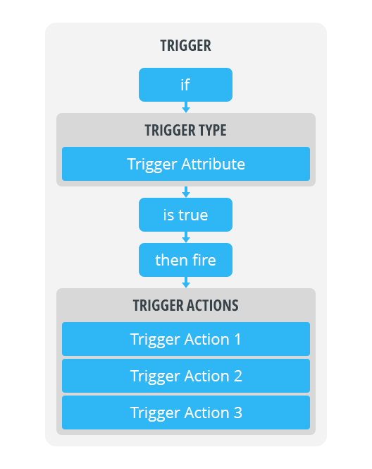
Triggers are configured by selecting one of the many available 📑 Trigger Types that the system should 'listen for', and whose settings are configured through 📑 Trigger Attributes.
Whilst each of the offered Trigger Types provide their own unique set of Trigger Attributes, they all share a common mechanical system in which each of the available Trigger Attributes are paired up with one or many 📑 Trigger Actions, which each can be set up to fire a specific action when the 'listened for' event is detected as having taken place:
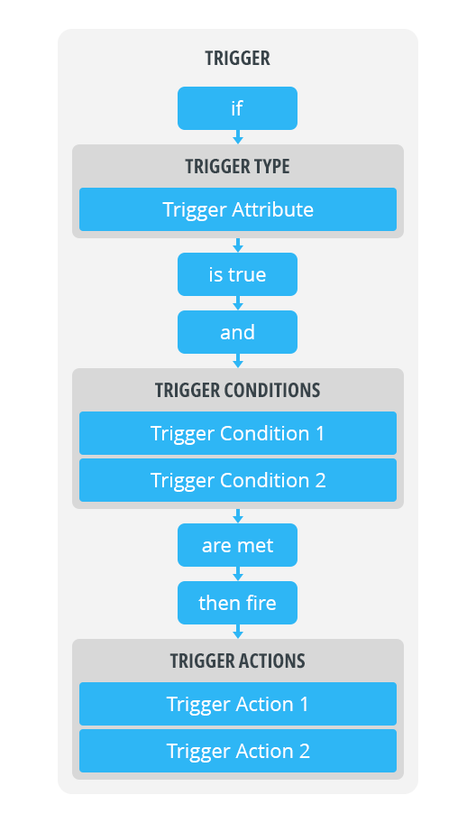
Furthermore, specific 📑 Trigger Conditions can also be added to any Trigger. These are an optional component of any Trigger configuration, that when employed, allow even more specificity to be applied to the circumstances that would see any of the designated 📑 Trigger Actions fire:
Trigger Attributes
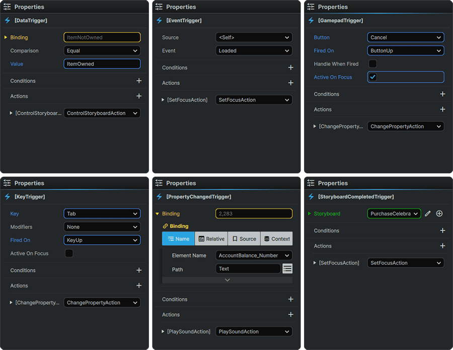
It is through configuring a Trigger's Attributes, that an event can be designated for the system to monitor.
These events can range from being able to monitor a user's input device for specific actions, listening for changes in a specific Element's Property Values, or to be on standby for a time delay or animation to be completed, among many others offered by the range of available 📑 Trigger Types.
Once the monitored events occur (and if any applicable 📑 Trigger Conditions are also met) the designated 📑 Trigger Actions then fire off.
Trigger Conditions
Conditions offer an optional feature allowing creators to set even more granular controls than just those configured in the 📑 Trigger Attributes, to dictate when 📑 Trigger Actions should fire.
When employing Conditions, both the Trigger Attributes and the Trigger Conditions are evaluated. If the conditions of both are met, the selected Trigger Actions then fire off.
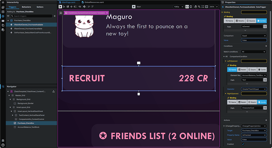
Using the techniques outlined in 📑 Condition Configuration, this system enables, for example, to set up up a 'Buy' 📘 Button Element which adds an item to the player's inventory if it they have performed a Click (Event Trigger) on it, and their current account balance exceeds the cost of the item (Condition).
Trigger Actions
The Actions applied to a Trigger set what exactly should happen once the event specified in the 📑 Trigger Attributes (and any applicable 📑 Trigger Conditions) has occured.
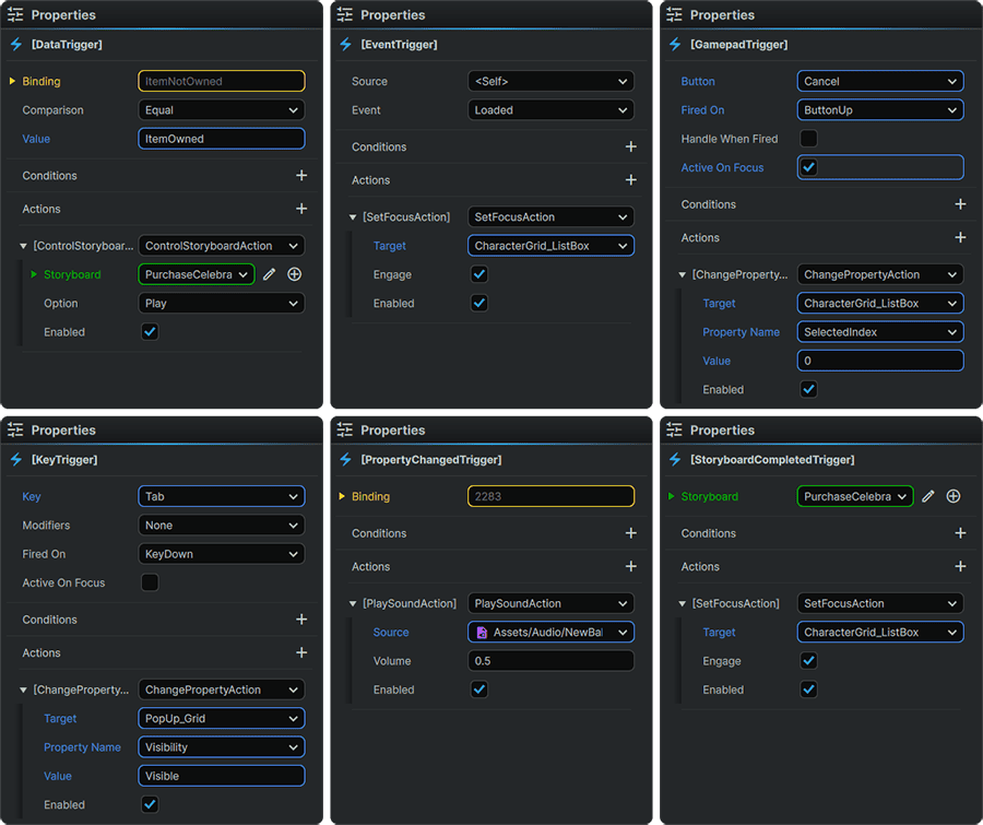
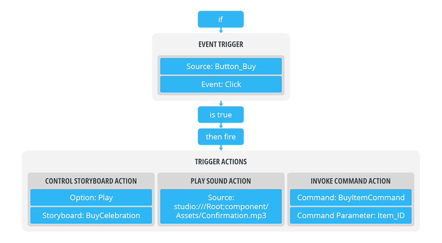
Noesis Studio includes a wide range of 📑 Action Types, which can be employed to, in the case of a 'Buy' 📘 Button Element being clicked, to produce the following results, for example:
- A celebratory animation plays via a ControlStoryboardAction.
- A confirmation sound plays via a PlaySoundAction.
- The purchase order gets passed onto the backend via a InvokeCommandAction.
Trigger Configuration
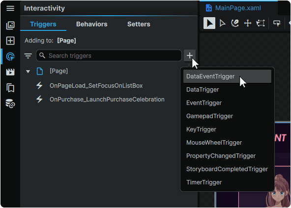
Triggers can be added to any Element from the 📘 Interactivity Panel 'Triggers' tab.
Adding a Trigger first requires selecting an Element from the 📘 Stage or from the 📘 Navigator Panel, then clicking the + (Add Trigger) icon in the top of the Triggers panel, and selecting one of the many 📑 Trigger Types.
Note
Triggers are created as part of the Element they are applied to. It is therefore important to consider that when deleting, moving, or duplicating an Element, so will its Trigger configuration.
Any Trigger can be renamed by double-clicking on it, and inputting a custom name:
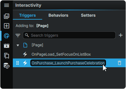
Although Triggers are grouped in the list according to the order of each Element within the 📘 Navigator Panel, Triggers with the same parent Element can be re-ordered amongst eachother by hovering over a Trigger, clicking-and-dragging its ⋮⋮ (Drag) icon, and slotting each into a new position.
A Trigger can be deleted from its respective Element by hovering over it in the list and clicking the 🗑 (Delete Trigger) icon:
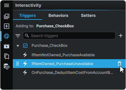
Trigger Types
The following Trigger Types can be added to any Element, and listened for:
DataEventTrigger
|
• Fires off an Action when a Data Object's Data Event is detected.
|
DataTrigger
|
• Fires off an Action based on a comparison result between two values.
• The Trigger can be set to fire when both values are set to any combination of 'Equal', 'NotEqual', 'LessThan', and 'GreaterThan' one another.
|
EventTrigger
|
• Fires off an Action when one of the available Event types are detected as having taken place on a specific Element.
|
GamepadTrigger
|
• Fires off an action when a Gamepad button is actuated.
• Supports firing either on 'ButtonDown' or 'ButtonUp'.
|
KeyTrigger
|
• Fires off an Action when a keyboard key is actuated.
• Supports firing either on 'KeyDown' or 'KeyUp'.
• Supports optional Modifiers which require holding a Modifier Key alongside the designated primary Key in order to fire the designated Action.
|
MouseWheelTrigger
|
• Fires off an Action when a MouseWheelScroll in a specific direction is detected.
|
PropertyChangedTrigger
|
• Fires off an Action when a specified Element Property value changes.
• Differs from the DataTrigger in that it fires when any change in value is detected (as opposed to a match to a specified value.)
|
StoryboardCompletedTrigger
|
• Fires off an Action once a designated non-repeating and non-auto-reversing Storyboard has reached its end.
|
TimerTrigger
|
• Fires off an Action x-duration after a designated Event.
|
Condition Configuration
Conditions can be set up to act as a further gate to 📑 Trigger Actions firing.
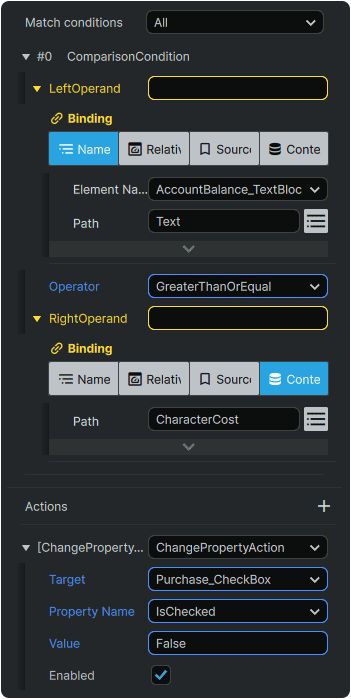
Setting a Condition consists of comparing two values (Operands) using an Operator which can be set to to any combination of 'Equal', 'NotEqual', 'LessThan', and 'GreaterThan.
If the Operator produces a match relative to the values of the LeftOperand and the RightOperand, the Trigger is then able to fire any designated 📑 Trigger Actions.
For example: If PlayerAccountBalance (LeftOperand) is GreaterThanOrEqual (Operator) to ItemCost (RightOperand), then ChangePropertyAction (Action) of the 'Buy' Button to 'Enabled'.
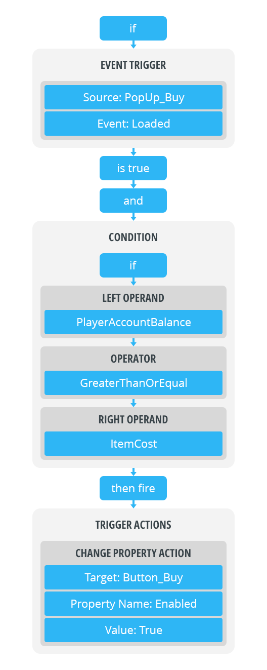
If a match is not produced, the Trigger remains inactive.
A Condition can be added to any Trigger by clicking on the + (Add Condition) icon in the Trigger's 📘 Properties Panel.
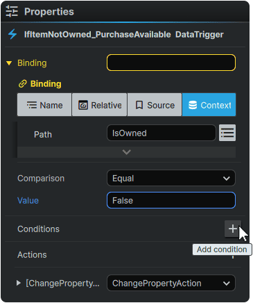
An infinite amount of Conditions can be configured within any Trigger.
Using the Match Conditions Property, any Trigger can be set to either have to match 'All' Conditions to fire the associated 📑 Trigger Actions, or, alternately, it can be set to Any, which will allow the designated Trigger Actions to fire as long as any of the listed Conditions are met.
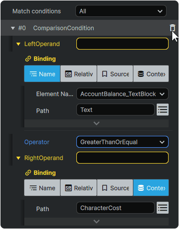
A Condition can be deleted from a Trigger by hovering over it in the list and clicking the 🗑 (Delete Condition) icon:
Action Types
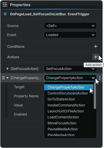
A Trigger Action can be added to any Trigger by clicking on the + (Add Action) icon in the Trigger's 📘 Properties Panel, and selecting the Action Type to add:
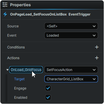
Any Action can be renamed by double-clicking on it, and inputting a custom name:
Actions can be re-ordered amongst eachother by hovering over an Action, clicking-and-dragging its ⋮⋮ (Drag) icon, and slotting each into a new position.
An Action can be deleted from a Trigger by hovering over it, clicking on its ⋮ (3-Dot) menu icon, and selecting 'Delete Action':
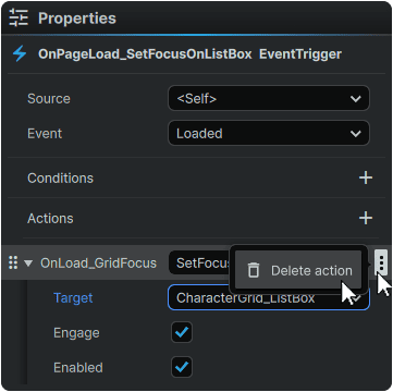
An unlimited amount of Action Types can be added to any Trigger to produce a variety of results within the UI when activated:
ChangePropertyAction
|
Provides the ability to change the Property value of a designated Element.
|
ControlStoryboardAction
|
Provides control over a designated Storyboard animation:
• Play: Play the Storyboard from the beginning.
• Stop: Stop playback of the Storyboard and return it to the beginning of its Timeline.
• TogglePlayPause: Switch between Play and Pause of the Storyboard every time the Action is fired.
• Pause: Pauses the Storyboard in its current position, from where it can be resumed.
• Resume: Play the Storyboard from its current position.
• SkipToFill: If the Storyboard's FillBehavior Property is set to 'HoldEnd', jumps to and holds the values of the last frame of the animation. If the Storyboard's FillBehavior Property is set to 'Stop', all values changed in the animation are discarded.
⚠️ This option is pending implementation. Its resolution can be followed at 🦗 Ticket #4899.
|
GoToStateAction
|
• Provides the ability to activate 📘 Visual States.
• With the Use Transitions Property, offers the ability to use, or bypass any 📘 Visual State Transitions configured in 📘 Visual State Groups.
|
InvokeCommandAction
|
• Provides the ability to execute 📘 Commands
|
LaunchURIOrFileAction
|
• Provides to ability to open any link targeted in the Path Property. Files are opened using the operating system's own protocols.
• If supported by the operating system, the Path value can either be written as a local path ('C:\Noesis\StudioTool.exe') , or as a network address ('https://www.noesisengine.com').
|
MoveFocusAction
|
• Provides the ability to change the Focus to the next eligible Element in either the 'Left', 'Right', 'Up', 'Down' Direction relative to the currently-Focused Element within a 📘 Directional Navigation system.
|
PauseMediaAction
|
• Provides the ability to pause the video or audio of a 📘 MediaElement Element in its current playback position.
• Unlike the StopMediaAction, if a PlayMediaAction is invoked after it has been paused, playback will resume from the position it was paused at.
• Requires the Loaded Behavior Property of the 📘 MediaElement Element designated in the Target to bet set to 'Manual' to function.
|
PlayMediaAction
|
• Provides the ability to play the video or audio of a 📘 MediaElement Element from the beginning.
• Requires the Loaded Behavior Property of the 📘 MediaElement Element designated in the Target to bet set to 'Manual' to function.
|
PlaySoundAction
|
• Provides the ability to play an audio file from beginning to end.
|
RemoveElementAction
|
• Provides the ability to remove a designated Element from a document for the remainder of its lifecycle.
• Elements removed using the RemoveElementAction return when the document is reloaded.
|
RewindMediaAction
|
• Provides the ability to return the video or audio of a 📘 MediaElement Element back to its beginning, and play again.
• Requires the Loaded Behavior Property of the 📘 MediaElement Element designated in the Target to bet set to 'Manual' to function.
|
RiveTriggerAction
|
• Provides the ability to fire a 📘 RiveControl Element Trigger.
|
SelectAction
|
• Provides the ability to select Elements offering the Selected Property.
|
SelectAllAction
|
• Provides the ability to select the contents of a 📘 TextBox Element.
• The SelectAllAction must directly be applied to the 📘 TextBox Element looking to utilize this feature, and cannot be issued by another Element.
|
SetFocusAction
|
• Provides the ability to set Focus on a designated Element.
|
StopMediaAction
|
• Provides the ability to stop the video or audio of a 📘 MediaElement Element.
• Unlike the PauseMediaAction, if a PlayMediaAction is invoked after it has been stopped, playback will occur from the beginning.
• Requires the Loaded Behavior Property of the 📘 MediaElement Element designated in the Target to bet set to 'Manual' to function.
|