🎓 Creating a Style Switcher in Noesis Studio
🏘️ NoesisGUI ▸ 🏠 Noesis Studio ▸ 🎓 Creating a Style Switcher in Noesis Studio
Note
This tutorial is a work-in-progress and cannot yet be completed to the end. Proceed with caution.
Introduction
In this tutorial, we will learn how to create a simple system that allows developers and/or users to easily switch between not just a single visual style, but an entire collection of styles, on-the-fly.
Some practical use-cases of this include allowing a user to switch between palettes composed of different of colours, to be able to switch fonts used between localisations, to offer font size presets to the user, or to provide the ability to completely change the overall interface style between various themes.
Although we will be looking at one specific example focused on Typography, the method we will be learning can be applied to anything whose presentation is driven by a ResourceDictionary.
Overview
Objective
Our goal will be to create a method through which a user can pick between one of three different typographic styles for their interface.
Each set will be composed of a unique body font, and a unique header font.
Prerequisites
- A copy of the Noesis Studio desktop application (🎓 Installing and Setting Up Noesis Studio).
- A selection of 6 distinct fonts. You are free to use whichever fonts you wish, but we will be picking from the Windows default font list.
Time to Complete
This tutorial will take ~20 min to complete.
Process Overview
To achieve our objective:
1. We will create a new Studio Project, a Page to work within, and a folder structure to contain our content.
2. We will create an individual ResourceDictionary per Style that we want to make available to the user. This dictionary will contain information on which fonts and font metrics to use in each Style.
3. We will create a 'master' ResourceDictionary which will serve to pass on the selected Style to the wider application/interface. As part of this process, we will perform an operation known as 'ResourceDictionary Merging' which allows us to 'include' the contents of one ResourceDictionary in another without having to manually duplicate and maintain any Dictionary other than the one where our Styles are originally defined.
4. We will add a couple of 📘 TextBlock Element to our page. These will be the elements the Styles will be applied to. We will also add a 📘 ComboBox Element which will be used to switch between each of the Styles.
5. We will set up the functionality that will change the Style depending on which option is selected in the 📘 ComboBox Element.
Once finished, we will have an architecture ressembling the below, and we will be able to test our system as an end-user.

Instructions
1. Project Setup
First, we will set up the Noesis Studio project we will be working in:
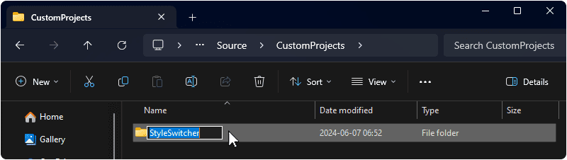
1a. Create a folder on your machine in which this project will live. You can name this folder as you wish, but we will be using 'StyleSwitcher'.
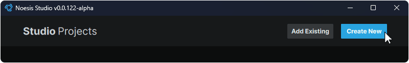
1b. Launch the Noesis Studio application, and select 'Create New' within the launcher to create the project.
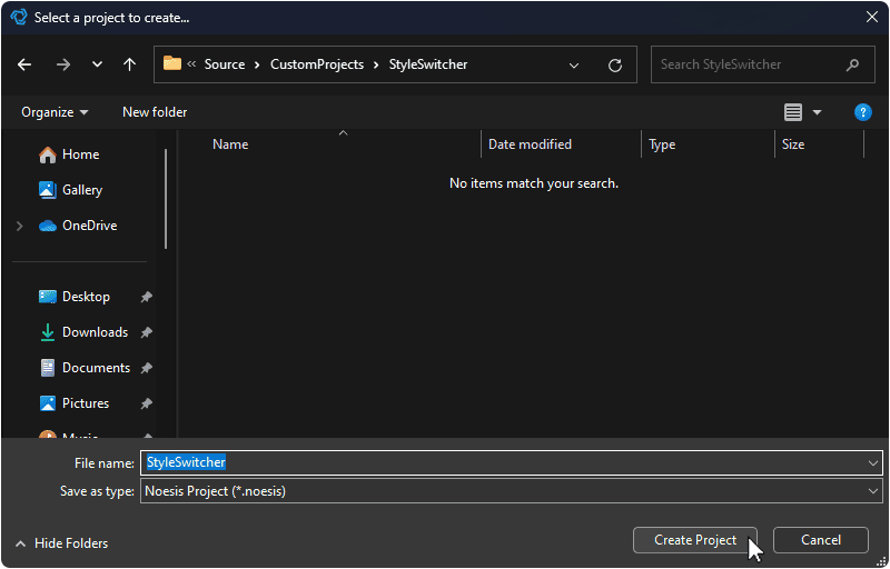
1c. In the file explorer, navigate to within the folder created in step 1a. and name your project. You can name this project as you wish, but we will be using 'StyleSwitcher'. Once you are done, select 'Create Project' to continue.
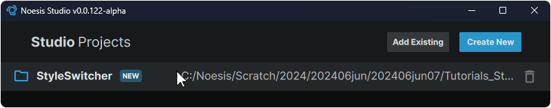
1d. The file explorer will now close, and the created project will appear in the launcher. Click on the project to open it in the Noesis Studio visual editor.
2. Page Setup
We will set up the page we will be working in throughout the rest of the tutorial:
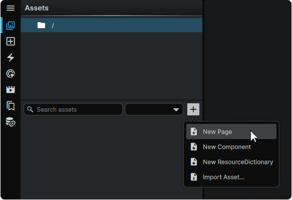
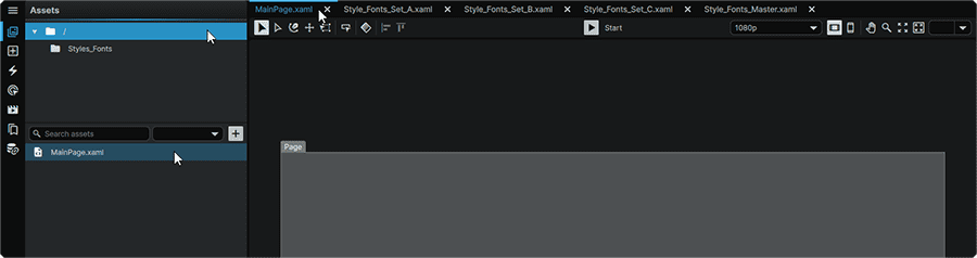
2a. Within the Noesis Studio visual editor, navigate to the 📘 Assets Panel (Ctrl+1), press the + (Add) icon, and select 'New Page' from the context menu.
2b. The page will now appear in the File Browser of the project's root folder. You can name the page as you wish, but we will be following convention and use 'MainPage'.

3. Internal Folder Setup
We will create a folder which will be used to contain our individual Styles:
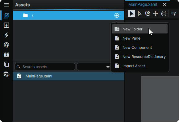
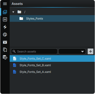
3a. Hover over the project's root folder (🗀/) , press the ⊕ (Add) icon, and select 'New Folder' from the context menu.
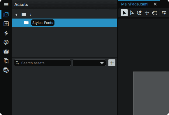
3b. The folder will now appear in the Folder Browser as a child of the project root directory (🗀/). You can name the folder as you wish, but we will be using 'Styles_Fonts'.
4. Individual Style Dictionary Creation
We will create three Style dictionaries within the 'Styles_Fonts' folder we set up in step 3.
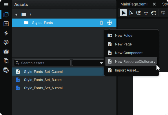
4a. Hover over the newly-created 'Styles_Fonts' folder , press the ⊕ (Add) icon, and select 'New ResourceDictionary' from the context menu.
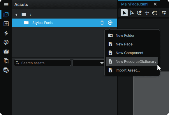
4b. The Dictionary will now appear in the File Browser of the 'Styles_Fonts' folder. You can name the ResourceDictionary as you wish, but we will be using 'Style_Fonts_Set_A' for our first set.

4c. Repeat steps 4a. and 4b. and create an additional two ResourceDictionary files, each with a unique name. You can name these as you wish, but we have elected to follow the pattern of the first one, and will create a 'B' and a 'C' version to go alongside the already-created 'A' version.
5. 'Master' Dictionary Creation
We will create a 'master' ResourceDictionary which will serve as a fixed reference point for the application/interface to look towards to know which font Style to present between the three we are making available.
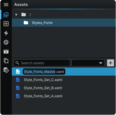
5a. Similarly to how we created our individual font Styles, hover over the 'Styles_Fonts' folder in the Assets Panel, press the ⊕ (Add) icon, and select 'New ResourceDictionary' from the context menu.
5b. The Dictionary will now appear in the File Browser of the 'Styles_Fonts folder. You can name the ResourceDictionary as you wish, but we will be using 'Style_Fonts_Master.
6. Setting the 'Master' as a MergedDictionary
We will set the 'master' dictionary created in step 5. to point at one of our three font Styles. This will be done using a technique called setting a 'MergedDictionary'. Using a MergedDictionary allows dictionaries from multiple sources and/or locations to be 'merged' into one easy-to-manage intermediary file.
6a. Ensure that the 'Style_Fonts_Master' master file is the currently-active file in Studio.
If the file is already open, but is not the currently-active tab, this can be done by selecting its tab in the Open Pages at the top of the application window.
If the file is not open, it can be opened by selecting the file in the 📘 Assets Panel, which will open it and set it as the currently- active page.
6b. With the 'master' page still active, navigate to the 📘 Resources Panel, (Ctrl+5), then hover over the ResourceDictionary found within the master file, press the ⊕ (Action) icon, and under the 'Merge Dictionary' context submenu, select one of the font Style sets we created. In our case, we will select the 'A' set.

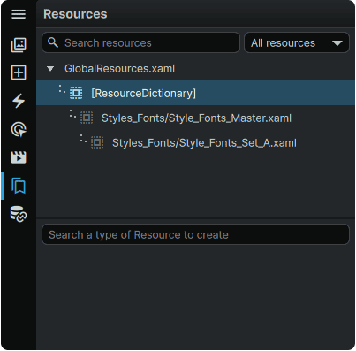
The succesful completion of this action will be confirmed by the 'A' set now being visible as a child of the master within the 📘 Resources Panel.

6c. Lastly, we will merge our 'master' dictionary into our application-wide GlobalResources dictionary to make it accessible from our MainPage, where it will be used.
To do so, within the 📘 Resources Panel, hover over the 'GlobalResources.xaml' entry, press the ⊕ (Action) icon, and under the 'Merge Dictionary' context submenu, select our 'master'.

7. Style Creation
We will create the text Styles for our three individual font sets. Each set will contain a 'Header' and a 'Body' font Style.
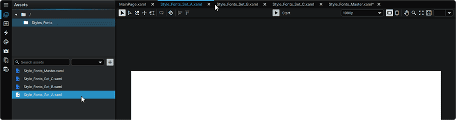
7a. Ensure that the file for the first of the three Style sets is the currently-active file in Studio. In our case, we will be starting with the 'Style_Fonts_A' set.
If the file is already open, but is not the currently-active tab, this can be done by selecting its tab in the Open Pages at the top of the application window.
If the file is not open, it can be opened by selecting the file in the 📘 Assets Panel, which will open it and set it as the currently- active page.
7b. With the file still active, navigate to the 📘 Resources Panel, (Ctrl+5), ensure that the active dictionary is the one for the current file (and not the GlobalResources dictionary). Then, in the input field titled 'Search a type of Resource to create', type 'Style' to perform a search for the 'Style' resource. Once it has been found, select it from the list.

7c. Selecting the Style resource will cause it to appear as an entry within the ResourceDictionary belonging to'Style_Fonts_Set_A'. You can name the Style as you wish, but we will be using 'Header'.

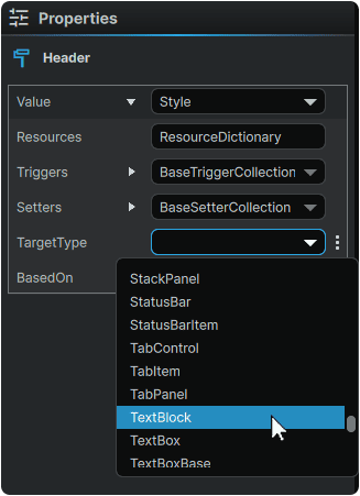
7d. Select the newly-created Style from the 📘 Resources Panel, and navigate to the 📘 Properties Panel on the far-right of the application window. Under the 'TargetType' field, select 'TextBlock', as this is the element type our font styling will be applied to.
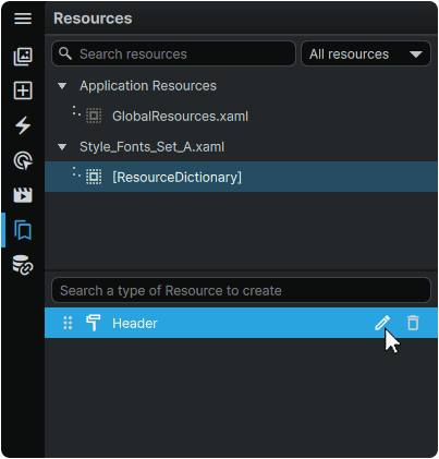
7e. Within the 📘 Resources Panel, hover over the Style for the Header Style, and select the 🖉 (Edit) icon to allow you to edit the properties of the Style.
7f. Upon selecting the 🖉 (Edit) icon, the window layer will receive an orange outline, indicating that we are inside of a Style. We can now edit the properties of this TextBlock Style within the 📘 Properties Panel.
In particular, for the purpose of this tutorial, we are most interested in setting a custom FontFamily and a custom Size for the Header Style. This can be done by navigating to the 'Text' category within the 📘 Properties Panel, selecting a Font under the 'Family' field, and inputting a nice large value in the 'Size' field.

7g. Repeat steps 7b. through 7e, to create a second 'Font_Body' Style in the same way that we created 'Header' We will be making our 'Body' Style feature a different font family, and a smaller text size than 'Header'.

7h. Repeat steps 7a. through 7f. in the two remaining 'B' and 'C' sets. At the end of the procedure, all three sets should have a 'Header' and a 'Body' Style. It is important that these names are consistent across all three sets in order to permit them to seamlessly interchanged.

8. Element Placement
We will add a couple of 📘 TextBlock Element elements to our page to be able to see our text styling in action. We will also add a 📘 ComboBox Element which will be used to switch between each of the Styles.
8a. Navigate to the 📘 Assets Panel (Ctrl+1), select the Project's root folder (🗀/) and select the MainPage to display it on the Stage. Alternately, if the page was already open, it can be made active by clicking on its tab in the Open Pages tabs at the top of the application window.
8b. With the page still open, navigate to the 📘 Add Element Panel (Ctrl+2), find the 📘 StackPanel Element under the 'Panels and Layout' category, and Left Mouse Button Click-and-Drag it to the Stage (or to the root Grid of the page in the 📘 Navigator Panel).
The 📘 StackPanel Element, as the name implies, allows us to automatically 'stack' all of the remaining elements we will be bringing in, without having to manually specify the position of each.
8c. From the same 📘 Add Element Panel, find the 📘 TextBlock Element under the 'Text' category, and Left Mouse Button Click-and-Drag two instances of this element to the 📘 StackPanel Element layer in the 📘 Navigator Panel).
8d. Using the 📘 Assets Panel search field, search for 'ComboBox', and Left Mouse Button Click-and-Drag one ComboBox, and three ComboBoxItem elements to 📘 StackPanel Element layer in the 📘 Navigator Panel). The ComboBox should be placed within the StackPanel first. The three ComboBoxItems (one for each font Style) should be placed within the ComboBox.
8e. Within the Navigator, select the StackPanel with Left Mouse Button Click, and in the 📘 Properties Panel for the StackPanel found on the right of the application window, set the HorizontalAlignment and VerticalAlignment to 'Center'. This will center our StackPanel and its content in the middle of the screen.
9. Content Population
We will populate the elements we've placed on the Stage with the appropriate content.
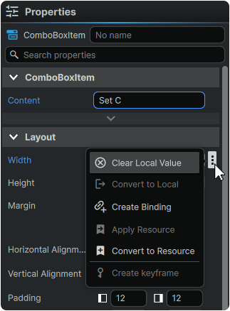
9a. Within the Navigator, select the bottom-most ComboBoxItem, and within its 📘 Properties Panel, found on the right of the application window, navigate to the 'Content' field, and input "Set C". Then hover over the 'Width' property, and Left Mouse Button Click on the ⋮ (3-Dot) menu to the right of the field, and select 'Clear Local Value' to have the width of the ComboxBox dictacted by the length of the content within it rather than a fixed size.
9b. Repeat step 9a. for the two remaining ComboBoxItem elements, but naming them as 'Set B' and 'Set A', and clearing the local value for the 'Width' properties of each.

9c. Within the Navigator, select the ComboBox, and within its 📘 Properties Panel, found on the right of the application window, navigate to the 'Placeholder' field, and input "Font Style:". The 'Placeholder' property corresponds to the visible 'label' the ComboBox will have.
Then, hover over the 'Height' property, and Left Mouse Button Click on the ⋮ (3-Dot) menu to the right of the field, and select 'Clear Local Value' to have the height of the ComboxBox dictacted by the height of the content within it rather than a fixed size.

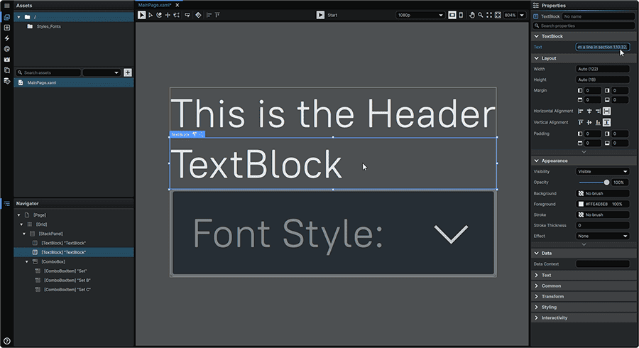
9d. Within the Navigator, select the visually top-most TextBlock, and within its 📘 Properties Panel, found on the right of the application window, navigate to the 'Text' field, and input a couple words to serve as a placeholder Title. In our case, we will be using the a very original 'This is a Header'
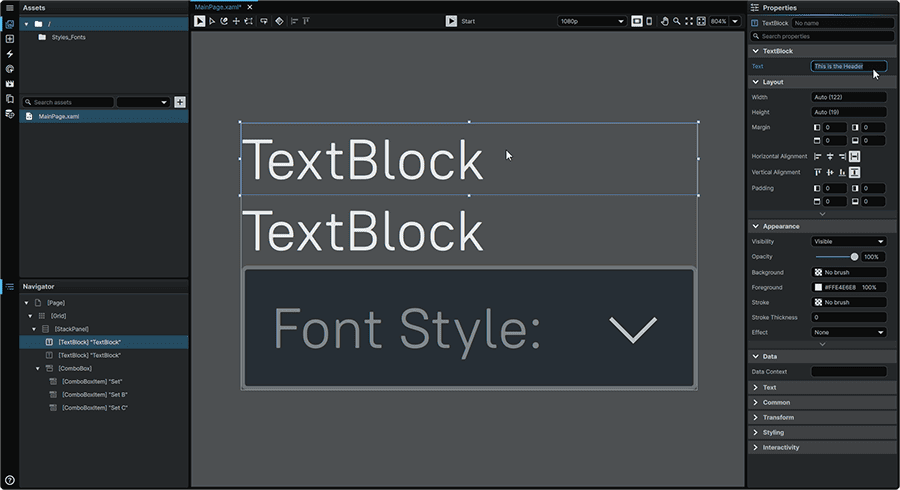
9e. Repeat the same process with the second TextBlock, but this time inputting long-form paragraph text. In our case, we will be pasting in some placeholder text.
9f What you will notice is now that we have paragraph text in place, is how the text expands all the way to the edges of the Screen.
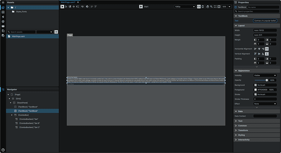
We can give our content a bit of breathing room by adjusting the Margin properties of the element containing our content, which in this case, is our 📘 StackPanel Element.
To adjust this, within the Navigator, select the StackPanel, and within its 📘 Properties Panel, found on the right of the application window, navigate to 'Layout' category. Under the 'Margin' field, set a left and right margin by typing in the desired pixel amount into the corresponding fields. In our case, we will be setting the StackPanel's margin to be 128px on both sides.

9e. At the top-center of the application window, press the ▶ (Play) button (Ctrl+P) to see what we've created so far in-action.
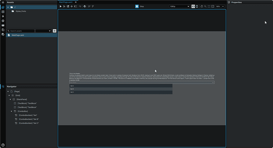
On-screen, two pieces of text should be visible. There should also be a ComboBox which can be opened with Left Mouse Button. Inside of this ComboBox, should be 3 different buttons, one for each of our three Styles. For the moment, these have no functionality, but this is what we will be tackling in our next steps.
Once you we are done inspecting our work so far, we will select ◼ (Stop) button (Ctrl+P) to exit playback, and return to a mode where we can continue authoring our interface.
10. Adding Functionality
We will configure our elements so that when we select a presentation style from our ComboBox, our TextBlocks will update to reflect the chosen styling.
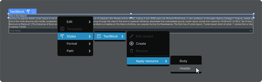
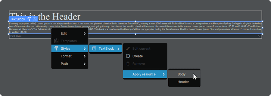
10a. To set our two TextBlock elements to each use a Style, we will first assign the 'Header' style to our title. To do so, select the corresponding TextBlock (either within the Navigator or the Stage), and enter its context menu by actuating the Right Mouse Button. Once within, navigate to the 'Styles' submenu. Under the 'TextBlock' entry, hover over the 'Apply resource' item, and select the 'Header' style.
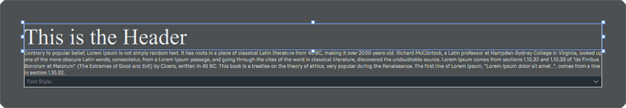
Applying the style will make it display in the font, and size we set in our 'A' set:
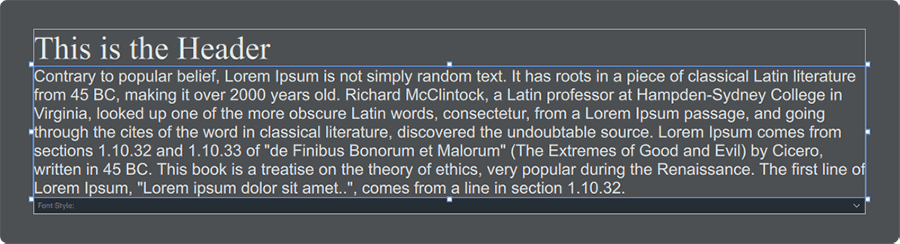
10b. Repeat the same process on the Body TextBlock, but applying the 'Body' Style instead.
At this point, you should see body the Header and the Body TextBlocks using the Style that we initially set up when we merged one of our font Styles into our 'master' ResourceDictionary.
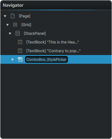
10c. To be able to leverage the selected option within our ComboBox, we first need to name it so that we have a way to point towards it and read its value. To rename the ComboBox, select it from the Navigator, and Left Mouse Button double-click on it.
Alternately, you can also rename the ComboBox by selecting it from either the Navigator or the Stage, and navigating to the 'ComboBox' entry at the very top of the ComboBox properties panel, and entering a new name there. Regardless of chosen method, we will be naming it 'ComboBox_StylePicker'.
10d. To add the Triggers required to read the value of the ComboBox, and to load a different Style set, we will navigate to the 📘 Interactivity Panel.
However, before we are able to add any Interactivity Triggers, we first need to select the element that we will be appying the triggers to. To do so, select the ComboBox either from the Navigator or the Stage.
With the ComboBox selected, in the 'Triggers' tab, open the dropdown at the top of the 📘 Interactivity Panel, select 'DataTrigger', then press the 🗲+ (Add Trigger) icon.


11. Testing
We will launch our project, and verify that everything is working as intended.
11a.
Table of Contents