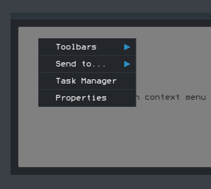
Introducing Controls
NoesisGUI includes a standard set of controls that enables you to quickly assemble traditional user interfaces. They can be grouped into four main categories, which mostly coincide with their inheritance hierarchy:
Note
The images shown in this tutorial are taken using the default Theme embedded in Noesis
Content Controls
Content controls are simply controls that are constrained to contain a single item. Content controls all derive from ContentControl, which has a Content property that contains the single item. The built-in content controls come in three major varieties: Buttons, Simple Containers and Containers with a header.
Buttons

Buttons are probably the most familiar and essential user interface element. A basic button is a content control that can be clicked, but not double-clicked. This behavior is actually captured by an abstract class called BaseButton, from which a few different control are derived.
The BaseButton class contains the Click event and contain the logic that defines what it means to be clicked. It also defines a boolean IsPressed property, in case you want to act upon the pressed state.
The most interesting feature of BaseButton, however, is it ClickMode property. This can be set to a value of a ClickMode enumeration to control exactly when the Click event gets raised. Its values are Release (the default), Press and Hover. Although changing the ClickMode on standard buttons would likely confuse users, this capability is very handy for buttons that have been restyled to look like something completely different. In these cases, it's a common expectation that pressing and object should be the same as clicking it.
Button, RepeatButton, ToggleButton, CheckBox and RadioButton derive from BaseButton.
Button
The Button class only adds two simple concepts on top of what BaseButton already provides: being a cancel button or a default button. These two mechanisms are handy shortcuts for dialogs. If Button.IsCancel is set to true on a Button inside a dialog, the Window is automatically closed with a DialogResult of false. If Button.IsDefault is set to true, pressing Enter causes the Button to be clicked unless focus is explicitly taken away from it.
RepeatButton
The RepeatButton acts just like Button except that it continually raises the Click event as long as the button is being pressed. The behavior of RepeatButton might sound strange at first, but is useful for buttons that increment or decrement a value each time they are pressed. For example, the buttons at the ends of a scrollbar exhibit the repeat-press behavior when clicking them and holding the mouse button down. The default look of a RepeatButton is exactly the same as Button.
ToggleButton
ToggleButton is a "sticky" button that holds its state when it is clicked. Clicking it the first time sets its IsChecked property to true, and clicking it again sets IsChecked to false. ToggleButton also has an IsThreeState property that, it set to true, gives IsChecked three possible values: true, false, or null. In addition to the IsChecked property, ToggleButton defines a separate event for each value of IsChecked: Checked for true, Unchecked for false, and Indeterminate for null. The default appearance of ToggleButton is exactly the same as Button and RepeatButton.
CheckBox

CheckBox is a familiar control. It is nothing more than a ToggleButton with a different appearance. CheckBox is a simple class deriving from ToggleButton that does little more than overriding its default style.

<Grid xmlns="http://schemas.microsoft.com/winfx/2006/xaml/presentation">
  <StackPanel VerticalAlignment="Center">
    <CheckBox Width="150" Content="Enable folder view" />
    <CheckBox Width="150" Content="Send Stats" />
    <CheckBox Width="150" Content="Debug Mode" />
  </StackPanel>
</Grid>
RadioButton
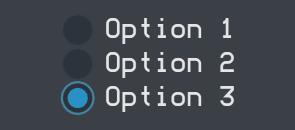
RadioButton is another control that derives from ToggleButton, but is unique because it has built-in support for mutual exclusion. When multiple RadioButtons are grouped together, only one can be checked at a time. Checking one RadioButton automatically unchecks all others in the same group.
By default, any RadioButtons that share the same direct logical parent are automatically grouped together.
<Grid xmlns="http://schemas.microsoft.com/winfx/2006/xaml/presentation">
  <StackPanel VerticalAlignment="Center" HorizontalAlignment = "Center">
    <RadioButton>Option 1</RadioButton>
    <RadioButton>Option 2</RadioButton>
    <RadioButton>Option 3</RadioButton>
  </StackPanel>
</Grid>
If you need to group RadioButtons in a custom manner, however, you can use its GroupName property, which is a simple string. Any RadioButtons with the same GroupName value get grouped together.
<Grid xmlns="http://schemas.microsoft.com/winfx/2006/xaml/presentation">
  <StackPanel VerticalAlignment="Center" HorizontalAlignment = "Center">
    <RadioButton GroupName="A">Option 1</RadioButton>
    <RadioButton GroupName="A">Option 2</RadioButton>
    <RadioButton GroupName="B">Option 3</RadioButton>
  </StackPanel>
</Grid>
Simple Containers
NoesisGUI includes several built-in content controls that don't have a notion of being clicked like a button, but each has its own unique features to justify its existence.
Label
Label is a classic control that can be used to hold some text. Being a content control, it can hold arbitrary content in its Content property, but Label is really only useful for text.
Note
Access Keys feature though the Target property is yet not implemented in noesisGUI
ToolTip
The ToolTip control holds its content in a floating box that appears when you hover over an associated control and disappears when you move the mouse away. For example:
<Grid xmlns="http://schemas.microsoft.com/winfx/2006/xaml/presentation">
  <Button Width="60" Height="40" Content="OK">
    <Button.ToolTip>
      Clicking this will submit your request
    </Button.ToolTip>
  </Button>
</Grid>
Containers with a header
All the previous content controls either add very simple default visuals around the content or don't add any visuals at all. The following two controls are a little different because they add a customizable header to the main content. These controls derive from a subclass of ContentControl named HeaderedContentControl, which adds a Header property.
GroupBox

GroupBox is a familiar control for organizing chunks of controls. It is typically used to contain multiple items, but because it is a content control, it can only directly contain a single item. Therefore, you typically need to set GroupBox's content to an intermediate control that can contain multiple children.

<Grid xmlns="http://schemas.microsoft.com/winfx/2006/xaml/presentation">
  <GroupBox Header="Grammar" Width="300" VerticalAlignment="Center">
    <StackPanel>
      <CheckBox>Check grammar as you type</CheckBox>
      <CheckBox>Hide grammatical errors</CheckBox>
      <CheckBox>Check grammar with spelling</CheckBox>
    </StackPanel>
  </GroupBox>
</Grid>
Expander

Expander is very much like GroupBox, but contains a button that enables you to expand and collapse the inner contents (by default, the Expander stars out collapsed). Expander defines an IsExpanded property and Expanded/Collapsed events. It also enables you to control which direction the expansion happens (Up, Down, Left, or Right) with an ExpandDirection property.

<Grid xmlns="http://schemas.microsoft.com/winfx/2006/xaml/presentation">
  <Expander Header="Grammar" Width="300" VerticalAlignment="Center">
    <StackPanel>
      <CheckBox>Check grammar as you type</CheckBox>
      <CheckBox>Hide grammatical errors</CheckBox>
      <CheckBox>Check grammar with spelling</CheckBox>
    </StackPanel>
  </Expander>
</Grid>
Items Controls
Another major category of noesisGUI controls are the items controls, which can contain an unbounded collection of items rather than just a single piece of content. All items controls derive from the abstract ItemsControl class, a direct subclass of Control.
ItemsControl stores its content in an Items property. Each item can be an arbitrary object, which by default gets rendered just like it would inside a content control.
Selectors
Selectors are items controls whose items can be indexed and, most important, selected. The abstract Selector class, which derives from ItemsControl, add a few properties to handle selection. For example, two similar properties for getting or setting the current selection are:
- SelectedIndex: a zero-based integer that indicates what item is selected or -1 if nothing is selected. Items are numbered in the order they are added to the collection.
- SelectedItem: the actual item instance that is currently selected.
Selector also support two attached properties that can be applied to individual items:
- IsSelected: a Boolean that can be used to select or unselect an item (or to retrieve its current selection state)
- IsSelectionActive: a read-only property that tells you if the selection has focus.
Selector also defines the event SelectionChanged that makes it possible to listen for changes to the current selection.
NoesisGUI includes four Selector-derived controls: ComboBox, ListBox, ListView and TabControl.
ComboBox

The ComboBox control enables user to select one item from a list. ComboBox is a popular control because it doesn't occupy much space. It displays only the current selection in a selection box, with the rest of the list shown on demand in a drop-down. The drop-down can be opened and closed by clicking the button.
ComboBox supports a mode in which the user can type arbitrary text into the selection box. If the text matches one of the existing items, that item automatically becomes selected. Otherwise, no item gets selected but the custom test gets stored in ComboBox's Text property so you can act on it appropriately. This mode can be controlled with two properties: IsEditable and IsReadOnly, which are both false by default. In addition, a StaysOpenOnEdit property can be set to true to keep the drop-down open if the user clicks on the selection box.
<Grid xmlns="http://schemas.microsoft.com/winfx/2006/xaml/presentation">
  <ComboBox Width="80" Height="20">
    <Label>200%</Label>
    <Label>100%</Label>
    <Label>50%</Label>
  </ComboBox>
</Grid>
ListBox
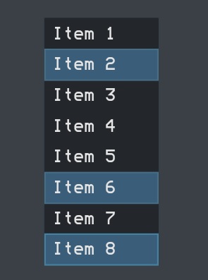
The familiar ListBox control is similar to ComboBox, except that all items are displayed directly within the control's bounds (or you can scroll to view additional items if the don't all fit).
Probably the most important feature of ListBox is that it can support multiple simultaneous selections. This is controlable via the SelectionMode property, which accepts three values:
- Single: only one item can be selected at a time.
- Multiple: any number of items can be selected simultaneously. Clicking an unselected item ads it to ListBox's SelectedItems collection, and clicking a selected item removes it from the collection.
- Extended: any number of items can be selected simultaneously, but the behavior is optimized for the single selection case. To select multiple items in this mode, you must hold down Shift (for contiguous items) or Ctrl (for noncontiguous items) while clicking.
<Grid xmlns="http://schemas.microsoft.com/winfx/2006/xaml/presentation">
  <ListBox Width="80" Height="200" SelectionMode="Extended">
    <Label>Item 1</Label>
    <Label>Item 2</Label>
    <Label>Item 3</Label>
    <Label>Item 4</Label>
    <Label>Item 5</Label>
    <Label>Item 6</Label>
    <Label>Item 7</Label>
    <Label>Item 8</Label>
  </ListBox>
</Grid>
ListView

The ListView control, which derives from ListBox, looks and acts just like a ListBox, except that it uses the Extended SelectionMode by default. But ListView also adds a property called View that enables you to customize the view in a richer way than choosing a custom ItemsPanel.
The View property is of type BaseView, an abstract class. NoesisGUI ships with one concrete subclass, and that class is called GridView.
GridView has a Columns content property that holds a collection of GridViewColumn objects, as well as other properties to control the behavior of the column header.
ListView's items are specified as a simple list as with ListBox, so the key to displaying different data in each column is the DisplayMemberBinding property of GridViewColumn. The idea is that ListView contains a complex object for each row, and the value for every column is a property or subproperty of each object.
What is nice about GridView is that it automatically support the following features:
- Columns can be reordered by dragging and dropping them.
- Columns can be resized by dragging the column separator.
- Columns can automatically resize to "just fit" their content by double-clicking their separators.

<Grid
  xmlns="http://schemas.microsoft.com/winfx/2006/xaml/presentation"
  xmlns:x="http://schemas.microsoft.com/winfx/2006/xaml">

  <Grid.Resources>
    <DataTemplate x:Key="RefText">
      <Border Background="#8080FFFF" BorderBrush="Navy" BorderThickness="1"
              Padding="6,2" CornerRadius="2">
        <TextBlock Text="{Binding Name}" Foreground="Navy" FontWeight="Bold"/>
      </Border>
    </DataTemplate>
  </Grid.Resources>

  <GroupBox Width="200" VerticalAlignment="Center" Padding="10">
    <ListView Height="200">
      <ListView.View>
        <GridView>
          <GridViewColumn Header="#Ref" CellTemplate="{StaticResource RefText}" />
          <GridViewColumn Header="Product" Width="140"/>
        </GridView>
      </ListView.View>
      <TextBlock x:Name="ID20041" Text="Alfalfa meal" Margin="5,0"/>
      <TextBlock x:Name="ID13494" Text="Blood meal" Margin="5,0"/>
      <TextBlock x:Name="ID83471" Text="Greensand mix" Margin="5,0" IsEnabled="False"/>
      <TextBlock x:Name="ID27856" Text="Calcium lime" Margin="5,0"/>
      <TextBlock x:Name="ID74865" Text="Chilean nitrate" Margin="5,0"/>
      <TextBlock x:Name="ID47286" Text="Cotton seed" Margin="5,0"/>
      <TextBlock x:Name="ID27456" Text="Epsom salt" Margin="5,0" IsEnabled="False"/>
      <TextBlock x:Name="ID24583" Text="Feather meal" Margin="5,0"/>
      <TextBlock x:Name="ID24659" Text="Humates" Margin="5,0"/>
    </ListView>
  </GroupBox>
</Grid>
TabControl
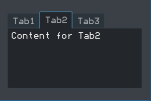
The final selector, TabControl, is useful for switching between multiple pages of content. Tabs in TabControl are typically placed on the top, but with TabControl's TabStripPlacement property, you can also set their placement to Left, Right or Bottom.
Unlike the other selectors, the first item is selected by default. However, you can programmatically unselect all tabs by setting SelectedItem to null (or SelectedIndex to -1).
TabControl is pretty easy to use. Simply add items, and each item is placed on a separate tab. For example:

<Grid xmlns="http://schemas.microsoft.com/winfx/2006/xaml/presentation">
  <TabControl Width="175" Height="100" VerticalAlignMent="Center">
    <TabItem Header="Tab1">Content for Tab1</TabItem>
    <TabItem Header="Tab2">Content for Tab2</TabItem>
    <TabItem Header="Tab3">Content for Tab3</TabItem>
  </TabControl>
</Grid>
Other Items Controls
The remaining items (TreeView, ToolBar and StatusBar) are neither selectors nor menus, but can still contain an unbounded number of arbitrary objects.
TreeView
TreeView is a popular control for displaying hierarchical data with nodes that can be expanded and collapsed.

TreeView, like Menu, is a very simple control. It can contains any items, and stacks them vertically. But TreeView is pretty pointless unless you fill it with TreeViewItems.
TreeViewItem, just like MenuItem, is a headered items control. TreeViewItem's Header property contains the current item, and its Items collection contains subitems (which, again, are expected to be TreeViewItems).
TreeViewItem contains handy IsExpanded and IsSelected properties, as well as four events covering all four states from these properties: Expanded, Collapsed, Selected, and Unselected.

<Grid xmlns="http://schemas.microsoft.com/winfx/2006/xaml/presentation">
  <TreeView VerticalAlignment="Center" HorizontalAlignment="Center">
    <TreeViewItem Header="Desktop">
      <TreeViewItem Header="Computer" />
      <TreeViewItem Header="Recycle Bin" />
      <TreeViewItem Header="Control Panel">
        <TreeViewItem Header="Programs" />
        <TreeViewItem Header="Security" />
        <TreeViewItem Header="User Accounts" />
      </TreeViewItem>
    </TreeViewItem>
  </TreeView>
</Grid>
ToolBar
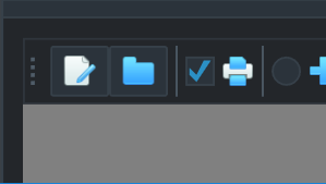
The ToolBar control is typically used to group together many small buttons (or other controls) as an enhancement to a traditional menu system.
ToolBars can be placed anywhere in an element tree, but they are typically placed inside a FrameworkElement called ToolBarTray. ToolBarTray has an Orientation property that can be set to Vertical to make all of its ToolsBars arrange its item vertically.
If a ToolBar contains more items that it can fit withing its bounds, the extra items move to an overflow area. This overflow area is a pop-up that can be accessed by clicking the little arrow at the end of the control. By default, the last item is the first to move to the overflow area, but you can control the overflow behavior of individuals items with ToolBar's OverflowMode attached property. With this you can mark an item to overflow AsNeeded (the default), Always, or Never.
<Grid xmlns="http://schemas.microsoft.com/winfx/2006/xaml/presentation">
  <ToolBar DockPanel.Dock="Top" Height="30" Width="200">
    <Button>
      <Image Height="16" Source="Images/Icons/consulting.png" Stretch="Fill" Width="16"/>
    </Button>
    <Button>
      <Image Height="16" Source="Images/Icons/folder.png" Stretch="Fill" Width="16"/>
    </Button>
    <Separator/>
    <CheckBox>
      <Image Height="16" Source="Images/Icons/print.png" Stretch="Fill" Width="16"/>
    </CheckBox>
    <Separator/>
    <RadioButton>
      <Image Width="16" Height="16" Source="Images/Icons/plus.png" Stretch="Fill"/>
    </RadioButton>
    <RadioButton>
      <Image Width="16" Height="16" Source="Images/Icons/refresh.png" Stretch="Fill"/>
    </RadioButton>
    <Separator/>
    <Label HorizontalContentAlignment="Center" VerticalContentAlignment="Center" Margin="2,0,7,0">
      <Image Height="16" Source="Images/Icons/freelance.png" Stretch="Fill" Width="16"/>
    </Label>
  </ToolBar>
</Grid>
StatusBar

StatusBar behaves just like Menu; it just stacks its items horizontally. But it's typically used along the botton of a Window to display status information.
By default, StatusBar gives Separator a control template that renders it as a vertical line, just like when it is within a ToolBar. Items in a StatusBar (other than Separators) are implicitly wrapped in a StatusBarItem, but you can also do this wrapping explicitly. This enables you to customize their positions with layout-related attached properties.
<Grid xmlns="http://schemas.microsoft.com/winfx/2006/xaml/presentation">
  <StatusBar VerticalAlignment="Center" Width="180">
    <Label VerticalAlignment="Center">27 items</Label>
    <Separator/>
    <Label VerticalAlignment="Center">Zoom</Label>
    <ComboBox>
      <Label>200%</Label>
      <Label>100%</Label>
      <Label>50%</Label>
    </ComboBox>
  </StatusBar>
</Grid>
Range Controls
Range controls do not render arbitrary content like content controls or items controls. They simply store and display a numeric value that falls within a specified range.
The core functionality of range controls come from an abstract class called RangeBase. This class defines properties of type float that store the current value and the endpoints of the range: Value, Minimum, and Maximum. It also defines a simple ValueChanged event.
This section examines the two major built-in range controls, ProgressBar and Slider.
ProgressBar

In an ideal world, we would never need to use a ProgressBar in our software. But when faced with long-running operations, showing users a ProgressBar helps them realize that progress is indeed being made. Therefore, using a ProgressBar in the right places can dramatically improve usability.
<Grid xmlns="http://schemas.microsoft.com/winfx/2006/xaml/presentation">
  <ProgressBar Width="150" Height="18" Value="50" />
</Grid>
ProgressBar has a default Minimum of 0 and a default Maximum of 100. It only adds two public properties to what RangeBase already provides:
- IsIndeterminate: When set to true, ProgressBar shows a generic animation (so the values of Minimum, Maximum, and Value don't matter). This is a great feature for when no clue how long something will take.
- Orientation: Horizontal by default, but can bet set to Vertical to make progress go from bottom-to-top rather than left-to-right.
Slider

Slider is a bit more complicated than a ProgressBar because it enables users to change the current value by moving its thumb through any number of optional ticks. For example, you typically create a volume control by using a Slider control.
<Grid xmlns="http://schemas.microsoft.com/winfx/2006/xaml/presentation">
  <Slider Width="100" Height="30" Margin="8,4,8,2" TickPlacement="TopLeft" />
</Grid>
Slider also has a default Minimum of 0 and a default Maximum of 100. It also defines an Orientation property, but it contains several properties for adjusting the placement and frequency of ticks, the placement and precision of ToolsTips that can show the current value as the thumb is moved, and whether the thumb snaps to tick values or moves smoothly to any arbitrary value.
Text Controls
TextBox

The TextBox control enables users to type one or more lines of text into it. Unless the size of the TextBox is constrained by its surroundings (or given an explicit size), it grows as the text inside of it grows. But when the TextBox's width is contrained, you can make the text wrap to form additional lines by setting its TextWrapping property to Wrap or WrapWithOverflow. Wrap never allows a line to go beyond the control's bounds, forcing wrapping even if it's in the middle of a word. WrapWithOverflow only breaks a line if there's an opportunity, so long words could get cut off.
<Grid xmlns="http://schemas.microsoft.com/winfx/2006/xaml/presentation">
  <TextBox Width="100" Height="25" />
</Grid>
PasswordBox

PasswordBox is a simpler Textbox designed for the entry of a password. Rather than displaying the text typed in, the PasswordBox control allows you to hide the characters and limit the number of characters to be typed in the editable area.
<Grid xmlns="http://schemas.microsoft.com/winfx/2006/xaml/presentation">
  <PasswordBox Width="100" Height="25" />
</Grid>
PasswordBox's text is stored in a string property called Password. Rather than having TextChanged and SelectionChanged events, PasswordBox only defines a PasswordChanged event. In addition this event uses the plain RoutedEventHandler delegate, so no information about the old and new password is sent with the event. If you must know the current password, you can simply check the Password property within such an event handler.
Table of Contents


