🎓 Creating Background Blur Effects in Noesis Studio
🏘️ NoesisGUI ▸ 🏠 Noesis Studio ▸ 🎓 Creating Background Blur Effects in Noesis Studio
Introduction
In this tutorial, we will learn how to use a BackgroundEffect Behavior to create a notification badge that blurs the area of the background beneath it, creating an 'acrylic' effect in the process.
This technique can be used to create unique visual effects, and can be leveraged purely for style, or as a way to exercise further control over UI element legibility across a variety of backgrounds.
Overview
Objective
Our goal will be to apply a BlurEffect to an Element via a Behavior, and setting it to blur an area directly underneath it in the composition.
Prerequisites
- A copy of the Noesis Studio desktop application (🎓 Installing and Setting Up Noesis Studio).
- Any 1920x1080 PNG image, to be used as a background.
- Any 512x512 semi-transparent PNG image, to be used as the badge's icon.
Throughout this tutorial, you are of course free to take liberties and deviate from the prescribed assets to make the result of this exercise truly your own. However, if you wish to continue with the exact same assets we'll be using throughout this exercise, the PNG images we'll be using can be created from the following Stock assets: ↗️ Background [Adobe Stock], ↗️ Skull Icon [Adobe Stock], .
Time to Complete
This tutorial will take ~15 min to complete.
Process Overview
To achieve our objective:
1. We will set up a new Studio Project.
2. We will set up the Page in which our interface will appear.
3 We will set up BackgroundEffectBehavior on the Element that will be used to blur the background.
4 We will set up a second 'mirror' Element to serve as a graphical 'overlay' to the blurred region, and we'll add some final touches of stylization.
Instructions
1. Project Setup
First, we will set up the Noesis Studio project we will be working in:
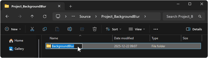
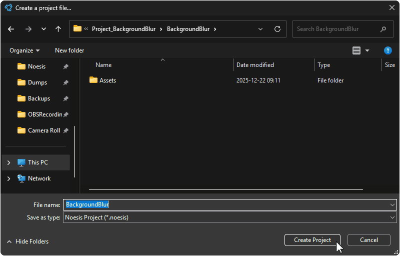
1.1 Create a folder on your machine in which this Project will live. You can name this folder as you wish, but we will be using BackgroundBlur.
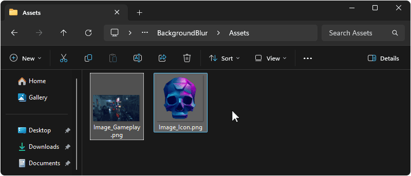
1.2 Within the 🗀 BackgroundBlur directory created in the previous step, create an 🗀 Assets folder, and place two PNG images inside. These can be of anything you wish, but this exercise will be using a 1920x1080 background image, and a 512x512 icon featuring transparency.
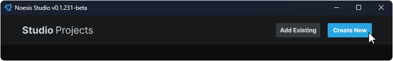
1.3 Launch the Noesis Studio application, and select 'Create New' within the launcher to create the project.
1.4 In the file explorer, navigate to the folder created in step 1.1 and name your project. You can name this project as you wish, but we will be using BackgroundBlur.
Once you are done, select 'Create Project' to continue. This will open the Project.
1.5 Once within Studio, create a new Page by navigating to the the 📘 Assets Panel (Ctrl+1), pressing the + (Add) icon, and selecting 'New Page' from the context menu.
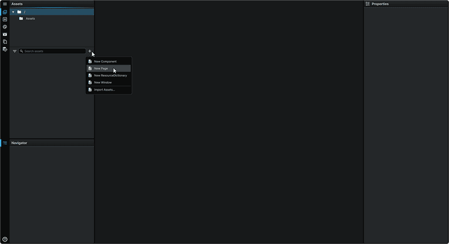
Creating a new Page will open it on the 📘 Stage.
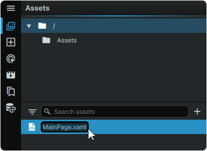
At this point, the Page can also be renamed to MainPage.xaml from the 📘 Assets Panel.
2. Page Setup
Next, we will set up the contents of our Page:
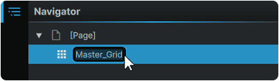
2.1 Within the 📘 Navigator Panel, double-click on the 📘 Grid Element at the root of 🗋 MainPage.xaml, and rename it to Master_Grid.
We will now introduce, and set up the Element that will serve as our background:
2.2 Navigate to the 📘 Add Element Panel (Ctrl+2) and use the Search field at the top of the Panel to find the 📘 Image Element.
Then, click-and-drag an instance of it to the 📘 Navigator Panel, under 'Master_Grid'.
Once placed, double-click on it and rename it to Background_Image.
Note
Providing this Image Element with a custom name is required to allow the BackgroundEffect to target it as the subject of the blurring in later steps.
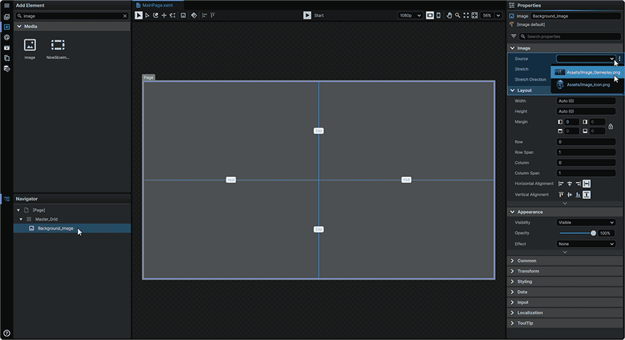
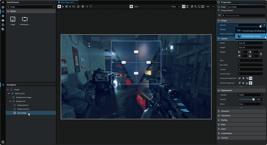
2.3 Select the 📘 Image Element introduced to the Page, and in its 📘 Properties Panel, set its Source Property to point to the background image asset.
Next, we will set up the group that will make up our notification badge:
2.4 Navigate to the 📘 Add Element Panel (Ctrl+2) and use the Search field at the top of the Panel to find the 📘 Grid Element.
Then, click-and-drag an instance of it to the 📘 Navigator Panel, within the 'Master_Grid', just below the 'Background_Image' Element.
Once placed , double-click on the Element in the 📘 Navigator Panel and rename it to Badge_Grid.
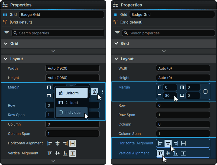
2.5 Select 'Badge_Grid', and from its 📘 Properties Panel, set its Margin Property to 'Individual', then set the Element's Properties to:
| Margin | 0, 0, 80, 0 |
| Horizontal Alignment | Center |
| Vertical Alignment | Top |
We will now add a drop shadow to the overall badge to make it stand out against the background:
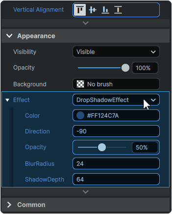
2.6 With 'Badge_Grid' still selected, from its 📘 Properties Panel, add a DropShadowEffect with Properties:
| Color | #FF124C7A |
| Direction | -90 |
| Opacity | 50 |
| BlurRadius | 24 |
| ShadowDepth | 64 |
Since the 📘 Grid Element is devoid of content, no effect will be visible until the next step of adding the Elements responsible for making up the physical shape of the badge, is completed:
2.7 Navigate to the 📘 Add Element Panel (Ctrl+2) and use the Search field at the top of the Panel to find the 📘 Star Element.
Then, click-and-drag an instance of it to the 📘 Navigator Panel, within the 'Badge_Grid'.
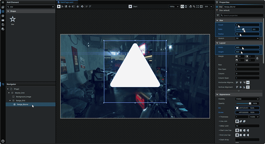
Once placed , double-click on the Element in the 📘 Navigator Panel and rename it to Badge_Blurrer.
2.8 Select the 📘 Star Element, and from the 📘 Properties Panel, set its Properties to:
| Count | 3 |
| Ratio | 0.5 |
| Radius | 32 |
| Width | 800 |
| Height | 800 |
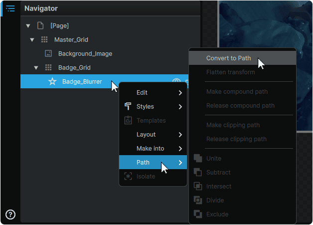
2.9 Within the 📘 Navigator Panel, right-click on the 📘 Star Element and from the context menu's 'Path' category, select 'Convert to Path'.
This will allow us to refine the footprint of our shape further prior to applying the behaviour to it.
2.10 With the Element still selected, from it 📘 Properties Panel, set its Properties to:
| Render Transform Rotation Angle | 180 |
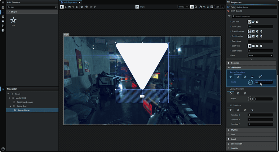
Next, we will 'flatten' the angle adjustment, so that the newly-set rotation angle acts as the shape's new base angle:
2.11 Within the 📘 Navigator Panel, right-click on the the 'Badge_Blurrer' Element and from the context menu's 'Path' category, select 'Flatten Transform'.
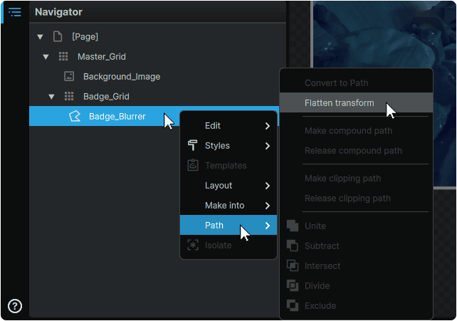
Note
The 'flattening' operation must be performed for the BackgroundEffectBehavior to apply succesfully in later steps.
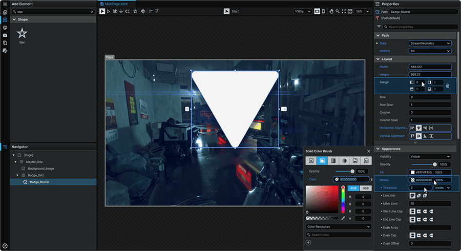
2.12 With the 'Badge_Blurrer' Element still selected, from the 📘 Properties Panel, set its Properties to:
| Margin | MouseWheel (Press) on any of the 'Margin' fields to clear the local value. |
| Stroke | #00000000 |
| Thickness | 2 |
3. BackgroundEffect Behavior Configuration
We will now add a Behavior to our badge shape which will blur the area directly behind it.
3.1 Navigate to the 📘 Interactivity Panel (Ctrl (Hold) + 3), and select the 'Behaviors' tab.
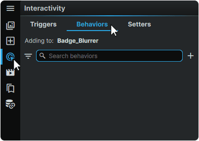
3.2 With the 'Badge_Blurrer' Element selected in the 📘 Navigator Panel, click on the '+' (Add behavior) button in the top-right of the Behaviors tab, and select 'BackgroundEffectBehavior'.
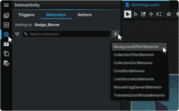
This will add the BackgroundEffectBehavior to our badge shape.
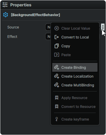
Using the BackgroundEffectBehavior's Properties, we can now set the target of the effect, and which Effect to apply.
3.3 With the newly-added BackgroundEffectBehavior selected in the 📘 Interactivity Panel, in its 📘 Properties Panel, hover over the 'Source' Property, click on the ⋮ (3-Dot) menu icon directly to the right of the 'Source' Property's input field, then select 'Create Binding'.
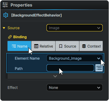
3.4 From the Binding selection menu, click on the 'Name' tab.
Under the 'Element Name' Property, set the BackgroundEffectBehavior to take effect on the 'Background_Image'.
Then, in the 'Path' Property, clear its value by deleting the text present in the field.
3.5 Then to apply the blur effect, from the BackgroundEffectBehavior's 'Effect' Property, select 'BlurEffect', then set a 'Radius' of '128'.
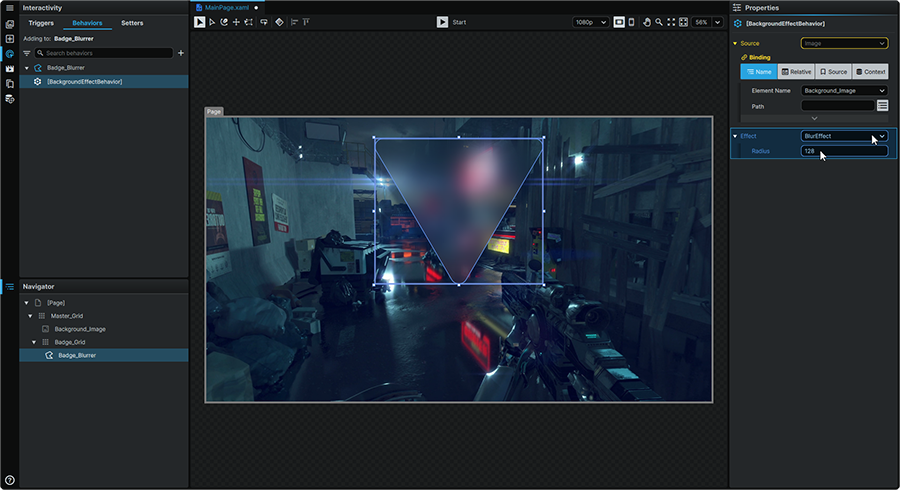
At this point, the background will visibly blur in the shape of the badge.
4. Badge Stylization
If this first badge shape serves exclusively to blur the background, we will then add a second, 'mirror' shape to serve as a 'stylization layer' allowing us to add a custom color fill, and a stroke to further define the look of our element.
4.1 Within the 📘 Navigator Panel, right-click on the the 'Badge_Blurrer' Element and from the context menu's 'Edit' category, select 'Duplicate'.
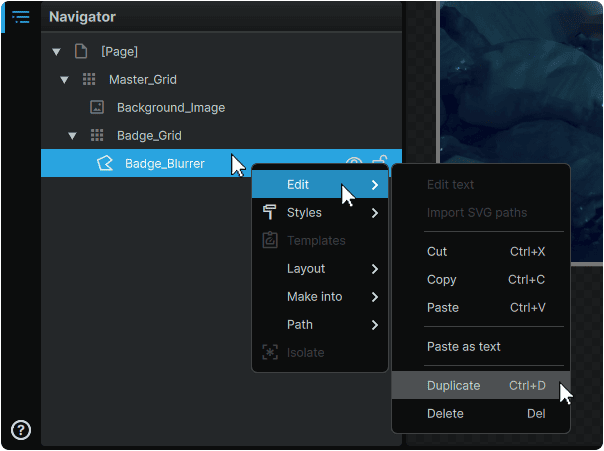
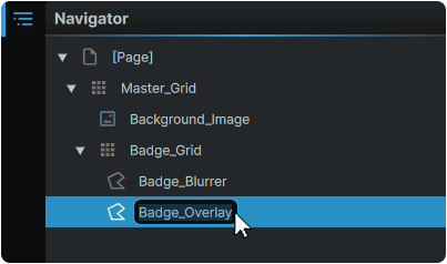
4.2 Once copied, double-click on the Element in the 📘 Navigator Panel and rename it to Badge_Overlay.
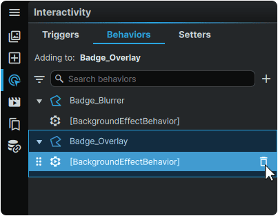
Within the 📘 Interactivity Panel 'Behaviors' tab, we can observe that duplicating the Element has also duplicated its Behavior alongside it, indicating that Behaviors are embedded within their respective Elements.
To achieve our effect, the behavior is only required on one of our Elements, so we will remove it from our duplicate.
4.3 Within the 📘 Interactivity Panel 'Behaviors' tab, hover over the 'Badge_Overlay' Behavior, and click on the 🗑 (Remove) icon remove the Behavior from 'Badge_Overlay'.
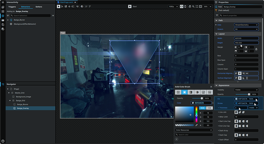
Clearing the effect (which uses the Element's 'Fill' Property), will then allow us to use this Property as a color overlay instead. We will also customize the badge by giving it a colored outline.
4.4 With 'Badge_Overlay' selected in the 📘 Navigator Panel, in its 📘 Properties Panel, set the following Properties:
| Fill | #3F124C7A |
| Stroke | #FF124C7A |
| Thickness | 2 |
Next, we will set up a selection of Bindings in this new Element, to directly 'mirror' key Properties in the original shape it was duplicated from.
This will result in a setup where changes to the badge's key physical Properties only need to be made on one of the Elements; and will update across both Elements simultaneously.
4.5 With 'Badge_Overlay' selected in the 📘 Navigator Panel, in its 📘 Properties Panel, hover over the 'Data' Property, click on the ⋮ (3-Dot) menu icon directly to the right of the 'Data' Property's input field, then select 'Create Binding'.
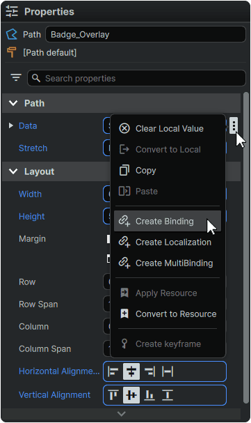
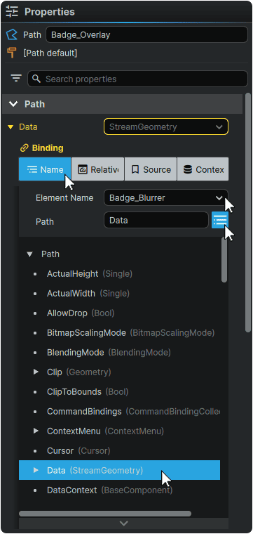
4.6 From the Binding selection menu, click on the 'Name' tab.
Under the 'Element Name' Property, select the 'Badge_Blurrer' Element from the list.
Then, click the button directly to the right of the 'Path' input field, identify the 'Data' entry in the list, and select it.
4.7 Repeat the same Binding Process for the following additional Properties:
| Property | Element Name | Path |
| Width | Badge_Blurrer | Width |
| Height | Badge_Blurrer | Height |
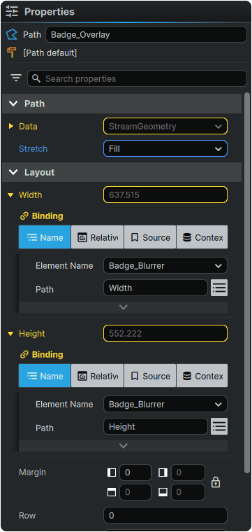
It is now possible to test these Bindings by adjusting the Path Points in 'Badge_Blurrer', and observing how the shape of 'Badge_Overlay' changes alongside it.
With the structure of the badge now completed, we will now add our final touch; our badge icon:
4.8 Navigate to the 📘 Add Element Panel (Ctrl+2) and use the Search field at the top of the Panel to find the 📘 Image Element.
Then, click-and-drag an instance of it to the 📘 Navigator Panel, within 'Badge_Grid'.
Once placed, double-click on it and rename it to Icon_Image.
4.9 Select the newly-introduced 📘 Image Element, and in its 📘 Properties Panel, set its Source Property to point to the icon image asset.
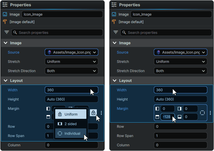
4.10 With the Element still selected, set its Margin Property to 'Individual', then set its Properties to:
| Width | 360 |
| Margin | 0, 0, -128, 0 |
As a final touch, we will now add a drop shadow to the icon to give it some depth atop the badge:
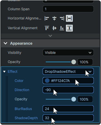
4.10 With 'Icon_Image' still selected, from its 📘 Properties Panel, add a DropShadowEffect with Properties:
| Color | #FF124C7A |
| Direction | -90 |
| BlurRadius | 24 |
| ShadowDepth | 32 |
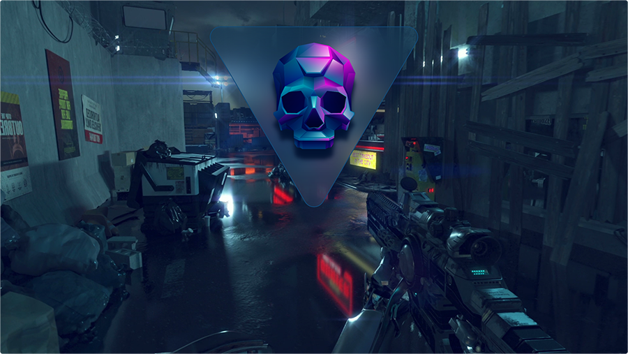
5. Final Result
And that's all it takes to create a stylized notification badge that blurs what's behind it, in a completely non-destructive, and highly-dynamic fashion that works right out of the box without any programming or VFX support required, and all configurable directly within Noesis Studio!
With the foundation of the BackgroundEffectBehavior learned, this powerful technique can be easily used to open up many new exciting presentation capabilities; including the ability to combine the effect with animation!