

🎓 Creating Custom Template Properties in Noesis Studio
🏘️ NoesisGUI ▸ 🏠 Noesis Studio ▸ 🎓 Creating Custom Template Properties in Noesis Studio
Introduction
In this tutorial, we will learn how to add additional Custom Properties to Templates of any of the 📘 Interface Elements included with Noesis Studio. We will be employing this technique in the context of creating a navigable ListBox, controlled by two instances of the 📘 Button Element that each share the exact same Template, but are able to benefit from presentational differences between each other.
This technique can be used to extend the list of available Properties visible on any Element with a compatible Template applied, and can be used as a powerful relay mechanism to pass information between a Template's internals, and the Document in which it's employed.
Overview
Objective
Our goal will be to create two new Properties on a pair of 📘 Button Element used to move the selection up and down within a 📘 ListBoxItem Element.
In addition to the default 'Content' Property included by default, and used for the Button's title, we will also add:
- A custom 'String' Property, which will allow us to define a custom button hint on the Button, used to illustrate which keyboard shortcut can be used to actuate the Button.
- A custom 'Boolean' Property which will allow us to easily change the orientation of the Button's arrows, allowing us to use the same Button Template for both the 'Previous' and the 'Next' Button placed on the Page.
Prerequisites
- A copy of the Noesis Studio desktop application (🎓 Installing and Setting Up Noesis Studio).
Time to Complete
This tutorial will take ~20 min to complete.
Process Overview
To achieve our objective:
1. We will set up a new Studio Project.
2. We will set up the Page in which our interface will appear.
3. We will create a Template for a Button Element.
4. We will add our own Custom Properties to our Button Element Template.
5. We will customize the internal construction of the Button Template.
6. We will configure our Button Template so that when one of our Custom Properties is 'checked', the arrows within it change orientation.
7. We will bind a TextBlock Element within our Button, to the Element's Properties, so that it can reflect the values set on the Element in the Page where it's employed.
8. We will configure our Button Elements on the Stage, and populate them with values.
9. We will set each Button to change the 'SelectedIndex' Property of a ListBox Element, allowing each button to move up and down the list.
10. We will launch the Project, and verify that everything works as designed.
Instructions
1. Project Setup
First, we will set up the Noesis Studio Project we will be working in:
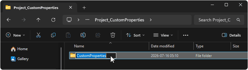
1.1 Create a folder on your machine in which this Project will live. You can name this folder as you wish, but we will be using CustomProperties.
1.2 Launch the Noesis Studio application, and select 'Create New' within the launcher to create the project.

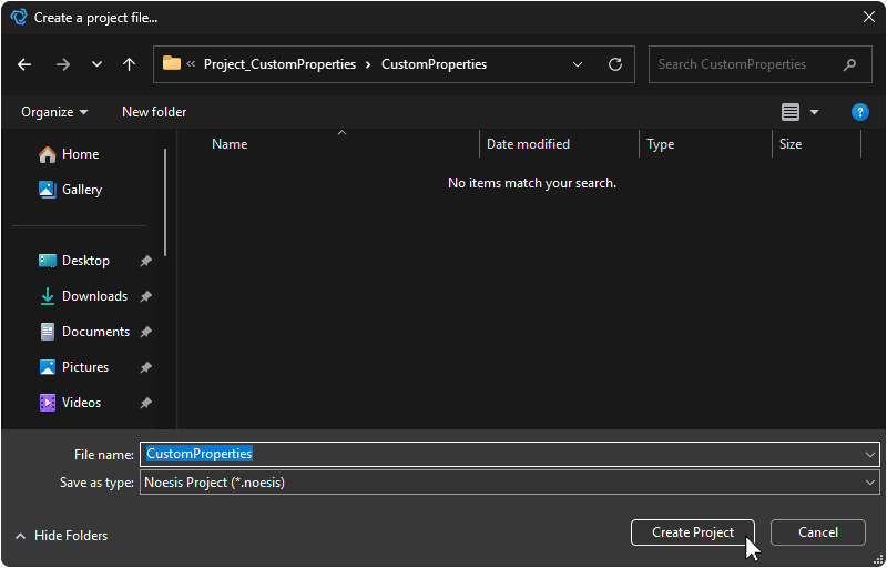
1.3 In the file explorer, navigate to the folder created in step 1.1 and name your project. You can name this project as you wish, but we will be using CustomProperties.
Once you are done, select 'Create Project' to continue. This will open the Project.
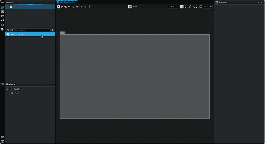
1.4 Since we are starting with nothing in the directory the Project was placed in, Studio will automatically create a MainPage.xaml for us to work from, and will automatically open it on the 📘 Stage when launching the new Project.
Note
If MainPage.xaml is missing on launch, a new Page can be created by navigating to the 📘 Assets Panel (Ctrl+1), pressing the + (Add) icon, and selecting 'New Page' from the context menu. From there, it can then be renamed as deired.
2. Page Setup
Next, we will set up the contents of our Page:
2.1 Navigate to the 📘 Add Element Panel (Ctrl+2) and use the Search field at the top of the Panel to find the 📘 Viewbox Element.
Then, click-and-drag an instance of it to the 📘 Navigator Panel, inside of the root 📘 Grid Element.
The Viewbox is an Element that will proportionally scale its children Elements, and in this scenario, will serve to have our list fill up the page.
2.2 Select the Viewbox, and from its 📘 Properties Panel, set the Element's Properties to:
| Margin | 128, 128, 128, 128 |
| Horizontal Alignment | Center |
| Vertical Alignment | Center |

2.3 Still within the 📘 Add Element Panel (Ctrl+2), use the Search field at the top of the Panel to find the 📘 StackPanel Element.
Then, click-and-drag an instance of it to the 📘 Navigator Panel, within the Viewbox.
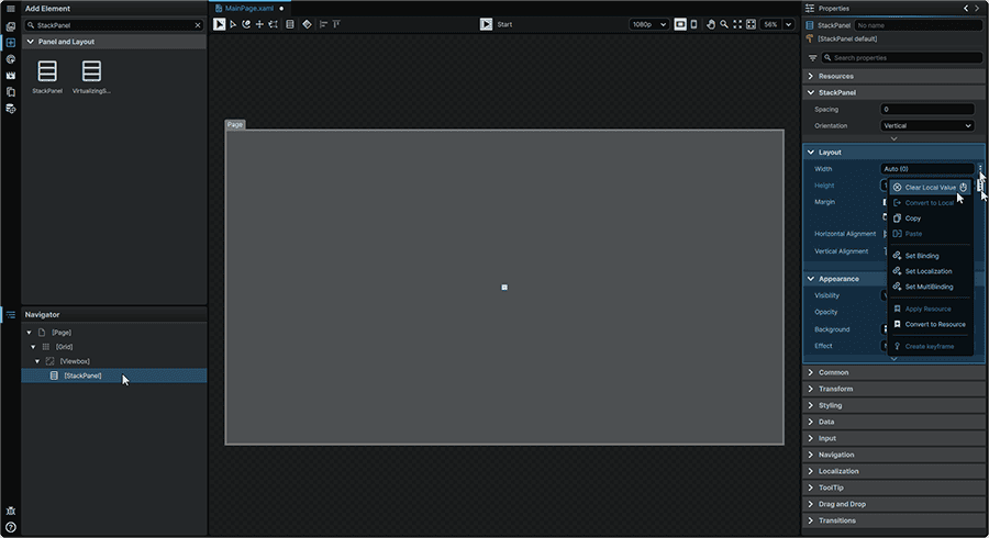
2.4 Select the StackPanel, and from its 📘 Properties Panel, remove its default 'Height' and 'Width' values by hovering over each Property within the Layout section, clicking the ⋮ (3-Dot) menu, and selecting 'Clear Local Value' on each. This can also be achieved by pressing MiddleMouse over the Property's fields.
2.5 Next, within the 📘 Add Element Panel (Ctrl+2), we'll use the Search field at the top of the Panel to find the 📘 Button Element.
Then, click-and-drag two instances of the Button to the 📘 Navigator Panel, within the StackPanel.
Once introduced, we'll rename the top one to Previous_Button, and the bottom one to Next_Button by double-clicking on each in the Navigator, and inputting their new names.
2.6 Lastly, within the 📘 Add Element Panel (Ctrl+2), use the Search field at the top of the Panel to find the 📘 ListBox Element.
Then, click-and-drag an instance of it to the 📘 Navigator Panel, within the StackPanel, directly between both Button Elements.
Once introduced, we'll rename it to MyListBox by double-clicking on it in the Navigator, and inputting its new name.
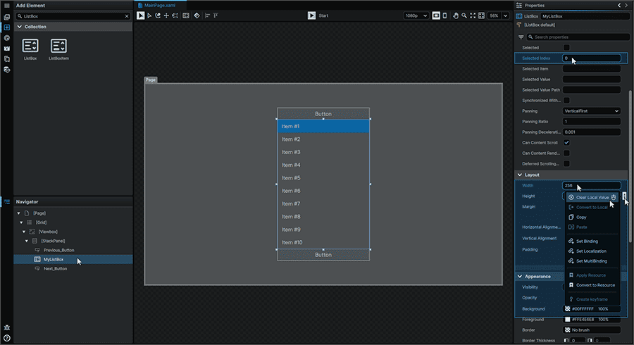
2.7 Select the ListBox, and from its 📘 Properties Panel, we'll set the Element's Properties to:
| Width | 256 |
| SelectedIndex | 0 |
Setting the 'SelectedIndex' to 0 will set the ListBox to set the first Item in the list as the 'selected' one within the Element.
We'll also remove its default 'Height' value by hovering over the Property within the Layout section, clicking the ⋮ (3-Dot) menu, and selecting 'Clear Local Value'. This can also be achieved by pressing MiddleMouse over the Property's field.
3. Button Template Creation
We will now create a new Template for our Button Elements, which we'll add our Custom Properties to to add a 'Hint' in addition to the default 'Content', as well as being able to set the orientation of the arrows within the Button from outside of the Element itself.
3.1 Either from the 📑 Stage or from the 📘 Navigator Panel, right-click on the 'Previous_Button', navigate to the 'Templates' context menu section, and from the 'Button' menu, select 'Create'.
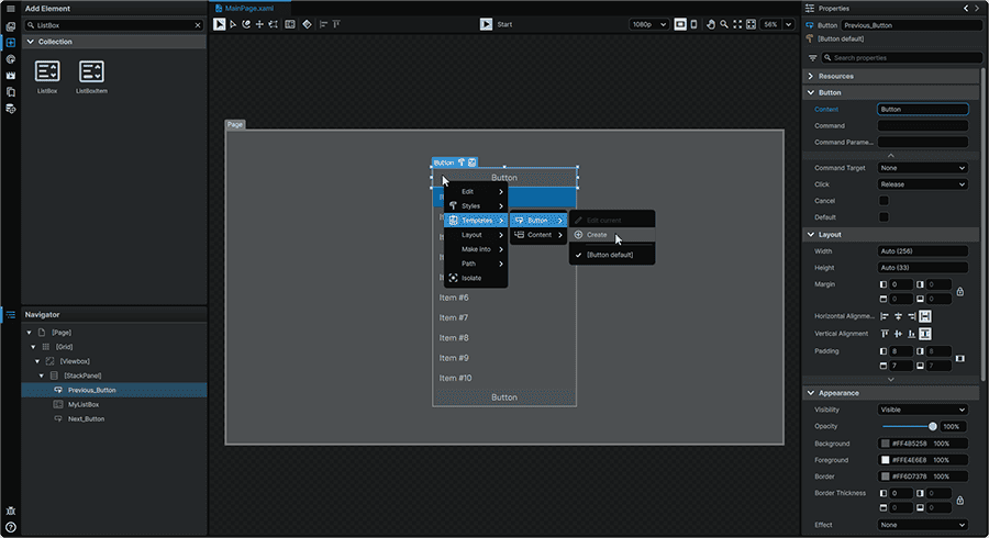
Upon creation, a window will appear allowing the Template Resource to be named, and the opportunity to select where the Resource is saved. We will name this Resource MyButton, and save it within GlobalResources.xaml, allowing the Template to be accessible from anywhere within the Project.
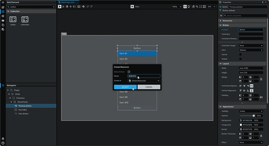
Selecting 'Accept' will open the Template in an isolated view and allow us to modify its construction, and add our Custom Properties.
4. Custom Property Creation
We will still remain within the Button Template to add our brand new Custom Properties to it.
After creating these, we'll then be able to then leverage these new Properties to alter the content and appearance of our Button, from the Page where it's employed.
4.1 From the 📘 Navigator Panel, we'll first select the Root of the Template. This will reveal the Template Root's 📘 Properties Panel. Under the 'Custom Properties' section, we'll click the '+'(Add Item) button twice to create two new Custom Properties. We'll then set their Properties to:
| Name | Hint |
| Type | String |
| Default | ⏹️ |
| Name | FlipOrientation |
| Type | Boolean |
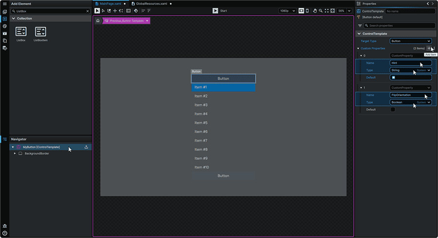
The 'Default' Property value in this case, will dictate what is displayed in the event that a Property value is not defined in the Element's Property. In this case, until the 'Hint' Property is given a value on the Button, it will display a '⏹️' icon.
5. Template Construction
We will now modify the structure of the Button Template to include all Elements required to achieve our visual target, in the desired layout.
5.1 From the 📘 Navigator Panel we'll first select the root 'BackgroundBorder', and clear its default 'Padding' values by hovering over the Property within the Layout section, clicking the ⋮ (3-Dot) menu, and selecting 'Clear Local Value' on each. This can also be achieved by pressing MiddleMouse over the Property's fields.
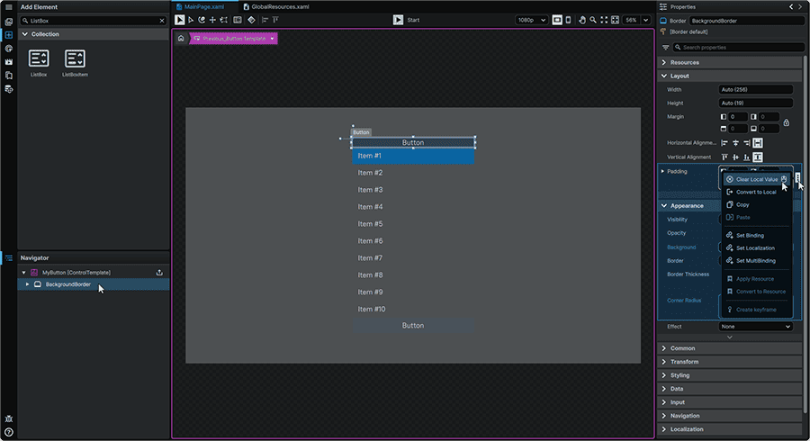
5.2 We'll then expand all Elements in the 📘 Navigator Panel, and envelop our 'ContentPresenter' Element into a 📘 Grid Element, which will allow us to create Columns to assign our 3 areas of content into.
We'll achieve this by right-clicking the 'ContentPresenter' Element, navigating to the 'Layout' context menu category, then from the 'Group Into' subcategory, selecting 'Grid'. This can also be achieved by selecting the Element and pressing Ctrl+G on the Keyboard.
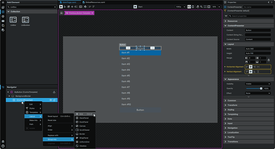
5.3 We'll then clear this new Grid's default 'Margin' values by hovering over the Property within the Layout section, clicking the ⋮ (3-Dot) menu, and selecting 'Clear Local Value' on each. This can also be achieved by pressing MiddleMouse over the Property's fields.

5.4 We'll now create some Columns within the Grid which we'll use to position our three main content blocks.
From the 📘 Navigator Panel, we'll select the Grid Element, then from its 📘 Properties Panel, under the 'Column Definitions' section, we'll click on the '+' (Add Item) button three times.
This will automatically create three equally-sized columns which we can assign Elements to.
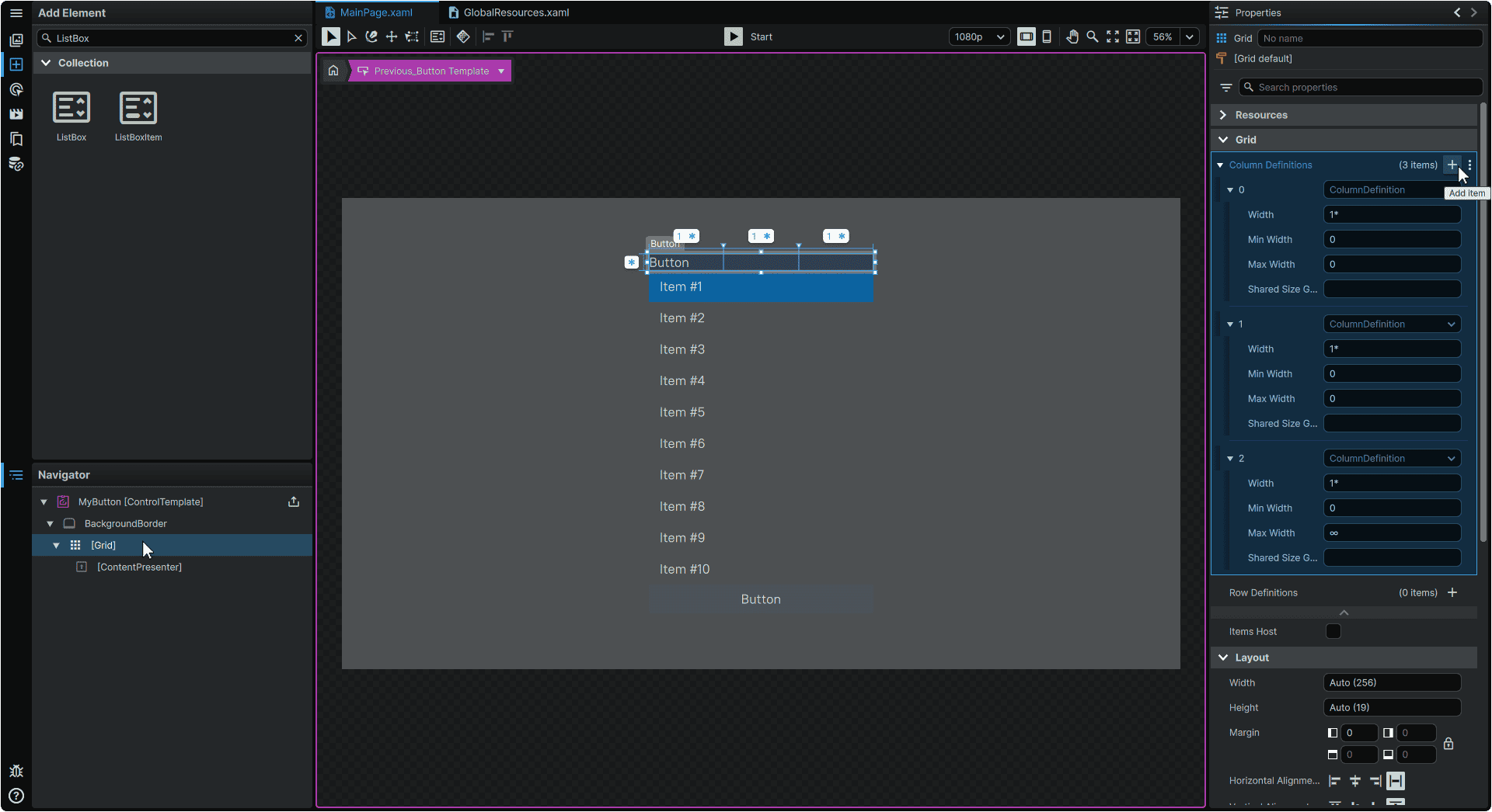
5.5 We will now introduce a 📘 StackPanel Element that will contain our default Button label (via the ContentPresenter), as well as our Button 'Hint' (via a new TextBlock).
Within the 📘 Navigator Panel, we'll right-click on the 'ContentPresenter' Element, and from the 'Layout' category, we'll navigate into 'Group Into', and select 'StackPanel' from the list.
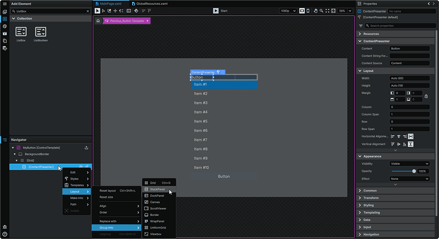
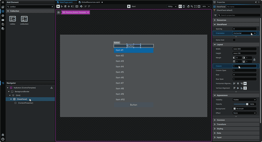
5.6 Then, we'll configure this StackPanel to be positioned in the middle Column of the Grid, and set its Orientation to 'Horizontal' so that the Button Label and the Button Hint will be positioned horizontally beside each other.
We'll achieve this by setting its Properties to:
| Orientation | Horizontal |
| Column | 1 |
This will place our StackPanel in the second Column of the Grid.
5.7 Next, we'll introduce the TextBlock that we'll use for our Button 'Hint'.
Within the 📘 Add Element Panel (Ctrl+2), we'll use the Search field at the top of the Panel to find the 📘 TextBlock Element.
Then, we'll click-and-drag an instance of it to the 📘 Navigator Panel, within the StackPanel, right above the 'ContentPresenter' Element currently displaying the Button's 'Content'.
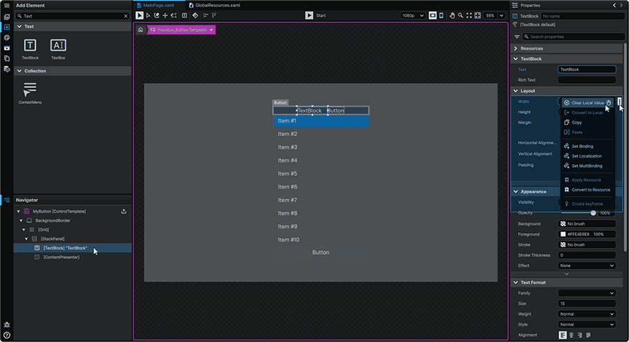
5.8 From the 📘 Navigator Panel, we'll select the TextBlock Element, then remove its default 'Width' value by hovering over the Property within the Layout section, clicking the ⋮ (3-Dot) menu, and selecting 'Clear Local Value'.
5.9 We will now introduce what will become our arrow shape.
From the 📘 Add Element Panel (Ctrl+2), we'll use the Search field at the top of the Panel to find the 📘 RegularPolygon Element.
Then, we'll click-and-drag an instance of it to the 📘 Navigator Panel, within the 'Grid', just above the StackPanel.
5.10 Once introduced, we'll select the Polygon, and from its 📘 Properties Panel, we'll remove its default 'Fill' value by hovering over the Property within the Layout section, clicking the ⋮ (3-Dot) menu, and selecting 'Clear Local Value'.
Then, we'll set the Element's Properties to:
| Count | 3 |
| Column Span | 1 |
| Stroke | #FFFFFFFF |

At this point, you'll notice that our Polygon has a bit of space below it that isn't present at the top. This is because this Element is still technically a Polygon, whose bottom points would regularly fill the bottom space.
5.11 To make our bounding box represent the Shape's actual footprint, Within the 📘 Navigator Panel, right-click on the 📘 RegularPolygon Element and from the context menu's 'Path' category, select 'Convert to Path'.
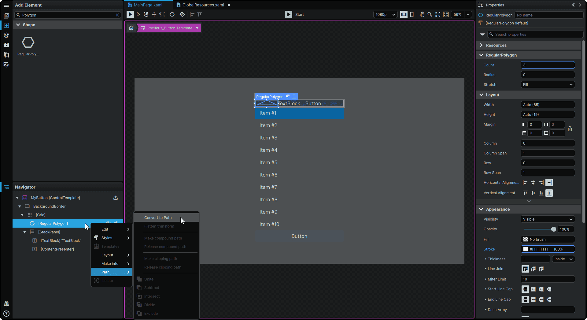
5.12 Converting the Polygon to a Path will also convert any current metrics set by the original Shape, and convert them into Property values, so we'll just do one more pass on the Properties of this Element by navigating to its 📘 Properties Panel, and setting the Element's Properties to:
| Width | 10 |
| Height | 8 |
We'll also clear the 'Margin' values by hovering over the Property within the Layout section, clicking the ⋮ (3-Dot) menu, and selecting 'Clear Local Value'. This can also be achieved by pressing MiddleMouse over the Property's field.
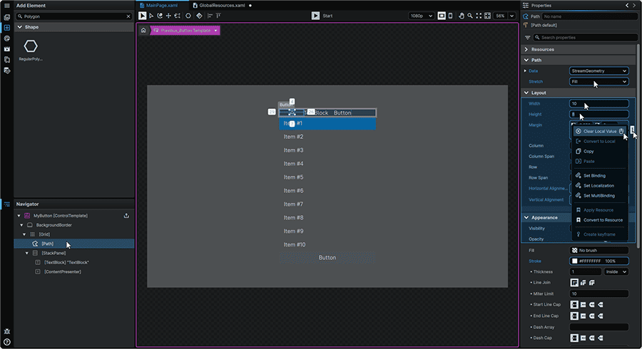
5.12 From the 📘 Navigator Panel, we'll select the Path Element, then duplicate it by right-clicking on it either from the 📑 Stage or from the 📘 Navigator Panel, navigating to its 'Edit' context menu category, and selecting 'Duplicate'. This can also be achieved by simply clicking on the Element, then pressing Ctrl+D.
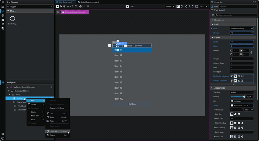
This will place the duplicated Path at the bottom of the Grid in the Navigator, exactly where we want it.
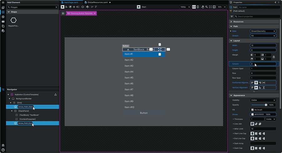
5.13 All that we need to do now, is to assign this new Path to the third Column of the Grid.
To achieve this, we'll select the new duplicate Path, and from its 📘 Properties Panel set its Properties to:
| Column | 2 |
We'll also take advantage of being here to rename each of our Paths to Arrow_Path_Start and Arrow_Path_End for the first and second arrow respectively.
6. Orientation Configuration
Next, we'll set up two Visual States for our Template; the first will display the arrows in their North-facing orientation, and the second will display the arrows in their South-facing orientation.
6.1 To begin, we'll head to the 📘 Animation Panel, which can also be accessed by pressing Ctrl (Hold) + 4 on the keyboard.
Here, in the 'Visual States' tab, we will find many of the bundled, default Visual States for Buttons which handle the most common Button interactions. In addition to these, we also have the ability to create our own.
To create our Visual States, we'll click on the '+' (Add VisualStateGroup) icon at the top of the Animation Panel's 'Visual States'. This will add a Visual State Group, which we'll then be able to create individual Visual States for to handle the change in arrow orientation.
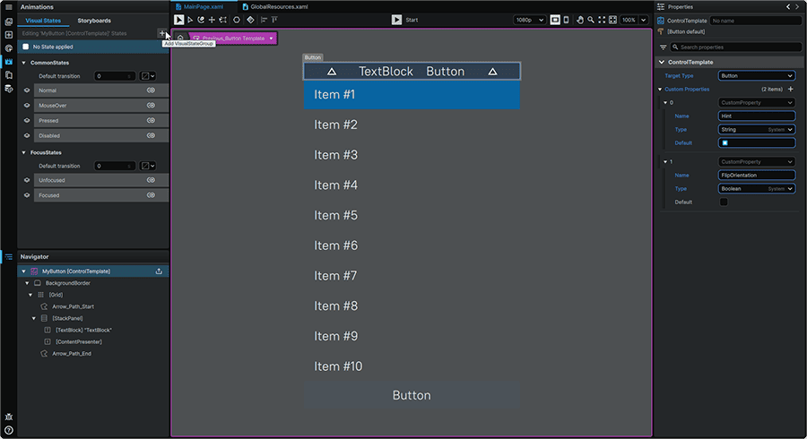
6.2 Creating a Visual State Group, will then invite us to name it, we'll call it Orientation.
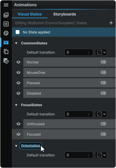
6.3 We'll then hover over the new 'Orientation' Visual State Group, and click the (+) (Add State) icon twice, to add our two custom Visual States.
Upon creating each of these, we'll be invited to name our Visual States, which we'll name North and South.
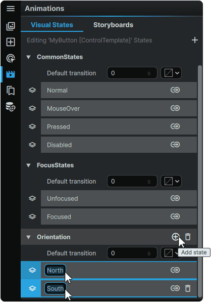
6.4 Our 'North' orientation is already handled by the default visuals in our Template, with our arrows pointing upwards.
We will however click on our 'South' Visual State, which will open the 📘 Animation Timeline. When a Visual State is selected, it is automatically set to be in 'Recording Mode', meaning that any changes made within the 📘 Properties Panel, will be keyed within the 📘 Animation Timeline.
With this 'South' Visual State selected, and with the red 📘 Stage border visible, this means we can simply select each of our arrow Elements, alter their appearance, and any changes we make will be keyed into this Visual State.
To edit the Properties of multiple Elements at once, we can simply hold Ctrl, and click on 'Arrow_Path_Start' and 'Arrow_Path_End'. This will perform a multi-selection, allowing us to change the Properties of both Elements at the same time.
With both arrow Paths selected, from their shared 📘 Properties Panel, we can then change their Properties to:
| Layout Transform Angle | 180 |
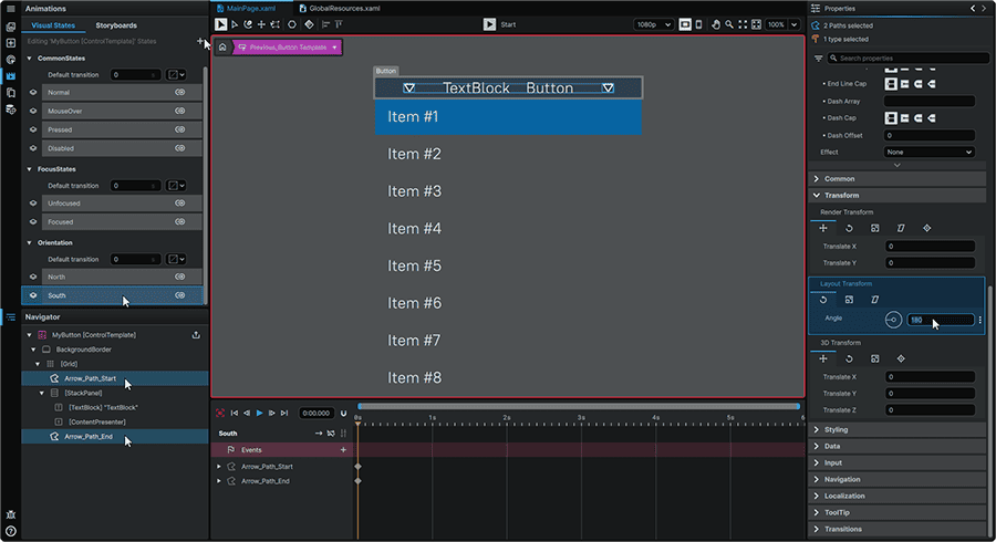
Doing so, will create keyframes on the Timeline, with the rotation Angle keyed, on this 'South' Visual State only, leaving the 'North' Visual State unaffected.
6.5 Next, we'll set up a pair of Triggers, configured to read our Custom Boolean Property value, and change the visual state depending on whether the Property's value is set to 'True' to engage the 'South' orientation, or 'False' to set the 'North' Orientation.
To achieve this, we'll navigate to the 📘 Interactivity Panel, which you also invoke by pressing Ctrl (Hold) + 3 on the keyboard.
From there, we'll first select the 'BackgroundBorder' from the 📘 Navigator Panel, then click on the '+' (Add Trigger) in the top-right of the Triggers tab.
From the dropdown, we'll select 'DataTrigger'. This will invite us to provide it a name, and we'll call it IfFlipOrientation_True_SetSouthOrientation.
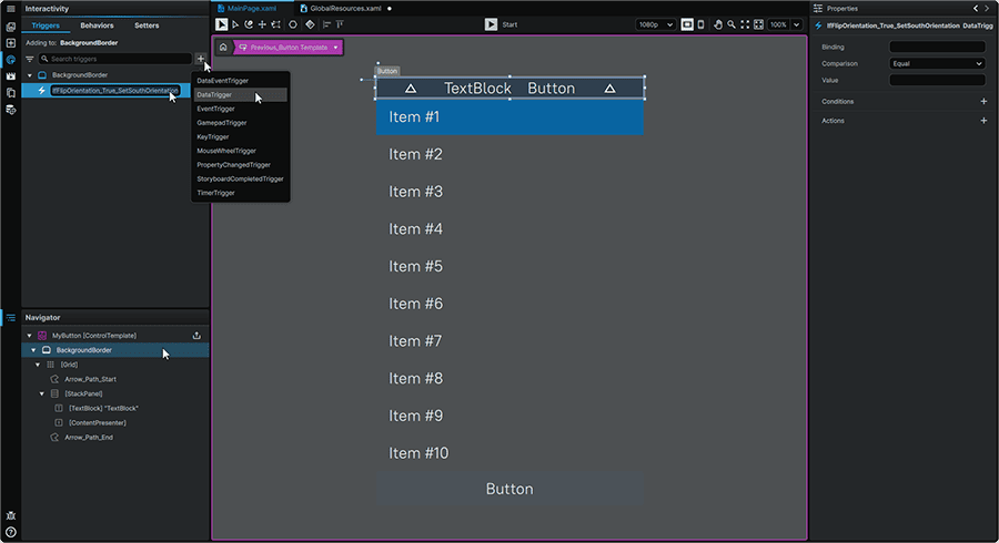
6.6 With the new Trigger still selected, we'll then navigate to its 📘 Properties Panel, and set it up.
We'll first hover over the 'Binding' Property, click on the ⋮ (3-Dot) menu, and select 'Set Binding'.
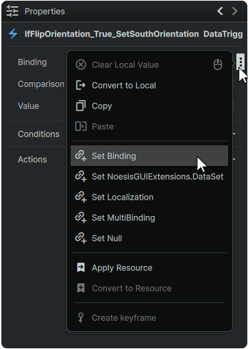
Then, within the 'Relative' tab, we'll ensure that 'Templated Parent' is selected.
In the 'Path' Property field, we'll simply type 'Orientation', and see our Custom Property appear, from where we'll select it, to apply it as the 'Path' value.
Lastly, as the 'Value', we'll set it as 'True'.

6.7 Then, we'll create the Action that will invoke the 'South' orientation by clicking on the '+' (Add Action) icon to the right of the 'Actions' section.
From there, we'll set the following Properties:
| Action Type | GoToStateAction |
| State | South |

6.8 Next, we'll need a Trigger to do the inverse action; if the 'FlipOrientation' is set to 'False', it will set the 'North' Visual State.
The only difference between these two Triggers will be the value (True/False) they listen to, and which Visual State they display. Because of this, we can save a bit of time by simply right-clicking on our 'IfFlipOrientation_True_SetSouthOrientation', and select 'Duplicate' from its context menu.
We'll then rename it to IfFlipOrientation_False_SetNorthOrientation.

We'll then select our 'IfFlipOrientation_False_SetNorthOrientation' Trigger, and from its 📘 Properties Panel, we'll simply change the following Properties:
| Value | False |
| State | North |

7. Text Binding
For our last step within the Button Template, we will bind our TextBlock, so that its value can be populated from Properties set outside of the Template, from the Button Element on the Page.
7.1 We'll first select our TextBlock Element from 📑 Stage or from the 📘 Navigator Panel.
This will reveal its Properties in the 📘 Properties Panel.
We'll first hover over its 'Text' Property, click on the the ⋮ (3-Dot) menu, and select 'Set Binding'.

7.2 Then, within the 'Relative' tab, we'll ensure that 'Templated Parent' is selected.
In the 'Path' Property field, we'll simply type 'Hint', and see our Custom Property appear, from where we'll select it, to apply it as the 'Path' value.
What you'll immediately notice is that the '⏹️' emoji has taken the place of the 'TextBlock'. This is because this Button Property does not yet have a value set for it on the Button Element in the Page. Therefore, it gets set to the 'Default' value we set for the 'Hint' Custom Property we created earlier in the exercise.

7.3 Lastly, before we leave the Template, we'll polish the presentation of our content by selecting the StackPanel Element from the 📘 Navigator Panel, and set its Properties to:
| Horizontal Alignment | Center |
This will center our Button Hint and Button Label nicely within the center column allocated to it.
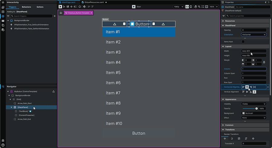
7.4 We are now done with our work inside of our Button Template, and we can return to our Page by clicking on the ⌂ (Home) icon in the Breadcrumb found in the upper-left hand corner of the 📘 Stage.

8. Button Configuration
8.1 Once back on the Page, we'll then select the 'Previous_Button' Button Element, and you'll immediately notice that in its Properties Panel, our Custom 'Hint' and 'FlipOrientation' Properties.

8.2 The orientation is already facing the correct direction in this Button, so let's go ahead and populate its 'Content' and 'Hint' Properties with the following values:
| Content | Previous |
| Hint | ⬆️ |

Upon populating these values, you'll notice that the Button's content has successfully updated.
8.3 We will now make these new Properties accessible to 'Next_Button' so that we can populate it as well.
Since these are a part of the Template itself, we need to first assign our Button Template to it. This can be done by right-clicking on the Button on the 📑 Stage or from the 📘 Navigator Panel, navigating to the 'Templates' context menu section, and from the 'Button' menu, selecting the 'MyButton' Template Resource.
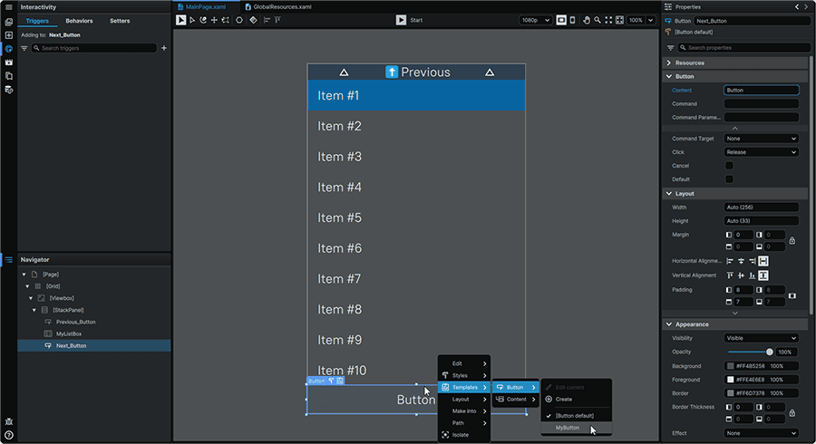
This Button will now be visually, and functionally-aligned with the first Button. We can now populate it in a similar manner.
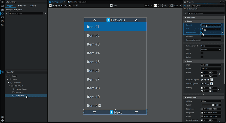
8.4 We'll first select 'Next_Button', and from its 📘 Properties Panel, we'll populate its Properties values with:
| Content | Next |
| Hint | ⬇️ |
| FlipOrientation | ✔️ |
You'll notice that in this case, once the 'FlipOrientation' Property is checked, the arrows successfully change their direction.
9. Navigation Triggers
For our very last step, we will create a pair of Triggers on the Page that will allow us to click each button to move up and down the list.
9.1 We'll start by remaining on our 'Next_Button', and within the 📘 Interactivity Panel (Ctrl (Hold) + 3), we'll click on the '+' (Add Trigger) in the top-right of the Triggers tab , and select 'EventTrigger'.
Upon creation, we'll be prompted to name our new Trigger, and we'll call it OnClick_IndexDown.
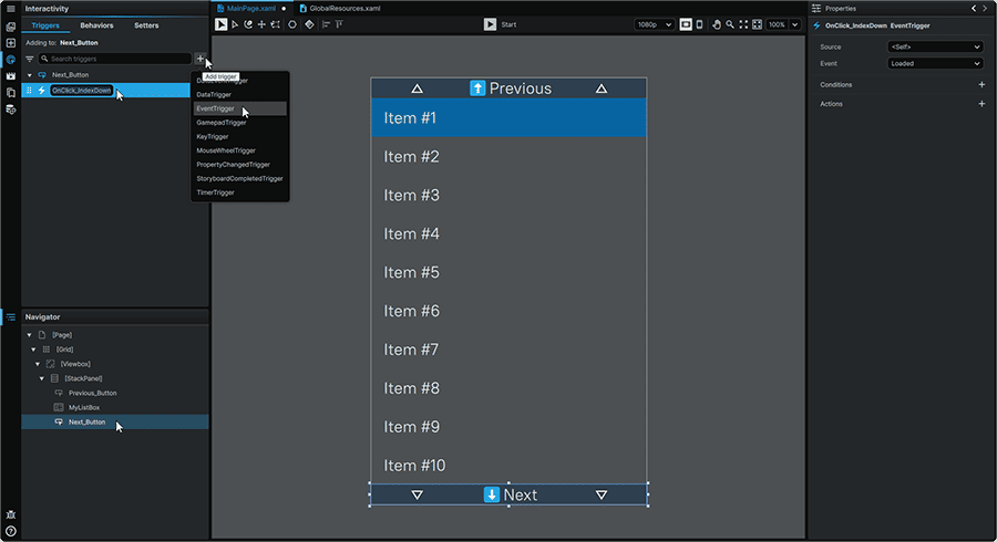
9.2 From this Trigger's 📘 Properties Panel, we'll set the following Trigger Property:
| Event | Click |
Then, with the new Trigger still selected, we'll then create the Action that will parse the SelectedIndex of the ListBox Element by clicking on the '+' (Add Action) icon to the right of the 'Actions' section.
From there, we'll set the following Properties:
| Action Type | ChangePropertyAction |
| Target | MyListBox |
| Property Name | SelectedIndex |

9.3 Then, we'll set this Action to increase the SelectedIndex of the ListBox by 1. This represents moving down to the next Item in the list.
We'll first hover over the 'Value' Property, click on the the ⋮ (3-Dot) menu, and select 'Set Binding'.

9.4 Then, within the 'Name' tab, we'll ensure that the 'Name' tab is selected, then set the following Properties:
| Element Name | MyListBox |
| Path | SelectedIndex |
By default, this Binding will simply reflect the SelectedIndex. However, since we want it to increase on Click, we will expand the section directly below the binding, and under the 'Converter' Property, we'll select 'MathConverter'.
Then, for the magic to happen, we will simply input as the MathConverter's 'Expression' {0}+1 .
In this context the '{0}' corresponds to the value of the Binding. So, in this case, this Action increases the SelectedIndex Property of the ListBox by 1.

9.5 We'll then repeat the same operation with our 'Previous_Button'. To save us a bit of time, we'll copy what we have in this first Trigger by right-clicking on it in the Triggers tab, and selecting 'Copy' from its context menu.

9.6 Next, we'll select the 'Previous_Button' from either the 📑 Stage or from the 📘 Navigator Panel, and then right-click in an empty area of the 📘 Interactivity Panel, and select 'Paste' from the context menu.
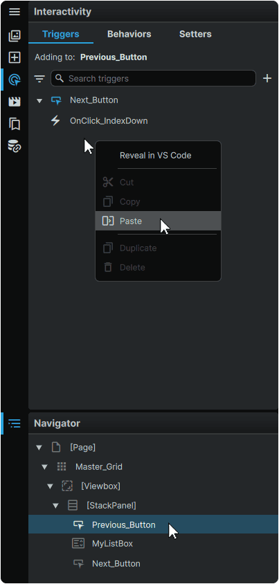
9.7 Once added, let's rename it to OnClick_IndexUp, and following that, all that we need to do is to select this new Trigger, and in its 📘 Properties Panel, we'll click on the yellow arrow to the left of the 'Value' Property, open its expander, and simply edit the MathConverter's 'Expression' to be {0}-1.
This will now function to decrease the ListBox's 'SelectedIndex' value by 1, resulting in moving up the list.
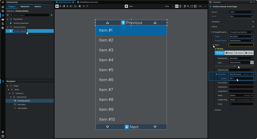
We can now test everything out!
10. Final Result
At the top-center of the application window, press the ▶ (Play) button (Ctrl+P) to see the result of what we've created.
You'll notice that you can click on either of the Buttons to move up or down the list, and thanks to many of our directional navigation defaults, we are also able to move up and down the entire list using the ArrowKeyUp and ArrowKeyDown keyboard keys.
Using these techniques, you can easily extend the functionality of all of the included Templates in the framework, and gain the freedom to expose new Properties not included by default, to make each Element offer exactly what you want, without any coding required, and in a format that makes it easy for anyone to populate with absolute ease!
📍 On this page