Styles and Templates Tutorial

NoesisGUI styling and templating refer to a suite of features (styles, templates, triggers, and storyboards) that allow developers and designers to create visually compelling effects and to create a consistent appearance for their product. Although developers and or designers can customize the appearance extensively on an application-by-application basis, a strong styling and templating model is necessary to allow maintenance and sharing of the appearance within and among applications. NoesisGUI provides that model.
Styles
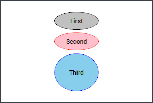
A style, represented by the Style class, is a pretty simple entity. Its main function is to group together property values that could otherwise be set individually. You can share this group of values among multiple elements.

The texts in the previous image are customized by setting six properties. Without a Style, you would need to duplicate these identical assignments on all the texts, as shown next:
<StackPanel HorizontalAlignment="Center" VerticalAlignment="Center"
  xmlns="http://schemas.microsoft.com/winfx/2006/xaml/presentation"
  xmlns:x="http://schemas.microsoft.com/winfx/2006/xaml">
  <TextBlock Text="John Doe" FontSize="18" FontWeight="Bold"
    Foreground="Crimson" Background="LightYellow" Padding="20,5" Margin="5"/>
  <TextBlock Text="251 Amazing Road" FontSize="18" FontWeight="Bold"
    Foreground="Crimson" Background="LightYellow" Padding="20,5" Margin="5"/>
  <TextBlock Text="Great City, ST 23145" FontSize="18" FontWeight="Bold"
    Foreground="Crimson" Background="LightYellow" Padding="20,5" Margin="5"/>
  <TextBlock Text="(555) 123.4224" FontSize="18" FontWeight="Bold"
    Foreground="Crimson" Background="LightYellow" Padding="20,5" Margin="5"/>
</StackPanel>
But with a Style, you can add a level of indirection setting them in one place and pointing each TextBlock to this new element, as shown in the following code snippet.
<StackPanel HorizontalAlignment="Center" VerticalAlignment="Center"
  xmlns="http://schemas.microsoft.com/winfx/2006/xaml/presentation"
  xmlns:x="http://schemas.microsoft.com/winfx/2006/xaml">
  <StackPanel.Resources>
    <Style x:Key="TextStyle">
      <Setter Property="TextBlock.FontSize" Value="18"/>
      <Setter Property="TextBlock.FontWeight" Value="Bold"/>
      <Setter Property="TextBlock.Foreground" Value="Crimson"/>
      <Setter Property="TextBlock.Background" Value="LightYellow"/>
      <Setter Property="TextBlock.Padding" Value="20,5"/>
      <Setter Property="TextBlock.Margin" Value="5"/>
    </Style>
  </StackPanel.Resources>
  <TextBlock Text="John Doe" Style="{StaticResource TextStyle}"/>
  <TextBlock Text="251 Amazing Road" Style="{StaticResource TextStyle}"/>
  <TextBlock Text="Great City, ST 23145" Style="{StaticResource TextStyle}"/>
  <TextBlock Text="(555) 123.4224" Style="{StaticResource TextStyle}"/>
</StackPanel>
Style uses a collection of Setters to set the target properties. Creating a Setter is just a matter of specifying the name of a dependency property and its desired value.
If you want to enforce that a Style can only be applied to a particular type, you can set its TargetType property accordingly. Also you no longer need to prefix the property names inside Setters with the type name. Applying a TargetType to a Style gives you another feature as well. If you omit its Key, the Style gets implicitly applied to all elements of that target type within the same scope. This is typically called a typed style as opposed to a named style. The scope of a typed Style is determined by the location of the Style resource.
<StackPanel HorizontalAlignment="Center" VerticalAlignment="Center"
  xmlns="http://schemas.microsoft.com/winfx/2006/xaml/presentation"
  xmlns:x="http://schemas.microsoft.com/winfx/2006/xaml">
  <StackPanel.Resources>
    <Style TargetType="{x:Type TextBlock}">
      <Setter Property="FontSize" Value="18"/>
      <Setter Property="FontWeight" Value="Bold"/>
      <Setter Property="Foreground" Value="Crimson"/>
      <Setter Property="Background" Value="LightYellow"/>
      <Setter Property="Padding" Value="20,5"/>
      <Setter Property="Margin" Value="5"/>
    </Style>
  </StackPanel.Resources>
  <TextBlock Text="John Doe"/>
  <TextBlock Text="251 Amazing Road"/>
  <TextBlock Text="Great City, ST 23145"/>
  <TextBlock Text="(555) 123.4224"/>
</StackPanel>
Styles can also define some values of an element based on one or more conditions through the use of Triggers. For example, if we want that text changes its foreground color and moves a bit to the right while the mouse pointer is over, we would add the following code:
<StackPanel HorizontalAlignment="Center" VerticalAlignment="Center"
  xmlns="http://schemas.microsoft.com/winfx/2006/xaml/presentation"
  xmlns:x="http://schemas.microsoft.com/winfx/2006/xaml">
  <StackPanel.Resources>
    <Style TargetType="{x:Type TextBlock}">
      <Setter Property="FontSize" Value="18"/>
      <Setter Property="FontWeight" Value="Bold"/>
      <Setter Property="Foreground" Value="Crimson"/>
      <Setter Property="Background" Value="LightYellow"/>
      <Setter Property="Padding" Value="20,5"/>
      <Setter Property="Margin" Value="5"/>
      <Style.Triggers>
        <Trigger Property="IsMouseOver" Value="True">
          <Setter Property="Foreground" Value="Blue"/>
          <Setter Property="Margin" Value="10,5,0,5"/>
        </Trigger>
      </Style.Triggers>
    </Style>
  </StackPanel.Resources>
  <TextBlock Text="John Doe"/>
  <TextBlock Text="251 Amazing Road"/>
  <TextBlock Text="Great City, ST 23145"/>
  <TextBlock Text="(555) 123.4224"/>
</StackPanel>
And even better, we can use some animation to make the transition smoother. This is possible thanks to EnterActions and ExitActions trigger properties.
<StackPanel HorizontalAlignment="Center" VerticalAlignment="Center"
  xmlns="http://schemas.microsoft.com/winfx/2006/xaml/presentation"
  xmlns:x="http://schemas.microsoft.com/winfx/2006/xaml">
  <StackPanel.Resources>
    <Style TargetType="{x:Type TextBlock}">
      <Setter Property="FontSize" Value="18"/>
      <Setter Property="FontWeight" Value="Bold"/>
      <Setter Property="Foreground" Value="Crimson"/>
      <Setter Property="Background" Value="LightYellow"/>
      <Setter Property="Padding" Value="20,5"/>
      <Setter Property="Margin" Value="5"/>
      <Style.Triggers>
        <Trigger Property="IsMouseOver" Value="True">
          <Trigger.EnterActions>
            <BeginStoryboard>
              <Storyboard>
                <ColorAnimation Duration="0:0:0.1" To="Blue"
                  Storyboard.TargetProperty="Foreground.Color"/>
                <ThicknessAnimation Duration="0:0:0.1" To="10,5,0,5"
                  Storyboard.TargetProperty="Margin"/>
              </Storyboard>
            </BeginStoryboard>
          </Trigger.EnterActions>
          <Trigger.ExitActions>
            <BeginStoryboard>
              <Storyboard>
                <ColorAnimation Duration="0:0:0.2" To="Crimson"
                  Storyboard.TargetProperty="Foreground.Color"/>
                <ThicknessAnimation Duration="0:0:0.2" To="5"
                  Storyboard.TargetProperty="Margin"/>
              </Storyboard>
            </BeginStoryboard>
          </Trigger.ExitActions>
        </Trigger>
      </Style.Triggers>
    </Style>
  </StackPanel.Resources>
  <TextBlock Text="John Doe"/>
  <TextBlock Text="251 Amazing Road"/>
  <TextBlock Text="Great City, ST 23145"/>
  <TextBlock Text="(555) 123.4224"/>
</StackPanel>

Templates
A template allows you to completely replace a control's visual tree with anything you can imagine while keeping all of its functionality intact. The source code for every control is completely separated from its default visual tree representations. Control templates are represented by the ControlTemplate class that derives from the abstract FrameworkTemplate class which defines the VisualTree content property, that is, the tree of elements that specify the desired look of a control.
Next we are going to use templates to redesign the appearance of a common Button control.
<Grid
  xmlns="http://schemas.microsoft.com/winfx/2006/xaml/presentation"
  xmlns:x="http://schemas.microsoft.com/winfx/2006/xaml">
  <Grid.Resources>
    <ControlTemplate x:Key="ButtonTemplate" TargetType="{x:Type Button}">
      <Grid>
        <Ellipse Stroke="Black" Fill="Silver"/>
      </Grid>
    </ControlTemplate>
  </Grid.Resources>
  <Button Template="{StaticResource ButtonTemplate}" Width="100" Height="100" Content="Rounded!"/>
</Grid>
Now we have a simple circle representing our button although the content, the text in this case, disappeared. If you are creating a control template that is meant to be broadly reusable, you need to do some work to respect various properties of the target control. We could add a TextBlock to the control template and use data binding to show the Button content. Of course, a Button can contain non-text Content, so using a TextBlock to display it, creates an artificial limitation. To ensure that all types of Content get displayed properly in the template, we can use a ContentPresenter, that was specifically designed for that purpose.
<Grid
  xmlns="http://schemas.microsoft.com/winfx/2006/xaml/presentation"
  xmlns:x="http://schemas.microsoft.com/winfx/2006/xaml">
  <Grid.Resources>
    <ControlTemplate x:Key="ButtonTemplate" TargetType="{x:Type Button}">
      <Grid>
        <Ellipse Stroke="Black" Fill="Silver"/>
        <ContentPresenter Content="{TemplateBinding Content}"
          HorizontalAlignment="Center" VerticalAlignment="Center"/>
      </Grid>
    </ControlTemplate>
  </Grid.Resources>
  <Button Template="{StaticResource ButtonTemplate}" Width="100" Height="100" Content="Rounded!"/>
</Grid>
With this template, the button has lost some interactivity feedback, user has no visual reference to know if the button is responding to mouse input or not. As with styles, templates can spefify triggers, so we will use them to generate different representations for the different states of the button.
<Grid
  xmlns="http://schemas.microsoft.com/winfx/2006/xaml/presentation"
  xmlns:x="http://schemas.microsoft.com/winfx/2006/xaml">
  <Grid.Resources>
    <ControlTemplate x:Key="ButtonTemplate" TargetType="{x:Type Button}">
      <Grid>
        <Ellipse x:Name="Circle" Stroke="Black" Fill="Silver"/>
        <ContentPresenter Content="{TemplateBinding Content}"
          HorizontalAlignment="Center" VerticalAlignment="Center"/>
      </Grid>
      <ControlTemplate.Triggers>
        <Trigger Property="IsMouseOver" Value="True">
          <Setter TargetName="Circle" Property="Stroke" Value="Red"/>
          <Setter TargetName="Circle" Property="Fill" Value="Pink"/>
        </Trigger>
        <Trigger Property="IsPressed" Value="True">
          <Setter TargetName="Circle" Property="Stroke" Value="Green"/>
          <Setter TargetName="Circle" Property="Fill" Value="PaleGreen"/>
        </Trigger>
      </ControlTemplate.Triggers>
    </ControlTemplate>
  </Grid.Resources>
  <Button Template="{StaticResource ButtonTemplate}" Width="100" Height="100" Content="Rounded!"/>
</Grid>

At the beginning of this section we explained that controls are lookless and have an implementation that is completely independent from their visuals. But this is not entirely true. Some controls have built-in logic that only applies based on the existence of certain elements in its visual tree. To find them it looks for specific names in the form of PART_XXX and sometimes for specific types as well. If such elements are found, additional behavior is applied to them. The specific names and behaviors are different for each control.
For example, if a ProgressBar control template has elements named PART_Indicator and PART_Track, the control ensures that the width of PART_Indicator remains the correct percentage of the PART_Track's width, based on ProgressBar's Value, Minimum and Maximum properties.
Themes
Although all the control templates thus far are applied directly to elements for simplicity, it is more common to set a Control's Template property inside a Style and then apply that style to the desired elements. Besides the convenience of combining a template with arbitrary property settings, there are important advantages to doing this:
- It gives you the effect of default templates. For example, when a typed Style gets applied to elements by default, and that Style contains a custom control template, it gets applied without any explicit markings on those elements.
<StackPanel
  xmlns="http://schemas.microsoft.com/winfx/2006/xaml/presentation"
  xmlns:x="http://schemas.microsoft.com/winfx/2006/xaml"
  HorizontalAlignment="Center" VerticalAlignment="Center">
  <StackPanel.Resources>
    <ControlTemplate x:Key="ButtonTemplate" TargetType="{x:Type Button}">
      <Grid>
        <Ellipse x:Name="Circle" Stroke="Black" Fill="Silver"
         Width="100" Height="50"/>
        <ContentPresenter Content="{TemplateBinding Content}"
          HorizontalAlignment="Center" VerticalAlignment="Center"/>
      </Grid>
      <ControlTemplate.Triggers>
        <Trigger Property="IsMouseOver" Value="True">
          <Setter TargetName="Circle" Property="Stroke" Value="Red"/>
          <Setter TargetName="Circle" Property="Fill" Value="Pink"/>
        </Trigger>
        <Trigger Property="IsPressed" Value="True">
          <Setter TargetName="Circle" Property="Stroke" Value="Green"/>
          <Setter TargetName="Circle" Property="Fill" Value="PaleGreen"/>
        </Trigger>
      </ControlTemplate.Triggers>
    </ControlTemplate>
    <Style TargetType="{x:Type Button}">
      <Setter Property="Template" Value="{StaticResource ButtonTemplate}"/>
    </Style>
  </StackPanel.Resources>
  <Button Content="First"/>
  <Button Content="Second" Margin="0,5"/>
  <Button Content="Third"/>
</StackPanel>

- It also enables you to provide default yet overridable property values that control the look of the template. In other words, it enables you to respect the templated parent's properties but still provide your own default values.
<StackPanel
  xmlns="http://schemas.microsoft.com/winfx/2006/xaml/presentation"
  xmlns:x="http://schemas.microsoft.com/winfx/2006/xaml"
  HorizontalAlignment="Center" VerticalAlignment="Center">
  <StackPanel.Resources>
    <ControlTemplate x:Key="ButtonTemplate" TargetType="{x:Type Button}">
      <Grid>
        <Ellipse x:Name="Circle"
          Stroke="{TemplateBinding BorderBrush}"
          Fill="{TemplateBinding Background}"/>
        <ContentPresenter HorizontalAlignment="Center" VerticalAlignment="Center"
          Content="{TemplateBinding Content}"
          Margin="{TemplateBinding Padding}"/>
      </Grid>
      <ControlTemplate.Triggers>
        <Trigger Property="IsMouseOver" Value="True">
          <Setter TargetName="Circle" Property="Stroke" Value="Red"/>
          <Setter TargetName="Circle" Property="Fill" Value="Pink"/>
        </Trigger>
        <Trigger Property="IsPressed" Value="True">
          <Setter TargetName="Circle" Property="Stroke" Value="Green"/>
          <Setter TargetName="Circle" Property="Fill" Value="PaleGreen"/>
        </Trigger>
      </ControlTemplate.Triggers>
    </ControlTemplate>
    <Style TargetType="{x:Type Button}">
      <Setter Property="BorderBrush" Value="Black"/>
      <Setter Property="Background" Value="Silver"/>
      <Setter Property="Padding" Value="10"/>
      <Setter Property="Template" Value="{StaticResource ButtonTemplate}"/>
    </Style>
  </StackPanel.Resources>
  <Button Content="First"/>
  <Button Content="Second" Margin="0,5"/>
  <Button Content="Third" BorderBrush="Blue" Background="SkyBlue" Padding="30"/>
</StackPanel>
Default styles
In contrast with WPF, that provides a fully functional theme by default installed in the operating system, NoesisGUI only provides a debug theme in the core library to define default styles for each control. Every application must provide a ResourceDictionary containing styles and templates for all controls that appear in the application. The dictionary must provide values for all properties. Properties not set will take the value from our internal debug theme that displays controls in pink to help detecting unset values. Functions for setting default font and properties are also exposed.
const char* fonts[] = { "Theme/Fonts/#PT Root UI", "Arial", "Segoe UI Emoji" };

Noesis::GUI::LoadApplicationResources("Theme/NoesisTheme.DarkBlue.xaml");
Noesis::GUI::SetFontFallbacks(fonts, 3);
Noesis::GUI::SetFontDefaultProperties(15, FontWeight_Normal, FontStretch_Normal, FontStyle_Normal);
string[] fonts = new string[] { "Theme/Fonts/#PT Root UI", "Arial", "Segoe UI Emoji" };

Noesis.GUI.LoadApplicationResources("Theme/NoesisTheme.DarkBlue.xaml");
Noesis.GUI.SetFontFallbacks(fonts);
Noesis.GUI.SetFontDefaultProperties(15, FontWeight.Normal, FontStretch.Normal, FontStyle.Normal);
NOTE
In Unity and Unreal, these properties are exposed in 'Noesis Settings' panel as 'Application Resources' and 'Default Font'
When using the Application Framework, the Resources property of the Application can be used for the same purpose. MergedDictionaries is a useful property for adding a whole XAML to the target dictionary.
<Application
  xmlns="http://schemas.microsoft.com/winfx/2006/xaml/presentation"
  xmlns:x="http://schemas.microsoft.com/winfx/2006/xaml"
  x:Class="XamlPlayer.App"
  StartupUri="MainWindow.xaml">
  <Application.Resources>
    <ResourceDictionary>
      <ResourceDictionary.MergedDictionaries>
        <ResourceDictionary Source="Theme/NoesisTheme.DarkBlue.xaml"/>
      </ResourceDictionary.MergedDictionaries>
      <!-- Resources scoped at the Application level should be defined here. -->
      <SolidColorBrush x:Key="Background0" Color="#FF2F3F4F"/>
      <SolidColorBrush x:Key="Background1" Color="SlateGray"/>
      <SolidColorBrush x:Key="Foreground0" Color="White"/>
      <SolidColorBrush x:Key="Foreground1" Color="SkyBlue"/>
      <SolidColorBrush x:Key="Foreground2" Color="Black"/>
      <SolidColorBrush x:Key="Border" Color="LightSlateGray"/>
    </ResourceDictionary>
  </Application.Resources>
</Application>
NOTE
Styles are complex to write and it requires time to obtain the desired results. Our Application Framework provides a rich theme with support for accent colors and dark & light modes. All our samples use this theme.
Local styles
FrameworkElement is the base class for all controls, and it has a Resources property that can be used for adding local resources. The following sample displays three buttons, each one with a different style.
<StackPanel
  xmlns="http://schemas.microsoft.com/winfx/2006/xaml/presentation"
  xmlns:x="http://schemas.microsoft.com/winfx/2006/xaml"
  HorizontalAlignment="Center" VerticalAlignment="Center">

  <Button Content="Nocturnal Style" Width="200" Height="60" Margin="0,5">
    <Button.Resources>
      <ResourceDictionary>
        <ResourceDictionary.MergedDictionaries>
          <ResourceDictionary Source="Themes/NocturnalStyle.xaml"/>
        </ResourceDictionary.MergedDictionaries>
      </ResourceDictionary>
    </Button.Resources>
  </Button>

  <Button Content="Agile Style" Width="200" Height="60" Margin="0,5">
    <Button.Resources>
      <ResourceDictionary>
        <ResourceDictionary.MergedDictionaries>
          <ResourceDictionary Source="Themes/AgileStyle.xaml"/>
        </ResourceDictionary.MergedDictionaries>
      </ResourceDictionary>
    </Button.Resources>
  </Button>

  <Button Content="Windows Style" Width="200" Height="60" Margin="0,5">
    <Button.Resources>
      <ResourceDictionary>
        <ResourceDictionary.MergedDictionaries>
          <ResourceDictionary Source="Themes/WindowsStyle.xaml"/>
        </ResourceDictionary.MergedDictionaries>
      </ResourceDictionary>
    </Button.Resources>
  </Button>

</StackPanel>

NOTE
Avoid local styles whenever possible. If the requested resource is not found in the local dictionary, the next lookup step is to check the application dictionary. That is the best place to put any app-specific resources that are referenced by multiple pages in your app's navigation structure.
Controls can only have one style set in its Style property, so if a few properties need to be locally overridden remember to define BasedOn in local style to inherit the rest of properties from the style defined in the application dictionary. If BasedOn is omitted, property values will fallback to the debug default style defined by Noesis theme.
<Grid
  xmlns="http://schemas.microsoft.com/winfx/2006/xaml/presentation"
  xmlns:x="http://schemas.microsoft.com/winfx/2006/xaml">
  <Grid.Resources>
    <Style x:Key="BigButtonStyle" TargetType="{x:Type Button}" BasedOn="{StaticResource {x:Type Button}}">
      <Setter Property="FontSize" Value="30"/>
      <Setter Property="Padding" Value="20,10"/>
    </Style>
    <Style x:Key="RedButtonStyle" TargetType="{x:Type Button}" BasedOn="{StaticResource BigButtonStyle}">
      <Setter Property="Background" Value="Red"/>
    </Style>
    <Style x:Key="BlueButtonStyle" TargetType="{x:Type Button}" BasedOn="{StaticResource BigButtonStyle}">
      <Setter Property="Background" Value="Blue"/>
    </Style>
    <ControlTemplate x:Key="CircularButtonTemplate" TargetType="{x:Type Button}">
      <Grid>
        <Ellipse Fill="{TemplateBinding Background}"/>
        <ContentPresenter HorizontalAlignment="Center" VerticalAlignment="Center"
          Margin="{TemplateBinding Padding}"/>
      </Grid>
    </ControlTemplate>
    <Style TargetType="{x:Type Button}" BasedOn="{StaticResource {x:Type Button}}">
      <Setter Property="Template" Value="{StaticResource CircularButtonTemplate}"/>
    </Style>
  </Grid.Resources>
  <StackPanel HorizontalAlignment="Center" VerticalAlignment="Center">
    <Button Content="Button"/>
    <Button Content="Red Button" Style="{StaticResource RedButtonStyle}" Margin="0,10"/>
    <Button Content="Blue Button" Style="{StaticResource BlueButtonStyle}"/>
  </StackPanel>
</Grid>

Notice that BigButtonStyle is based on any previously defined typed style that exists for the Button. This usually refers to the style defined in the application dictionary.
Moving our locally defined typed style for the Button in front of BigButtonStyle will make all buttons in the sample inherit from that style.
<Grid
  xmlns="http://schemas.microsoft.com/winfx/2006/xaml/presentation"
  xmlns:x="http://schemas.microsoft.com/winfx/2006/xaml">
  <Grid.Resources>
    <ControlTemplate x:Key="CircularButtonTemplate" TargetType="{x:Type Button}">
      <Grid>
        <Ellipse Fill="{TemplateBinding Background}"/>
        <ContentPresenter HorizontalAlignment="Center" VerticalAlignment="Center"
          Margin="{TemplateBinding Padding}"/>
      </Grid>
    </ControlTemplate>
    <Style TargetType="{x:Type Button}" BasedOn="{StaticResource {x:Type Button}}">
      <Setter Property="Template" Value="{StaticResource CircularButtonTemplate}"/>
    </Style>
    <Style x:Key="BigButtonStyle" TargetType="{x:Type Button}" BasedOn="{StaticResource {x:Type Button}}">
      <Setter Property="FontSize" Value="30"/>
      <Setter Property="Padding" Value="20,10"/>
    </Style>
    <Style x:Key="RedButtonStyle" TargetType="{x:Type Button}" BasedOn="{StaticResource BigButtonStyle}">
      <Setter Property="Background" Value="Red"/>
    </Style>
    <Style x:Key="BlueButtonStyle" TargetType="{x:Type Button}" BasedOn="{StaticResource BigButtonStyle}">
      <Setter Property="Background" Value="Blue"/>
    </Style>
  </Grid.Resources>
  <StackPanel HorizontalAlignment="Center" VerticalAlignment="Center">
    <Button Content="Button"/>
    <Button Content="Red Button" Style="{StaticResource RedButtonStyle}" Margin="0,10"/>
    <Button Content="Blue Button" Style="{StaticResource BlueButtonStyle}"/>
  </StackPanel>
</Grid>

Table of Contents