

📘 Tab Elements
🏘️ NoesisGUI ▸ 🏠 Noesis Studio ▸ 📘 Tab Elements
Overview
Noesis comes equipped with a powerful, fully-functional tabbing system in which users can instantly switch between parallel content areas.
Usage Guide
| 🌟 Strengths: | • All logic and mechanics are fully-handled out-of-the-box, enabling instantaneous plug-and-play content switching.
• Supports 📑 Inline Population or 📑 Data-Driven Population.
|
| 📝 Considerations: | • Only one Tab (and its associated Content) is active at a time, making it not well suited for implementations where multiple Tab Content areas need to be visible at once (such as carrousel or cross-fading animations).
|
| 📌 Typical Use Cases: | • Switching between parallel content areas within a layout.
|
TabControl Element
The TabControl Element and its parts allow for instant rendition of fully-functional tabbed layouts. Each Tab contains an associated Content area which is displayed when it's selected.
In addition to being interactive in 'Play' mode, Tabs can also be switched when editing content, allowing for the Content area of each Tab to easily be modified directly on the Page.
The TabControl Element is responsible for handling the overall mechanics to support this Tab-switching functionality, and includes the parts responsible for defining its layout, and the presentation of its invidual Templates.
The TabControl Element also includes functionality for automatic placement of its Tabs in either the 'Left', 'Top', 'Right', or 'Bottom' position relative to the Tab's content area. This can easily be customized via its Tab Strip Placement Property.
TabControl Template
The TabControl Template is responsible for the overall layout of the Tabs relative to the Content area, and can be customized whether the TabControl is populated with inline Elements, or whether it is Data-Driven.
Inside of the TabControl can be found the:
- 📘 DockPanel Element, responsible for laying out the Template's internal parts. Creating a new TabControl Template allow this to be changed to a different layout Element as desired.
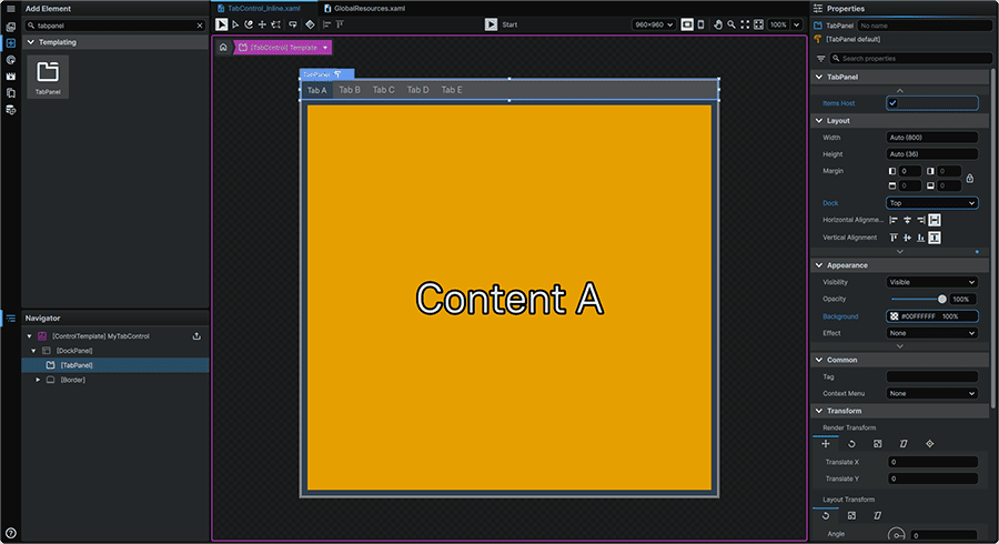
- 📑 TabPanel Element, responsible for displaying the individual Tabs.
- 'PART_SelectedContentHost' 📘 ContentPresenter Element, responsible for displaying the Content area of the selected Tab.

TabControl Content Template
Note
This Template is exclusively used in the context of a Data-Driven TabControl, and does not apply to TabControls populated with inline Elements.
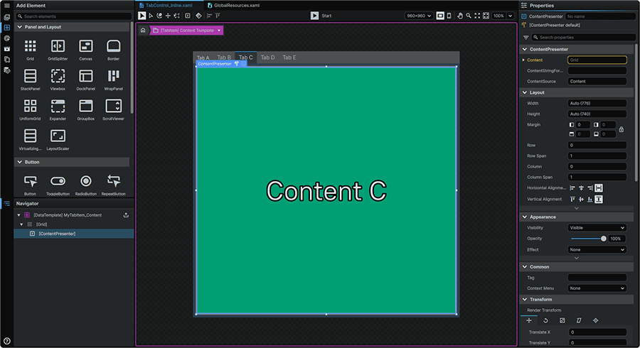
The TabControl Content Template is responsible for the presentation of the Content area displayed when the TabControl's Tabs are selected.
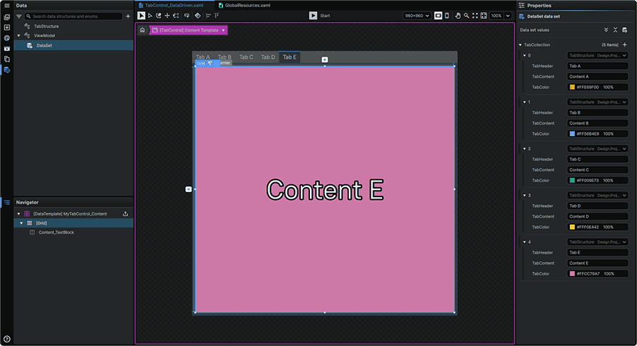
TabControl ItemsPanel Template
Note
This Template is exclusively used in the context of a Data-Driven TabControl, and does not apply to TabControls populated with inline Elements.
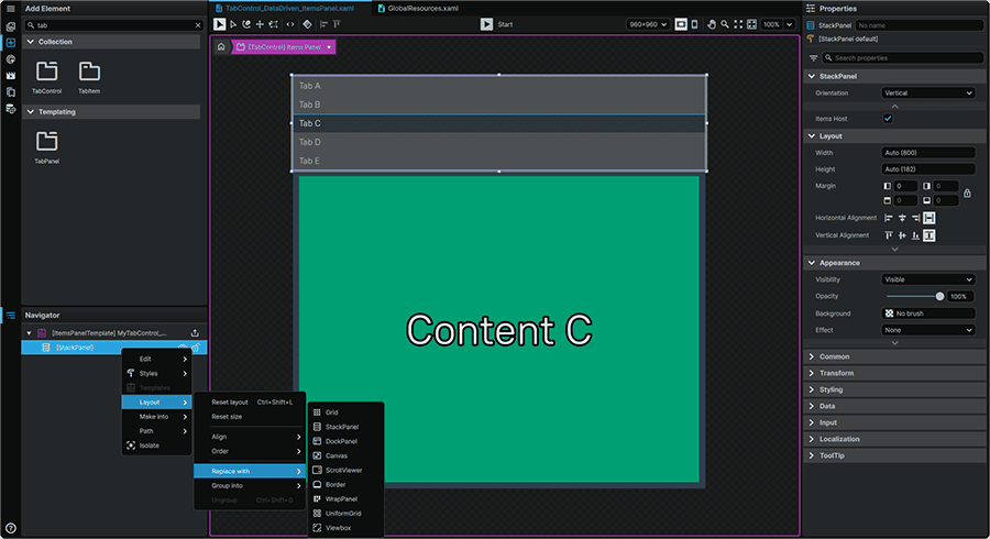
The TabControl ItemsPanel Template can be made responsible for driving the layout of the selectable Tabs, as a substitute to the default 📑 TabPanel Element. Doing so allows changing from the factory 📘 StackPanel Element Tab layout, to a different layout configuration.
It is important to note however that the ItemsPanel Template first requires an 📘 ItemsPresenter Element to be present in the 📑 TabControl Template.
To resolve this dependency, in the 📑 TabControl Template, the default 📑 TabPanel Element must be removed, then replaced with an 📘 ItemsPresenter Element as a requirement towards being able to create the ItemsPanel Template.
TabControl ItemContainer Template
Note
This Template is exclusively used in the context of a Data-Driven TabControl, and does not apply to TabControls populated with inline Elements.
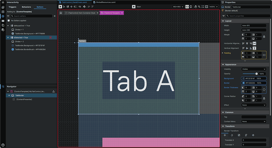
The TabControl ItemContainer Template is responsible for handling the generic shared interaction and presentation layer of each Tab.
Note
This TabControl's ItemContainer Template is driven by, and needs to be contained within an ItemContainer Style. Upon creation of the ItemContainer Template, Studio will automatically create a Style, and assign the newly-created Template within it. Once this process is completed, it is advisable to navigate to the 📘 Resources Panel to identify, and appopriately rename this new Style in order to facilitate its future tracking.
TabControl Item Template
Note
This Template is exclusively used in the context of a Data-Driven TabControl, and does not apply to TabControls populated with inline Elements.
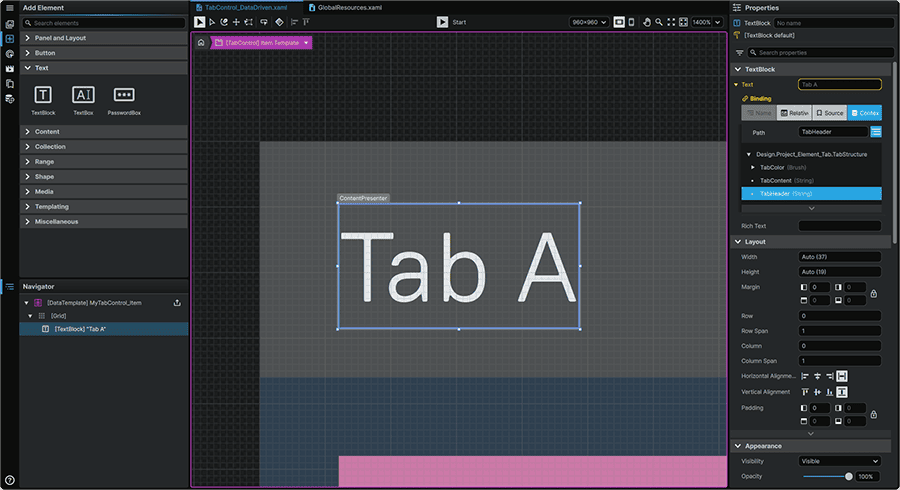
The TabControl Item Template is responsible for displaying the content unique to each tab.
TabItem Element
Note
This Element, and its parts below are exclusively used in the context of a TabControl populated with inline Elements, and does not apply to Data-Driven TabControls.
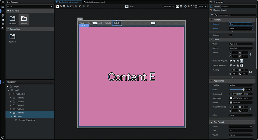
In a TabControl that is populated with inline Elements, the TabItem Element is responsible for the display of each individual Tab, and its associated Content area.
TabItem Template
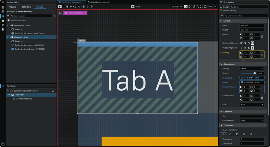
The TabItem Template is responsible for handling the generic shared interaction and presentation layer of each Tab.
TabItem Header Template
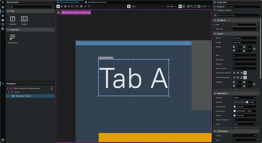
The TabItem Header Template is responsible for displaying the content unique to each Tab. By default, this is composed of a 📘 TextBlock Element configured to display the value of the 📑 TabItem Element Header Property.
TabItem Content Template
The TabItem Content Template is responsible for the presentation of the Content area displayed when an instance of the 📑 TabItem Element is selected.
TabPanel Element
The TabPanel Templating Element is responsible for defining the layout of individual Tabs in an array.
Note
Templating Elements are foundational building blocks to build other Templates; as such Templates cannot be created for them.
Population Methods
The 📑 TabControl Element supports either being driven by 📑 Inline Population or 📑 Data-Driven Population, each using different Templates to drive the Element's presentation.
It is important to note that these two modes are exclusive, and cannot be simultaneously used on the same Element.
Inline Population
In the default setup, when a 📑 TabControl Element is introduced into a Page, it is configured for inline Element population using instances of the 📑 TabItem Element.
In this configuration, each 📑 TabItem Element comes pre-populated with a 📘 Grid Element as the Tab's Content area, which corresponds to what is displayed when each Tab is selected.
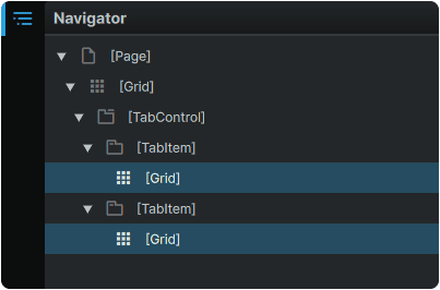
This Content area can either be populated with any collection of inline Elements, or it can be replaced with another Element altogether.
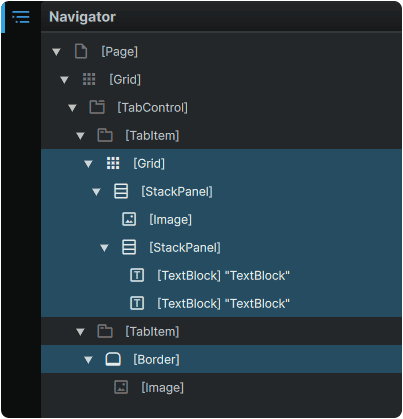
Further instances of the 📑 TabItem Element can be added by dragging them into the 📑 TabControl Element from the 📘 Add Element Panel.
Data-Driven Population
The 📑 TabControl Element can alternately be set to be Data-Driven by setting a DataContext in the TabControl's Items Source Property.
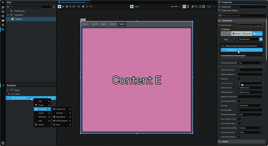
In the case of electing a Data-Driven model, the 📑 TabControl Element will instead be driven by the 📑 TabControl Content Template, the 📑 TabControl ItemsPanel Template, the 📑 TabControl ItemContainer Template, and the 📑 TabControl Item Template Templates.
Note
The process of converting to a Data-Driven configuration will clear any inline Elements present in the hierarchy. To convert from a Data-Driven configuration back to an inline configuration, after clearing the TabContol Element's Items Source Property, instances of the 📑 TabItem Element can be clicked-and-dragged from the 📘 Add Element Panel into the 📑 TabControl Element in the 📘 Navigator Panel or on the 📘 Stage.