🎓 Creating a Character Selection Screen in Noesis Studio
🏘️ NoesisGUI ▸ 🏠 Noesis Studio ▸ 🎓 Creating a Character Selection Screen in Noesis Studio
Introduction
In this tutorial, we will learn how to create a simple data-driven character picker in which a user can browse through, and pick one of many available characters.
The method we will be learning can be applied to any data-driven interface in which the user performs an item selection, such as inventory management, player item customization, or selection of settings and options.
Overview
Objective
Our goal will be to create a method through which the user is able to set one of many characters as the 'selected' one, and to have the selected character's unique name and visual display on-screen.
Prerequisites
- A copy of the Noesis Studio desktop application (🎓 Installing and Setting Up Noesis Studio).
Time to Complete
This tutorial will take ~45 min to complete.
Process Overview
To achieve our objective:
1. We will set up a new Studio Project.
2. We will set up the Page in which our interface will appear.
3 We will set up the Data Structures which will be used to populate each character's presented information.
4.0 We will learn about the 📘 ListBox Elements, and the parts we will be customizing:
4.1 We will create the Template for the ListBox ItemsPanel, responsible for how all available characters are displayed and laid out on-screen.
4.2 We will create the Template for the ListBox Item, responsible for how each individual character tile is displayed within the ListBox.
4.3. We will create the Template for the ListBox ItemContainer, responsible for handling the generic shared interaction layer of each ListBoxItem.
5. We will configure the screen to display the currently-selected character to the user.
6. We will test that the system is capable of displaying the currently-selected character correctly, and is able to change depending on the user's latest selection.
7. We will configure the ListBox ItemContainer with VisualStates to display a different presentation on-hover, and when selected.
8. We will launch the project, and verify that everything works as designed.
Instructions
1. Project Setup
First, we will set up the Noesis Studio project we will be working in:
1.1 Create a folder on your machine in which this project will live. You can name this folder as you wish, but we will be using 'CharacterSelector'.

1.2 Launch the Noesis Studio application, and select 'Create New' within the launcher to create the project.

1.3 In the file explorer, navigate to within the folder created in step 1.1 and name your project. You can name this project as you wish, but we will be using 'CharacterSelector'. Once you are done, select 'Create Project' to continue.

1.4 Upon creation, the Project will open, and as long as no other files are present in the working directory, it will come pre-populated with a 🗋 MainPage.xaml which we will build our interface within.

2. Page Setup
Note
If a 🗋 MainPage.xaml was not automatically created within the newly-created project, a new Page can be added by navigating to the the 📘 Assets Panel (Ctrl+1), pressing the + (Add) icon, and selecting 'New Page' from the context menu.
Next, we will create the base layout of our Page, starting by dividing the screen up into sections:
2.1 Within the 📘 Navigator Panel, select the 📘 Grid Element at the root of 🗋 MainPage.xaml, then, on the 📑 Stage, hover over the Grid's left edge, and click once along the highlighted section to create a 2-Row Grid.
We will then set the value of each Row to be 1* by clicking within the Grid's Row adorners, then inputting a value of 1 into each of the two Row fields.
This will create two Rows of equal height which due to using the star (*) unit, will remain equally-sized regardless of screen dimension.
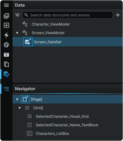
We will now introduce the three Elements which will compose our interface:
2.2 Navigate to the 📘 Add Element Panel (Ctrl+2).
Use the Search field at the top of the 📘 Add Element Panel to find, then click-and-drag to the 📑 Stage or to the 📘 Navigator Panel a:
- 📘 Grid Element, which will be used to contain the unique visual of the selected character.
- 📘 TextBlock Element, which will be used to display the name of the selected character.
- 📘 ListBox Element, which will be used to display a grid of all available characters to pick from.
2.3 Select the 📘 Grid Element introduced to the Page, and in the 📘 Properties Panel:
Name it SelectedCharacter_Visual_Grid, and set the following properties:
| Row | 0 |
| RowSpan | 2 |
| Column | 0 |
| ColumnSpan | 1 |
| Horizontal Alignment | Stretch |
| Vertical Alignment | Stretch |
These properties will make the selected character visual span across both rows, filling the entire Page.

2.4 Select the 📘 TextBlock Element introduced to the Page, and in the 📘 Properties Panel:
Name it SelectedCharacter_Name_TextBlock, and set the following properties in the Layout section:
| Margin | 32, 32, 32, 32 |
| Row | 0 |
| RowSpan | 1 |
| Column | 0 |
| ColumnSpan | 1 |
| Horizontal Alignment | Stretch |
| Horizontal Alignment | Bottom |
These properties will make the selected character name sit in the bottom of the top-half of the screen, with a bit of Margin around it to create some breathing room with other Elements, and the edges of the screen.
Then, set the following properties in the Text section:
| Size | 48 |
| Alignment | Center |
This will set a larger size for the text, and center it horizontally within the screen.

2.5 Select the ListBox Element introduced to the Page, and in the 📘 Properties Panel:
Name it Characters_ListBox, and set the following Layout properties:
| Row | 1 |
| RowSpan | 1 |
| Column | 0 |
| ColumnSpan | 1 |
| Horizontal Alignment | Stretch |
| Vertical Alignment | Stretch |
These properties will make the character selection grid fill the bottom half of the screen.

3. Data Setup
As the content of our screen will be data-driven, we will now configure the Data Structures and Data Properties that will be responsible for feeding content into the interface.
3.1 Navigate to the 📘 Data Panel (Ctrl (Hold) + 6).
We will start by creating a Data Structure that will drive the unique name, and the unique visual that each character will possess.
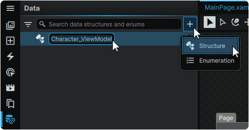
3.2 At the top of the 📘 Data Panel, from the + (Add) menu, click on the 'Structure' option, then double-click the newly-created entry and rename it to Character_ViewModel.
We will now create individual Properties for both the character name, and the character visual.
3.3 Select the Character_ViewModel Data Structure from the 📘 Data Panel , then navigate to the 📘 Properties Panel, and click the + (Add) icon on the 'Properties' field twice to add two new Data Properties to the Structure.
Double-click the first newly-created Data Property and rename it to Character_Name. Then, open its expander, and set its Properties to:
| Dropdown 1 | String |
| Dropdown 2 | Single |
| Min Value | 1 |
| Max Value | 2 |
Then, double-click on the the second newly-created Data Property and rename it to Character_Visual. Then, open its expander and set its Properties to:
| Dropdown 1 | String |
| Dropdown 2 | Single |
| Min Value | 1 |
| Max Value | 1 |

Next, we will create a Data Structure to serve as the screen's ViewModel.
3.4 At the top of the 📘 Data Panel, from the + (Add) menu, click on the 'Structure' option, then double-click the newly-created entry and rename it to Screen_ViewModel.

We will now create the Property which will serve the collection of characters to the screen's ViewModel.
3.5 Select the Screen_ViewModel Data Structure from the 📘 Data Panel , then navigate to the 📘 Properties Panel, and click the + (Add) icon on the 'Properties' field to add a new Data Property to the Structure.
Then, Double-click the newly-created Data Property and rename it to Characters_Collection. Then, open its expander, and set its Properties to:
| Dropdown 1 | CharacterSelector_Character_ViewModel |
| Dropdown 2 | Collection |
| Min Item Count | 8 |
| Max Item Count | 8 |

This will set our Screen_ViewModel to receive a collection of 8 Characters derived from the information we provided to the Character_ViewModel.
We will now create a Data Set to apply to our Page, which will provide it with a source of values to use to drive the interface.
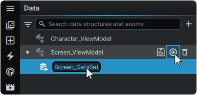
3.6 Hover over the Screen_ViewModel Data Structure from the 📘 Data Panel, and click its + (Add) icon. A new Data Set Entry will be created.
Then, double-click the newly-created Data Set and rename it to Screen_DataSet
3.7 Hover over the newly-created Screen_DataSet Data Set, and click on its ⌂ (Home) icon to assign it to the Page.
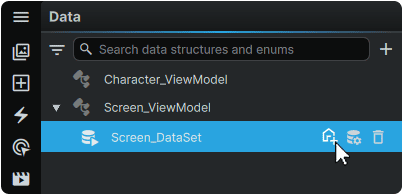
This operation can be validated as successful with both the Screen_DataSet in the 📘 Data Panel, and the 'Page' Root Element in the 📘 Navigator Panel both receiving a small blue dot next to their respective icons, representing that a Data Set has been assigned to it.
Lastly, we will fill out the unique data for each character. We will use our 'Generate Sample Data' feature to do most of the legwork for us.
3.8 Hover over the Screen_DataSet Data Set within the 📘 Data Panel, and click on its 🛢 (Generate) icon.
Within the 📘 Properties Panel, this will generate a data set containing random values, but which follow the rules of the Collection set in Step 3.5 (to generate a Collection containing 8 characters), and the rules of the Properties set in step 3.3 (to generate 'Name' and 'Visual' values for each character within the Collection).
These values can be displayed and edited by selecting the Screen_DataSet Data Set in the 📘 Data Panel, then opening the expanders within the Data Set in the 📘 Properties Panel.
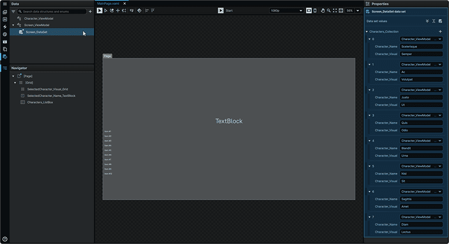
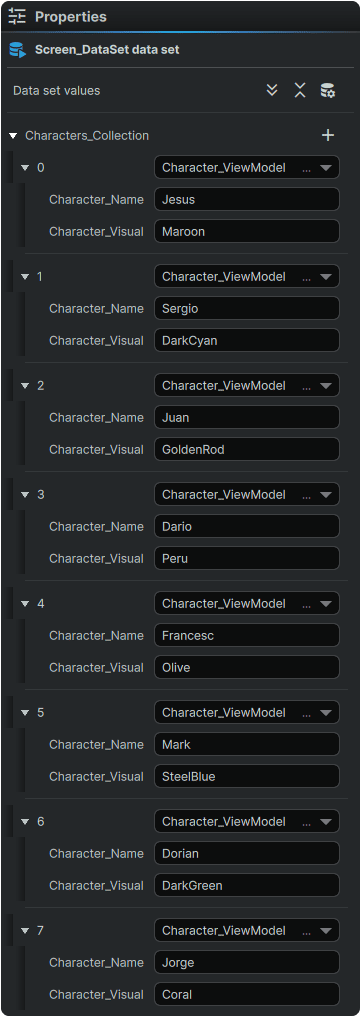
3.9 Fill out the character data with names of your choosing in the 'Character_Name' field, and a color of your choosing in the 'Character_Visual' field.
Colors can be input as either its name within the WPF framework, or as a hex value.
Note
A guide to the default WPF Framework colors can be found at ↗️ Colors Class
We are now done with configuring our data!
4.0 The ListBox Elements
We will customize the pieces that make up the 📘 ListBox Elements. To do this, we will create Templates for each part, which we can then style, and configure to display our collection of characters.
4.1 ListBox ItemsPanel
The first Element from the 📘 ListBox Elements that we will configure is the ListBox ItemsPanel. This Element is what controls how the collection of characters is laid out on-screen.
By default, the ListBox ItemsPanel displays Collections within the 📘 StackPanel Element in a Vertical Orientation, as can be seen from the current layout of the ListBox on the Stage.
4.1.1 Navigate to the 📘 Resources Panel (Ctrl+6).
From the 📑 Stage or from the 📘 Navigator Panel right-click on the ListBox on the Page, and from the 'Templates' category of its context menu, within the 'ItemsPanel' subcategory, select 'Create'.
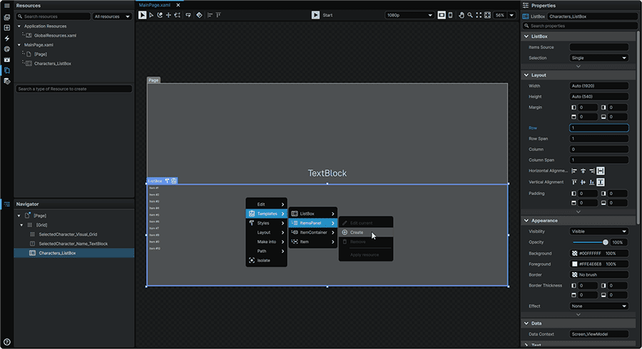
This will open the new ListBox ItemsPanel Template in an isolated view, and will add it as a Template Resource to the 📘 Resources Panel.
4.1.2 Within the 📘 Resources Panel , double-click on the the newly-created Template Resource and rename it to ListBoxItemPanel_Template.

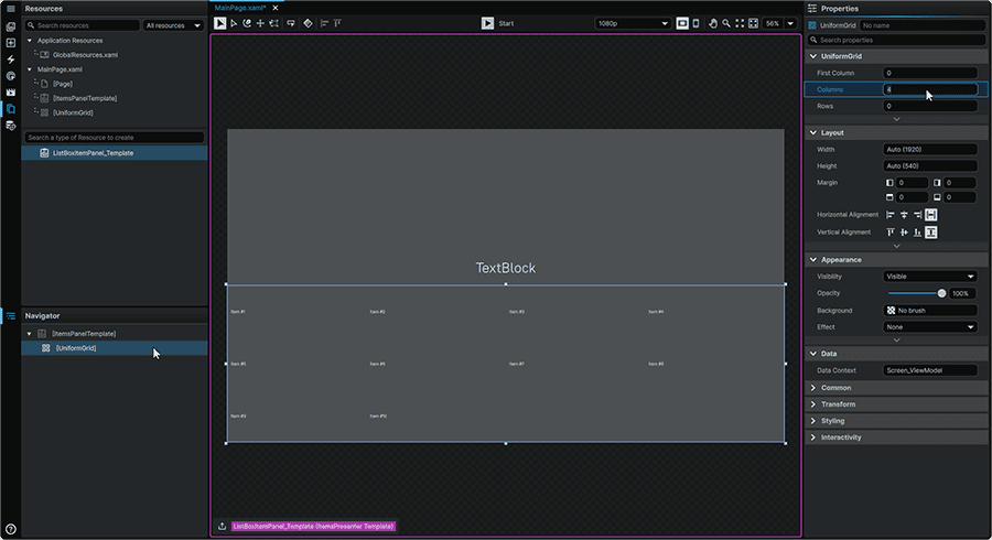
4.1.3 From the 📘 Navigator Panel, right-click on the 📘 StackPanel Element, navigate to the 'Layout' context menu category, then from the 'Replace With' subcategory, select 'UniformGrid'.

After this is selected, it will arrange our characters into a grid instead of a vertical list.
4.1.4 Select the UniformGrid from the 📘 Navigator Panel, and set its 'Columns' property to '4'. This will ensure that our characters are displayed in rows of 4 characters.
4.1.5 We can now exit the ListBox ItemsPanel Template by clicking on the 🠝 (Exit) icon in the lower left of the application window to return to the root of our Page.

4.1.6 Select the ListBox either from the 📑 Stage or from the 📘 Navigator Panel, and in the 📘 Properties Panel, hover over the 'Items Source' Property, and from the ⋮ (3-Dot) menu, select 'Create Binding.'

4.1.7 From the Binding selection menu, under the 'Context' tab, select Characters_Collection under the Screen_ViewModel expander.
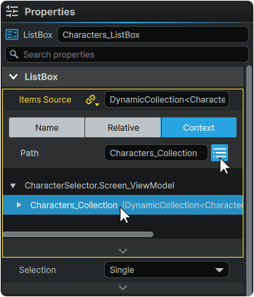
The data we created in Step 3 is now available to the ListBox to use.
4.2 ListBox Item
The next Element from the 📘 ListBox Elements that we will configure is the ListBox Item. This Element is what controls how each individual character tile is presented on-screen, and is what contains the information unique to each character.
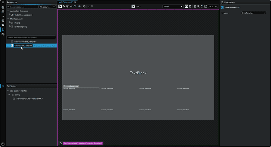
4.2.1 From the 📑 Stage or from the 📘 Navigator Panel right-click on the ListBox on the Page, and from the 'Templates' category of its context menu, within the 'Item' subcategory, select 'Create'.

This will open the new ListBox Item Template in an isolated view, and will add a Resource to the 📘 Resources Panel.
4.2.2 Navigate to the 📘 Resources Panel (Ctrl+5), double-click on the the newly-created Template Resource and rename it to ListBoxItem_Template.
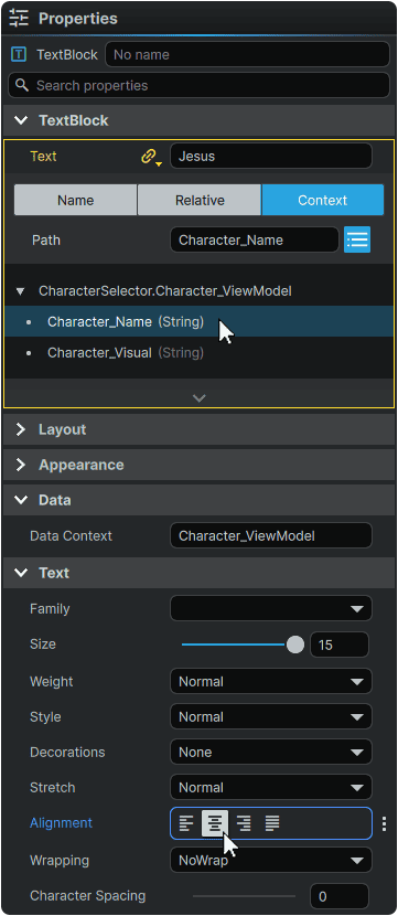
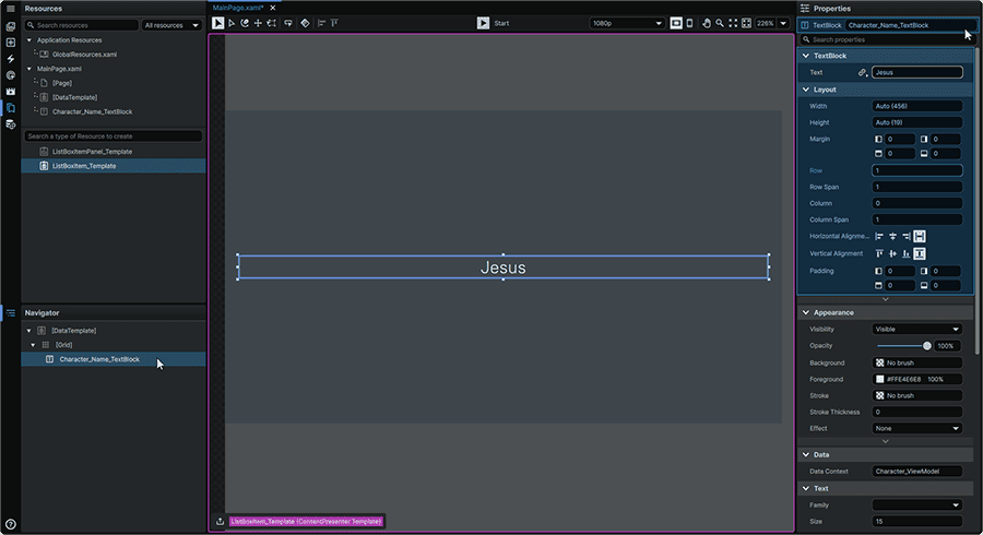
4.2.3 Remaining within the ListBox Item Template, select the TextBlock found within the Root Grid, either from the 📑 Stage or from the 📘 Navigator Panel, and and in the 📘 Properties Panel, hover over the 'Text' Property, and from the ⋮ (3-Dot) menu, select 'Create Binding.'

4.2.4 From the Binding selection menu, under the 'Context' tab, within the Character_ViewModel expander, select Characters_Name.
The TextBlock will now display the character name.
Whilst we are here, we can also take advantage and set our Text alignment to 'Center' under the 'Text' Properties category.
Now that we have the character Name accounted for, lets adjust our layout to allow a space for our character Visual to appear as well.
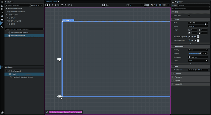
4.2.5 Whilst remaining within the ListBox Item Template, from the 📘 Navigator Panel, select the 📘 Grid Element at the root of the Template, hover over its left edge, and click once along the highlighted section to create a 2-Row Grid.
Within the Grid's Row adorners, set the value of the top row's adorner to be '1*', and the bottom row to a unit of 'Auto'. This will create two Rows where the bottom row will size to the dimensions of the content within, and the top row will fill all remaining available space. Whilst configuring the rows of the Grid, the TextBlock will disappear from view until we assign it to the correct Row in the next step.
With our layout set, let's set how our Elements will display within it:
4.2.6 From the 📘 Navigator Panel, select the TextBlock. Within the 📘 Properties Panel, rename it to Character_Name_TextBlock. Then, set its Properties to:
| Width | MouseWheel (Press) on the Width field to set to 'Auto'. |
| Height | MouseWheel (Press) on the Height field to set to 'Auto'. |
| Margin | MouseWheel (Press) on any Margin field to set all to '0'. |
| Row | 1 |
| RowSpan | 1 |
| Column | 0 |
| ColumnSpan | 1 |
| Horizontal Alignment | Stretch |
| Vertical Alignment | Stretch |
This will populate the lower section of the ListBox Item with the name of the character.
Next, we will add the Grid Element that we'll use to display the Visual (the unique color) of each character within the ListBox Item.
4.2.7 Still within the ListBox Item Template, navigate to the 📘 Add Element Panel (Ctrl+2), and use the Search field to find the 📘 Grid Element, then click-and-drag it to within the root Grid within the 📘 Navigator Panel.
4.2.8 Select the 📘 Grid Element recently introduced into the Navigator. Within the 📘 Properties Panel, rename it to Character_Visual_Grid. Then, set its Properties to:
| Width | MouseWheel (Press) on the Width field to set to 'Auto'. |
| Height | MouseWheel (Press) on the Height field to set to 'Auto'. |
| Margin | MouseWheel (Press) on any Margin field to set all to '0'. |
| Row | 0 |
| RowSpan | 1 |
| Column | 0 |
| ColumnSpan | 1 |
| Horizontal Alignment | Stretch |
| Vertical Alignment | Stretch |
In this layout, although it will not yet be visible on-screen, this layout will position the unique character visual in the upper section of the ListBox Item.
4.2.9 With the 📘 Grid Element recently introduced into the Navigator still selected. Under the 'Appearance' section of the 📘 Properties Panel, hover over the 'Background' Property, and from the ⋮ (3-Dot) menu, select 'Create Binding'.

4.2.10 From the Binding selection menu, under the 'Context' tab, then for the Path Property, under the 'Character_ViewModel' expander, select 'Character_Visual'.
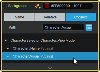
We have now set up the 📘 Grid Element to have its 'Background' Property reflect the designated color found within the individual character's 'Visual' Data Property.
Although it will not yet be visible on the 📑 Stage until we set up our next (and last) of the 📘 ListBox Elements Templates, this operation can be validated as successful by the presence of a color swatch (and value) present within the 'Background' field of the Character_Visual_Grid Element .
4.2.11 We can now exit the ListBox Item Template by clicking on the 🠝 (Exit) icon in the lower left of the application window to return to the root of our Page.
4.3 ListBox ItemContainer
The final Element from the 📘 ListBox Elements that we will configure is the ListBox ItemContainer. This Element acts as a generic interaction layer for each ListBox Item, and will be the Element that dictates what happens when the user interacts with each character's ListBox Item.
4.3.1 Either from the 📑 Stage or from the 📘 Navigator Panel, right-click on the ListBox, navigate to the 'Templates' context menu section, and from the 'ItemContainer' menu, select 'Create'.
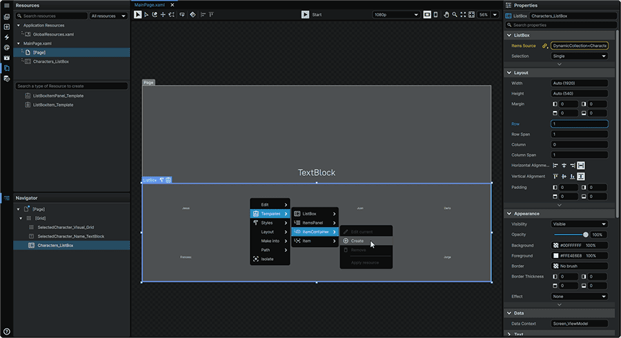
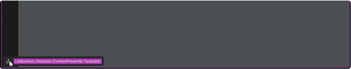
Once created, the Template will open in an isolated view.
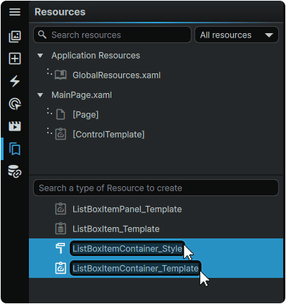
It is important to note that there exists an exception within the framework where a ListBox ItemContainer Template must be assigned within a Style rather than directly assigned to the 📘 ListBox Element. As a result, unlike the ListBox ItemsPanel and the ListBox Item Templates, when a ListBox ItemContainer Template is created, an adjoining ListBox ItemContainer Style is also created alongside it.
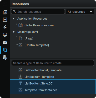
4.3.2 From the 📘 Resources Panel (Ctrl+5), double-click on the the newly-created Style Resource and rename it to ListBoxItemContainer_Style. Then, double-click on the newly-created Template Resource and rename it to ListBoxItemContainer_Template.
4.3.3 Within the ListBox ItemContainer Template, either from the 📑 Stage or from the 📘 Navigator Panel, right-click on the Root ItemBorder contained by default within the Template, and from its 'Layout' context menu, under the 'Replace With' category, select 'Grid' to replace the ItemBorder with a Grid Element.

4.3.4 Still remaining within the ListBox ItemContainer Template, either from the 📑 Stage or from the 📘 Navigator Panel, select the 📘 ContentPresenter Element contained by default within the Template, then, set its Properties to:
| Width | MouseWheel (Press) on the Width field to set to 'Auto'. |
| Height | MouseWheel (Press) on the Height field to set to 'Auto'. |
| Horizontal Alignment | Stretch |
| Vertical Alignment | Stretch |
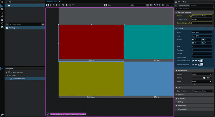
As the 📘 ContentPresenter Element is what will present the ListBox Item within the ListBox ItemContainer, setting its Alignments to 'Stretch' will allow the ListBox Item to span the entire area of the ListBox ItemContainer, which now has the space allocated to display both the character Name, and the character Visual.
4.3.5 We will then return to the root of our Page by clicking twice on a row on the 🠝 (Exit) icon in the lower left of the application window. The first, in magenta, will be to exit the ListBox ItemContainer Template, and the second, to exit the ListBox ItemContainer Style (which contains the Template)

5. Selected Item Display
Within the root of 🗋 MainPage.xaml, for the SelectedCharacter_Visual_Grid and SelectedCharacter_Name_TextBlock Elements in the upper-half of the screen to display the selected chraracter, we must first set the ListBox up to have an active Index value (for the UI to be able to know which of all characters, is the currently-selected one).
5.1 Either from the 📑 Stage or from the 📘 Navigator Panel, select Characters_ListBox, and in the 📘 Properties Panel, set the 'Selected Index' Property to 0 (0 being the first item in the collection).
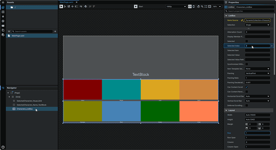
The other Elements on the screen are now able to hook into the ListBox's Selected Item, and display its information.
Next, we will set up SelectedCharacter_Name_TextBlock to read, and display the Selected Index character Name as on-screen text.
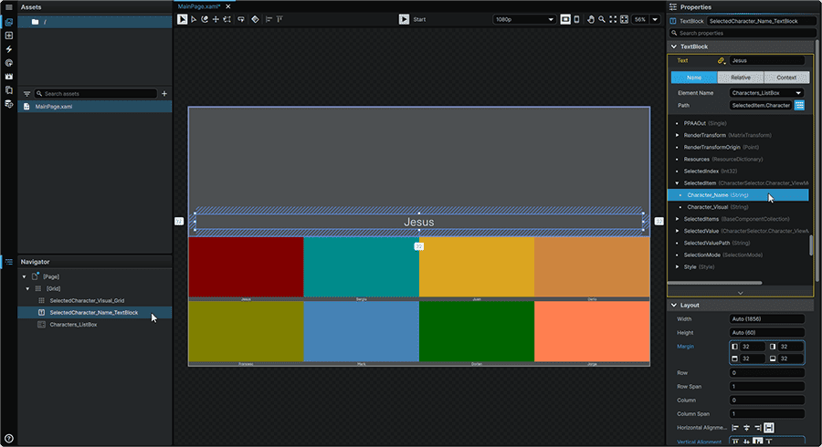
5.2 Either from the 📑 Stage or from the 📘 Navigator Panel, select SelectedCharacter_Name_TextBlock, and in the 📘 Properties Panel, hover over the 'Text' Property of the TextBlock category, click on the ⋮ (3-Dot) menu, and select 'Create Binding.'
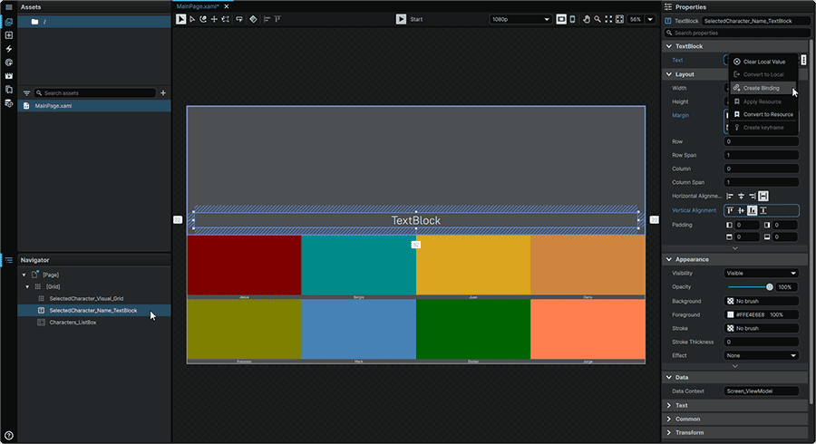
5.3 From the Binding selection menu, select the 'Name' tab, set Characters_ListBox as the Element Name, then for the Path Property, from the list, expand the SelectedItem entry, to then select the CharacterName Property.
Once this is selected, the Name of the currently-selected character will display on-screen.
Note
If you do not see the 'SelectedItem' and its children in the Binding list, restarting the application can sometimes resolve this.
Next, we will set up SelectedCharacter_Visual_Grid to read, and display the Selected Index character Visual as a background.
5.4 Either from the 📑 Stage or from the 📘 Navigator Panel, select SelectedCharacter_Visual_Grid, and in the 📘 Properties Panel, hover over the 'Background' Property of the Appearance category, click on the ⋮ (3-Dot) menu, and select 'Create Binding.'
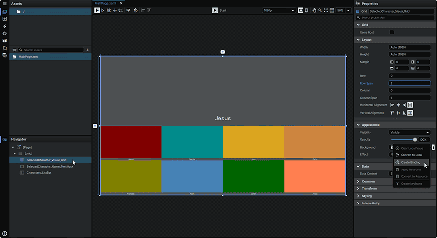
5.5 From the Binding selection menu, select the Name tab, set Characters_ListBox as the Element Name, then for the Path Property, from the list, expand the SelectedItem entry, to then select the Character_Visual property.

Once this is selected, the Visual of the currently-selected character will display on-screen.
That's the interface hookup to the character data now complete!
6. Functionality Testing
6.1 At the top-center of the application window, press the ▶ (Play) button (Ctrl+P) to see what we've created so far in-action.
At this point, you should be able to click on the various character tiles, and have the name, and the colour of the most recently-selected character appear in the top half of the screen. There won't be hover or selection states present on each character tile just yet, but we can verify that the data-driven interface mechanically works!
7. Visually Styling the ListBox ItemContainer
We will now visually customize the ListBox ItemContainer which will apply to all ListBox Items, and which will contain the interaction layer of each character tile.
7.1 Either from the 📑 Stage or from the 📘 Navigator Panel, right-click on the ListBox, navigate to the 'Templates' context menu section, and from the 'ItemContainer' menu, select 'Edit'. This will open the Template in an isolated view and allow us to modify the construction of this part.

We will now add two Rectangle Shapes.
7.2 Navigate to the 📘 Add Element Panel (Ctrl+2).
Use the Search field at the top of the 📘 Add Element Panel to find the 📘 Rectangle Element, click-and-drag two instances to the 📘 Navigator Panel, with one Rectangle 'below' the ContentPresenter, serving as the tile 'backer', and one 'above' it which will serve as a character tile 'outline'.
In this Template, the ContentPresenter reflects the 📘 ListBoxItem Element. By extension, through this operation, we are therefore placing one Rectangle above, and one below the ListBoxItem.
We will now configure each of these Rectangle to serve their purpose.
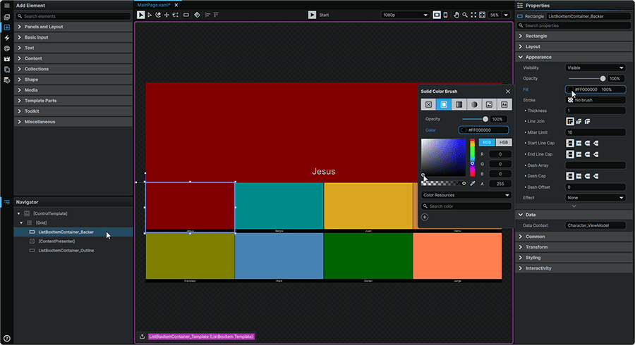
7.3 First, select the 📘 Rectangle Element above the Content Presenter to expose its Properties within the 📘 Properties Panel.
Rename it to ListBoxItemContainer_Outline. Then, remove its Fill by hovering over the 'Fill' Property within the Appearance section, clicking the ⋮ (3-Dot) menu, and selecting 'Clear Local Value'.

7.4 Remaining within the ListBox ItemContainer Template, from the 📘 Navigator Panel, select the 📘 Rectangle Element below the Content Presenter to expose its Properties within the 📘 Properties Panel.
Rename it to ListBoxItemContainer_Backer. Then, remove its Stroke by hovering over the Stroke Property within the Appearance section, clicking the ⋮ (3-Dot) menu, and selecting 'Clear Local Value'.

7.5 Next, we will change the Fill of the ListBoxItemContainer_Backer to Black by clicking on its 'Fill' Property from the 📘 Properties Panel, and using the color picker to change it to black.
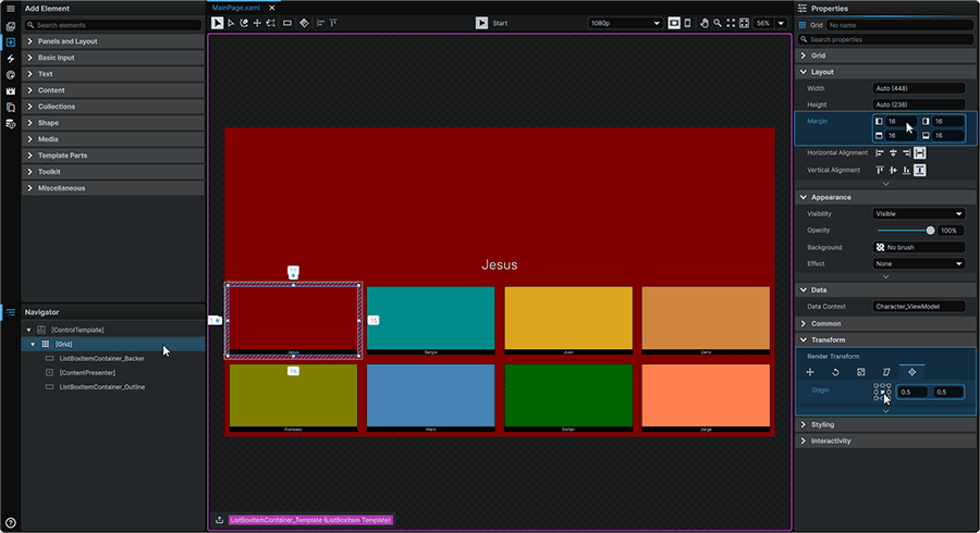
7.6 Lastly, from the 📘 Navigator Panel, select the root Grid, and from the 📘 Properties Panel, adjust the Margin Property to 16,16,16,16. This will add some spacing in between each character tile.
Whilst we're here, we also know that we want the tile to grow from the center when hovered over with the mouse, so we will also set our Render Transform Origin to 0.5,0.5 within the Render Transform Properties of the Transform section of the 📘 Properties Panel.
Next, we will set up our Visual States, which will allow us to display a different tile presentation depending on if the tile is unhovered, hovered, selected, or unselected.
7.7 Remaining within the ListBoxItemContainer Template, navigate to the 📘 Animation Panel (Ctrl (Hold) + 4), then select the 'MouseOver' Visual State found under the 'Common States' section.
Selecting the 'MouseOver' Visual State displays what the ListBox ItemsContainer will look like when the tile is hovered over with the mouse.
When a Visual State is selected, it is automatically set to be in 'Recording Mode', meaning that any changes made within the 📘 Properties Panel, will be keyed within the 📘 Animation Timeline.
We will select our Template's root Grid, and within the 📘 Properties Panel, we will set the Render Transform 'Scale X' and 'Scale Y' Properties to each be 1.05, which result in the character tile growing slightly when hovered.
Editing these with the playhead positioned at the 0s position will set a keyframe on the first frame of the 'MouseOver' Visual State.

Next, we will create a distinct Visual State for what the tile looks like when the character tile is the 'selected' one of the collection.
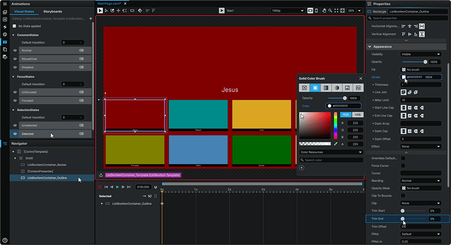
7.8 Still within the ListBoxItemContainer Template, navigate to the 📘 Animation Panel (Ctrl (Hold) + 4), then select the 'Selected' Visual State found under the 'SelectedStates' section.
This time, we will be altering the presentation of the tile outline (ListBoxItemContainer_Outline) to change color, and to feature a looping animation.
Select the ListBoxItemContainer_Outline Rectangle from the 📘 Navigator Panel, and within the 📘 Properties Panel, within the Apperance section, we will change the Stroke Property to White, as well as setting our Trim End to 0%.
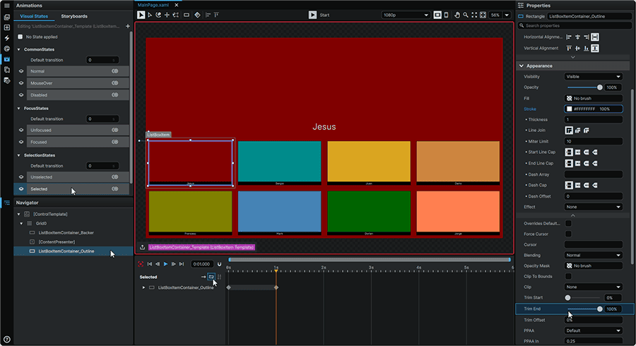
7.9 Still with the ListBoxItemContainer_Outline Rectangle selected within the 📘 Navigator Panel, within the 📘 Animation Timeline, move the Playhead to the 1s mark by clicking and dragging it rightward.
Then, within the 📘 Properties Panel, we'll adjust the 'Trim End' Property within the Appearance section to be 100%.
This will create an animation in which the outline will loop around the tile. However, we want this to repeat for as long as the character is selected, so we will also set the 'Repeat Forever' option to 'on' by clicking on the ⇆ (Loop) icon found at the top-left of the 📘 Animation Timeline.
We will now be able to test our work!
8. Final Result
8.1 At the top-center of the application window, press the ▶ (Play) button (Ctrl+P) to see the final result of our work!
Congratulations! This same technique can now be applied to many other applications, or with different data than the ones we used here!
📍 On this page