


📘 Digital Navigation
🏘️ NoesisGUI ▸ 🏠 Noesis Studio ▸ 📘 Working With Interactivity ▸ 📘 Digital Navigation
Overview
In addition to robust mouse and touch-based navigation, Noesis comes built-in with full support for Digital Navigation. This allows an entire interface to be effectively interacted with using keyboard keys, as well as controller buttons.
Although many Elements within the framework come with a set of default navigation mechanics, they can be fully customized through 📑 Digital Navigation Configuration. In this system, exactly which Element gets 📑 Focus when any directional input is actuated can be precisely tailored to best fit the desired outcome within any context.
Anatomy of Digital Navigation
In the framework, Digital Navigation is structured in a way where all Elements within a context are spatially placed within an invisible grid, where each Element is interpreted one-against-another along a horizontal (X) and vertical (Y) axis.
The system is composed of two core principles:
- 📑 Focus, which dictates which of the Elements within the layout currently serves as the 'center' of navigation from which an input actuation will take place when performed. This includes both actuating the 'focused' Element itself, as well as it serving as the origin for any directional movements away from it to another Element within the shared grid.
- 📑 Directionality, which dictates which Element will 'focus' next, when a directional input is actuated, in either a North, South, East, or West direction.
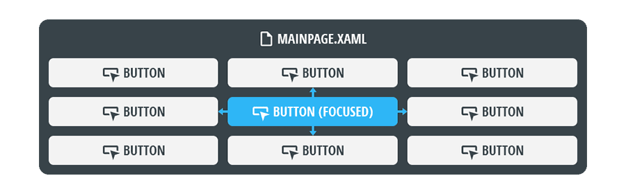
Focus
For any Digital Navigation to function, an Element must have Focus. Within the context of Digital Navigation, Focus serves two essential purposes:
- If a 'selection' input is actuated, it determines which Element receives the input. For example, pressing Space on a focused Element will 'press' it.
- If a 'directional' input is actuated, it sets the origin point within a layout from where the directional input begins. For example, pressing ArrowKey (Up) will move focus from the currently-focused Element, to the next focusable Element directly 'North' of it.
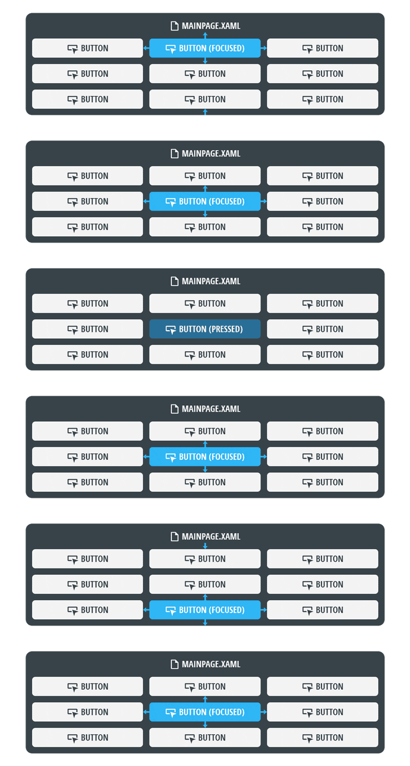
Directionality
In order to move 'focus' from one Element to another, Directionality can be used to navigate the grid of Elements North, South, East, and West, relative to the 'focused' Element.
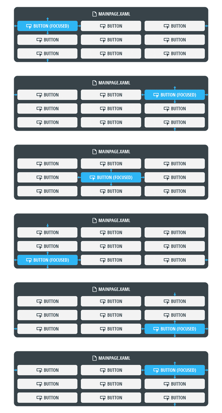
By default, the direction in which focus moves is determined with ArrowKey (Up/Down/Left/Right) on the keyboard, and D-Pad (Up/Down/Left/Right) or LeftJoystick (Up/Down/Left/Right) on a controller.
This can however be changed, either at the engine level, or in Noesis Studio using 📑 Directional Navigation.
Digital Navigation Configuration
When designing a Digital Navigation system using the principles above, a selection of mechanics can be leveraged to ensure control over the end-user's navigational experience:
Setting Focus
The 'Focusable' Property in an Element's 📘 Properties Panel, can be used to determine if it is capable of receiving 'focus' as part of the digital navigation system.
Many Elements have this value 'checked' by default, and will thus automatically be included as a candidate for being 'focusable' within the overall grid of Elements. For others, they can be manually included by simply checking their 'Focusable' Property.
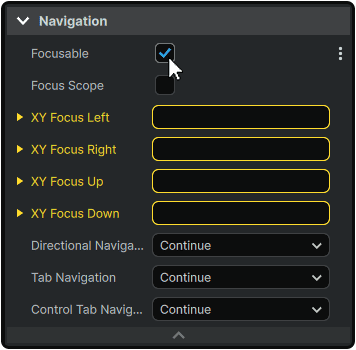
It is also through the 'Focusable' Property that Elements can be intentionally excluded from the digital navigation system.

To provide the best possible user experience, it is usually best-practice to manually establish which Element should be focused upon opening a Page. This can be achieved through 📘 Triggers, in which a Page contains an EventTrigger which specifies that when the Page is 'Loaded', to SetFocusAction on a specific Element within the scope.
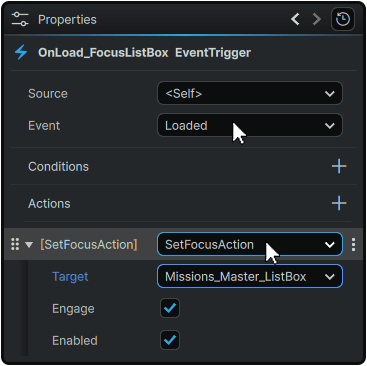
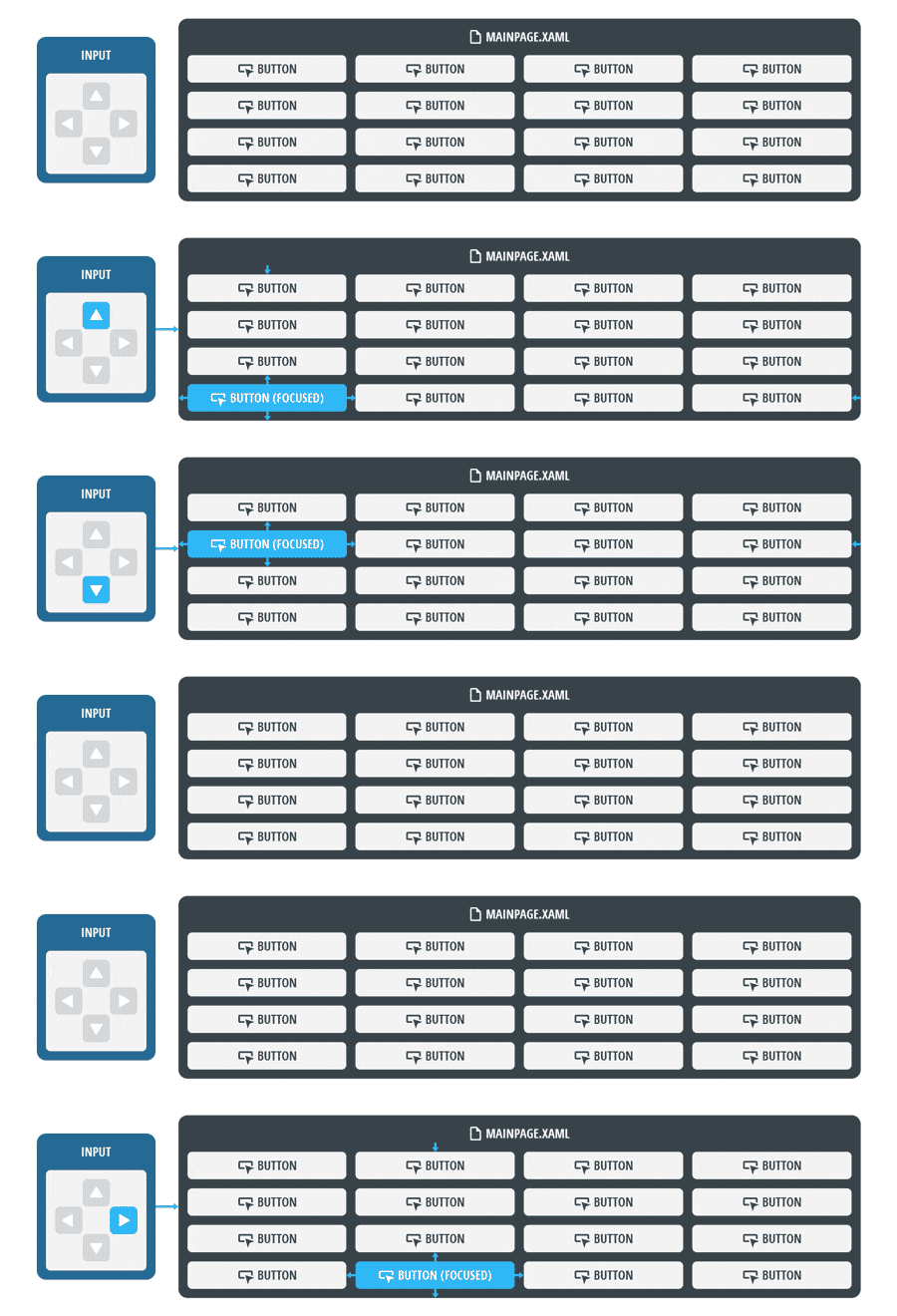
The system will however still function even without setting a 'starting Focus' manually. When landing on a Page for the first time, in a scenario where more than one Element capable of receiving 'focus' is present in a hierarchy:
- Pressing 'up' will set focus on the bottom-most and left-most focusable Element.
- Pressing 'down' will set focus on the second-to-top-most and left-most focusable Element.
- Pressing 'left' will set focus on the right-most and top-most focusable Element.
- Pressing 'right' will set focus on the second-left-most and bottom-most focusable Element.
Directional Navigation
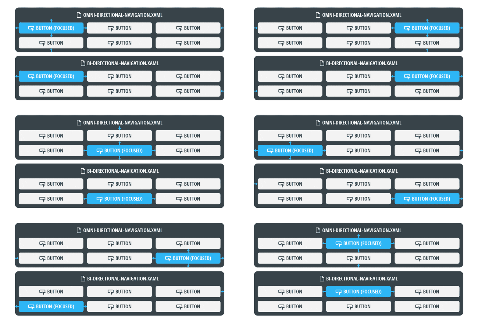
Within Studio, Directional Navigation is handled through two primary methods, each with their own default inputs:
- Omni-Directional Navigation (Up/Down/Left/Right), using ArrowKey (Up/Down/Left/Right) on the keyboard, and D-Pad (Up/Down/Left/Right) or LeftJoystick (Up/Down/Left/Right) on a controller.
- Bi-Directional Navigation (Prev/Next) using Tab and Shift (Hold) + Tab on the keyboard to move forward and backward respectively through the array. When using a controller, ShoulderButton (Right) and ShoulderButton (Left) are used to move to the next or previous item.
Selection
Within Studio, 'selecting' an Element is handled with the framework's defaults using Space on the keyboard, A on Xbox, Nintendo, and Steam Deck controllers, and X on PlayStation controllers.
Escaping Focus
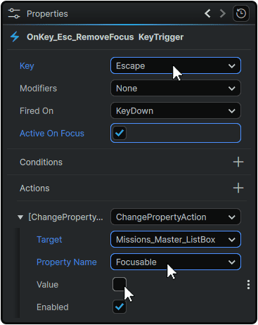
Focus can be disabled at any time using 📘 Triggers and using either a KeyTrigger or a GamepadTrigger containing a ChangePropertyAction which sets the 'Focusable' Property of the desired Element to 'False'.
Custom Inputs
Inputs other than the defaults listed above can be easily set up using 📘 Triggers, by customizing bespoke 📘 Trigger Types set to use KeyTriggers or GamepadTriggers.
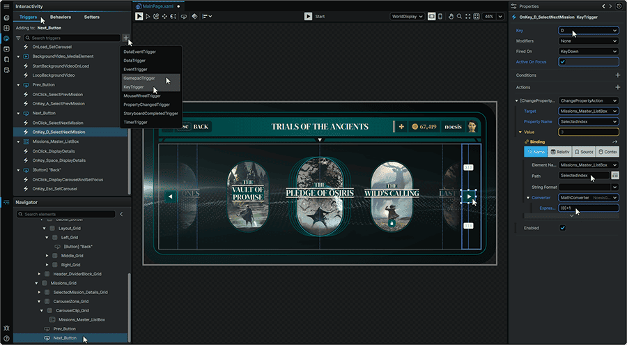
In the framework, all input events are processed using Noesis Keys. The 📑 Platform Map can be used to determine which Noesis Key corresponds to a specific input device's button.
Navigation Properties
A Navigation section can be found within an Element's 📘 Properties Panel, and allows its role within the Digital Navigation system to be customized further through a list of additional Properties.
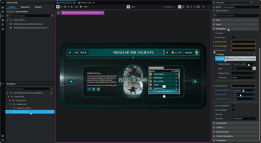
Focusable
|
• Determines whether the Element can be focused as part of a Project's Digital Navigation system.
|
| Focus Scope | • Allows for an Element to remember which of its focusable 'children' Elements was last-focused within its array.
For example, this allows an end-user to scroll through a list, navigate away from it, then return to it without losing their previous position within the list.
|
XY Focus Right
XY Focus Left
XY Focus Up
XY Focus Down
|
• Allows moving focus to a specific named Element within a scope when a directional input is actuated in a chosen direction.
For example, allows pressing ArrowKey (Left) to move focus directly from the currently-focused Element, to an Element named 'Button_A'.
|
Directional Navigation
(Omni-Directional navigation between panels)
Tab Navigation
(Bi-Directional navigation within a Control itself)
Control Tab Navigation
(Bi-Directional navigation between panels)
|
Allows setting each Navigation mode's behavior between:
• Continue: Each focusable Element along a multi-depth itinerary receives focus. Focus is removed from an Element when it is navigated away from.
• Once: The designated 'parent' Element, and any of its included 'children' receive focus as a whole.
• Cycle: When reaching the last item within an array of focusable Elements along any axis, focus is able to jump from the last item in the array, to the first, in any direction.
• None: Prevents navigation within the Element.
• Contained: When reaching the last item within an array of focusable Elements along any axis, focus is blocked from being moved further in that direction.
• Local: The Tab Index of each Element is used exclusively within the scope of the 'parent' in which it is located.
|
| Focus Engagement | • Allows designating a Control as able to have its sub-Controls focusable.
For example, in a vertical list of focusable Controls, allows pressing Space on a line to transfer focus from navigating the vertical list, to adjusting a horizontal 📘 Slider Element contained within the focused item in the list.
|
| Focus Engaged | • Allows 'locking' or 'unlocking' focus on a Control's sub-Control.
For example, pressing Space when focused on a horizontal 📘 Slider Element will set it to being 'Focus Engaged', and trap input to exclusively adjust the left/right movement of the Slider's Thumb. Pressing Esc will then disable the 'Focus Engaged' and remove focus from the Thumb.
|
| Tab Stop | • Determines if the Element is included as a 'stop' within a Bi-Directional (Tab) Navigation system's itinerary.
For example, if Item_A and Item_C are both designated as a 'Tab Stop', but Item_B isn't, pressing Tab when on Item_A will jump to Item_C without passing through Item_B.
|
| Tab Index | • Determines the order of Elements within a Bi-Directional ('Tab') Navigation system. Elements with lower 'Tab Index' values receive focus before Elements with higher 'Tab Index' values.
|
Platform Map
How Noesis inputs are mapped into engine inputs is determined by each individual implementation, and its own configuration.
With that said, Noesis Studio includes its own input system, ensuring that throughout development, in addition to mouse navigation, entire interfaces can be navigated within the application using a keyboard or controller.
How each 'Noesis Key' is mapped to all supported input devices is as follows:
| Noesis Key | Keyboard | Xbox / Steam Deck | PlayStation | Nintendo |
| Key_GamepadLeft | ArrowKey (Left) | D-Pad (Left)
LS (Left)
|
D-Pad (Left)
LS (Left)
|
D-Pad (Left)
LS (Left)
|
| Key_GamepadUp | ArrowKey (Up) | D-Pad (Up)
LS (Up)
|
D-Pad (Up)
LS (Up)
|
D-Pad (Up)
LS (Up)
|
| Key_GamepadRight | ArrowKey (Right) | D-Pad (Right)
LS (Right)
|
D-Pad (Right)
LS (Right)
|
D-Pad (Right)
LS (Right)
|
| Key_GamepadDown | ArrowKey (Down) | D-Pad (Down)
LS (Down)
|
D-Pad (Down)
LS (Down)
|
D-Pad (Down)
LS (Down)
|
| Key_GamepadAccept | Space | A | ✕ | A |
| Key_GamepadCancel | Esc | B | ◯ | B |
| Key_GamepadMenu | Menu | Options | + | |
| Key_GamepadView | View | Create | - | |
| Key_GamepadPageUp | PageUp | LT | L2 | ZL |
| Key_GamepadPageDown | PageDown | RT | R2 | ZR |
| Key_GamepadPageLeft | LB | L1 | L | |
| Key_GamepadPageRight | RB | R1 | R | |
| Key_GamepadContext1 | X | ◻ | Y | |
| Key_GamepadContext2 | Y | △ | X | |
| Key_GamepadContext3 | LS (Press) | LS (Press) / L3 | LS (Press) / L3 | |
| Key_GamepadContext4 | RS (Press) | RS (Press) / R3 | RS (Press) / R3 |
For a full technical overview of features, refer to 📘 Input Management.
Working With Interactivity
- 📘 Interactivity Introduction
- 📘 Visual States
- 📘 Triggers
- 📘 Behaviors
- 📘 Setters
- 📘 Digital Navigation
- 📘 Drag-And-Drop