
📘 Visual States
🏘️ NoesisGUI ▸ 🏠 Noesis Studio ▸ 📘 Working With Interactivity ▸ 📘 Visual States
Overview
Visual States enable creators to design, and manage a multitude of presentation variants of a Page or Element Template.
Each variant is defined through the 📘 Animation Panel 'Visual States' tab, through which editing 📑 Default Visual States or 📑 Custom Visual States can be performed.
Anatomy of the Visual State System
The Visual State system is composed of three inter-related core parts:
📑 Visual State Groups contain 📑Visual States, which can transition between each other through automatic or custom 📑 Visual State Transitions.
Visual State Groups
Visual State Groups are able to contain one, or many 📑Visual States.
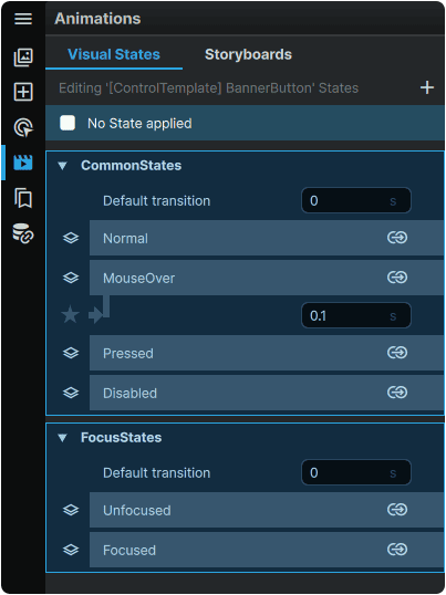
At a surface level, Visual State Groups are used to organize 📑Visual States into easy-to-manage categories.
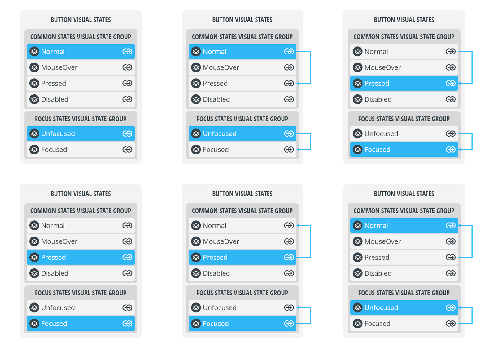
However, at a more technical level, a critical concept is that Visual State Groups also govern how Visual States are able to interface with each other:
The following rules apply to Visual States contained within a single Visual State Group:
- All Visual States within a Visual State Group are exclusive; only one Visual State within a Visual State Group can be active at a time.
- Visual States contained within a Visual State Group are able to transition between eachother via 📑 Visual State Transitions.
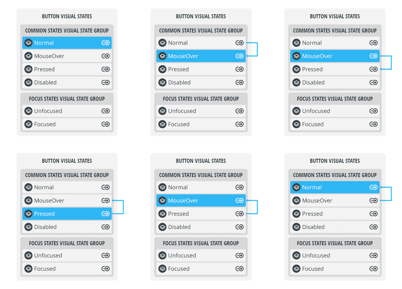
Conversely, the following rules apply to Visual States contained within different Visual State Groups:
- Visual States from different Visual State Groups are non-exclusive and can be active at the same time.
- Visual States from different Visual State Groups are not able to transition betweeen eachother.
Note
Due to the ability of Visual States from different Visual State Groups to be active at the same time, it is critical to ensure that they are set up in a way that avoids creating conflicts between multiple Visual States defining different values for the same Properties at once.
Visual States
Visual States are a collection of changes to the values of one, or many Element Properties within a Page or Element Template.
Visual States allow creators to easily create, visualize, and invoke Property-driven permutations to an interface.
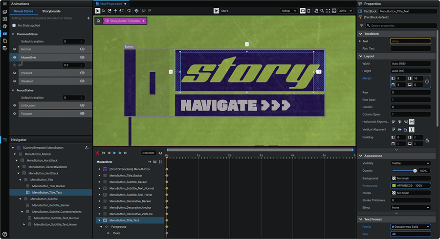
Each Visual State is accompanied by its own 📘 Animation Timeline which displays when a Visual State is selected in the 📘 Animation Panel 'Visual States' tab.
It is through this Timeline that changes to Element Property values can be keyed at the current playhead position by making changes to Property values in the 📘 Properties Panel or through manipulating Elements directly on the 📘 Stage, provided 'recording' mode is active when making these changes.
Property values within a Visual State can be keyed in the first frame of the Timeline to create a static, single-frame Visual State.
Alternatively, the entire Timeline can be leveraged to have animations either play once every time the Visual State is activated, or, in the case of a Timeline set to infinitely repeat, to play over and over again for as long as the Visual State is active.
Visual State Transitions
Within a single Visual State Group, individual Visual States can feature transitions between one-another through two different mechanisms; Visual State Group Default Transitions and Custom State-to-State Transitions:
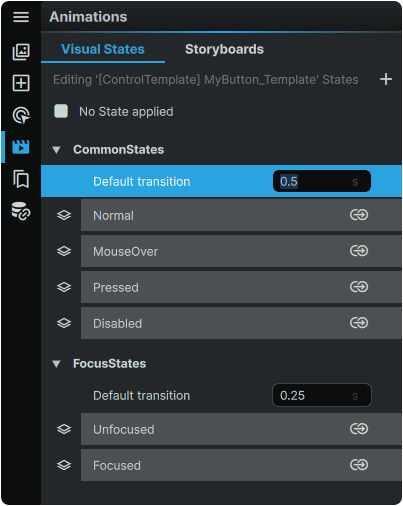
| Visual State Group Default Transitions | • By default, all Visual State Groups can be configured to automatically interpolate between any two Visual States within the same Visual State Group. Setting up this 'master' behavior requires no configuration beyond setting a custom timespan over which the interpolations take place.
• If a Visual State Group Default Transition is set, it will apply to all transitions that don't otherwise have Custom State-to-State Transitions configured.
|
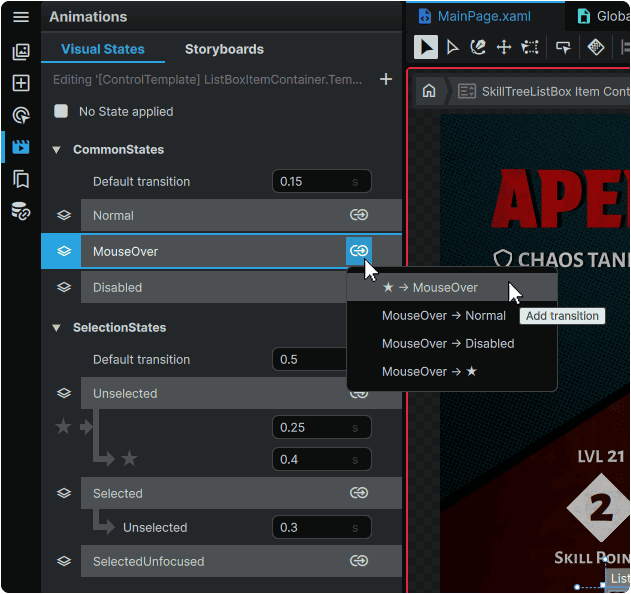
| Custom State-to-State Transitions | • Transitions between two Visual States within the Visual State Group can be set up by clicking a Visual State's ⇴ ('Add transition') button, then selecting the specific Visual State pairing to create a transition for.
• In this model, creators are able to manually key changes to Element Property values into the Visual State Transition's 📘 Animation Timeline. This allows complete control over every aspect of a transition's presentation from one Visual State to another.
• Custom Transitions exclusively govern the transition between two Visual States. Therefore, special care must be given to any differences between the last frame of the Transition, and the first frame of the destination Visual State. In many cases, to ensure a seamless transition between the Transition and the destination Visual State, these should be set to match.
• The earliest-keyed Property value in a Custom Transition's 📘 Animation Timeline will automatically interpolate from the Element's previous Property value.
• Custom State-to-State Transitions have authority over Visual State Group Default Transitions. Therefore, if a Custom State-to-State Transition is created, it will play instead of any configured Default Transition.
• When employing Custom State-to-State Transitions, the Transition Time value automatically adjusts to represent the duration of the Transition.
• When a Custom Transition is present, its Transition Time value can be adjusted and act as a shorthand for time-compressing or time-expanding the Custom Transition's duration. When making this manual adjustment, the position of the Custom Transition's keyframes will be automatically repositioned within its 📘 Animation Timeline.
|
Note
When creating a 'State-to-State' transition, the '★' icon serves as shorthand for 'any other Visual State from the same Visual State Group'.
Therefore, a ★ → MouseOver transition represents 'from any other Visual State in the Visual State Group to the 'MouseOver' Visual State'.
Default Visual States
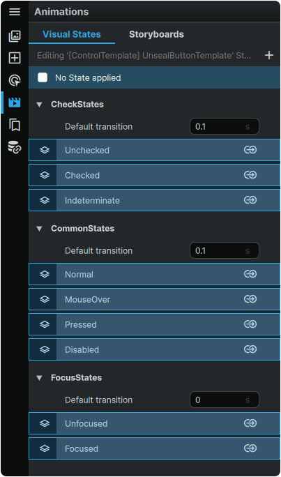
Many Element Templates within the framework come pre-equipped out-of-the-box with Default Visual State Groups, each containing Default Visual States responsible for handling many of the particular Element's expected interaction states.
For example, the 📘 CheckBox Element not only comes with Normal, MouseOver, Pressed, Unfocused, Focused, and Disabled Visual States, but also comes with Checkbox-specific Unchecked, Checked and Indeterminate Visual States, each of which can have their appearance customized.
It is important to note that unlike 📑 Custom Visual States, these Visual States (and their associated Visual State Groups) cannot be renamed, removed, or expanded with further Visual States.
However, where they present incredible power, is that Default Visual States do not just include pre-made slots in which Property value changes can be made, but come equipped with an entire back-end system that handles the functional layer of invoking each Visual State.
What this means at a practical level for example, is that the 📘 CheckBox Element Checked State will automatically activate when the CheckBox is 'Checked', and switch to the Unchecked Visual State when it is 'Unchecked', without any further work required.
Leveraging Default Visual States therefore allows creators to exclusively focus on customizing the appearance of each Visual State without manually having to create the mechanical layer to switch from one Visual State to another.
The Element Properties linked to its Visual States can additionally be used in conjunction with 📘 Triggers, and used as hooks to fire other events in the interface.
Custom Visual States
Whether in a Page, or within an Element Template, an unlimited amount of Custom Visual State Groups and Custom Visual States can be created.
These can be used to store a multitude of completely custom Element Property configurations, that can be easily switched between.
Additionally, these can also be used to create interactivity states with levels of customization exceeding those offered by the built-in 📑 Default Visual States.
Custom Visual State Groups
New Custom Visual State Groups can be added by clicking on the + (Add Visual State Group) icon in the upper right of the Visual States Panel:
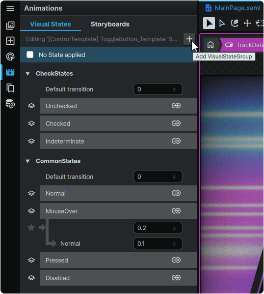
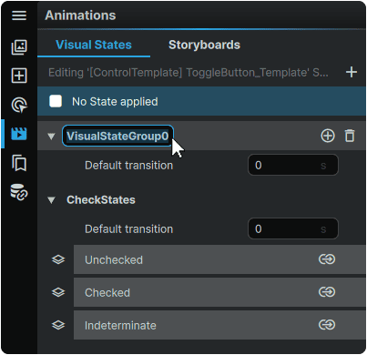
Any Custom Visual State Group can be renamed by double-clicking on it:
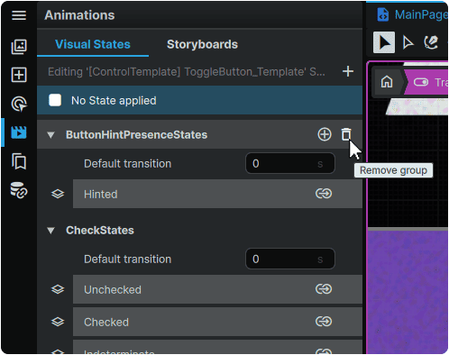
A Custom Visual State Group can be deleted by hovering over it and clicking the 🗑 (Remove Group) icon:
Note
Deleting a Visual State Group will also delete any 📑 Custom Visual States contained within it.
Custom Visual States
An unlimited amount of Custom Visual States can be added to any Visual State Group by hovering over it, and clicking on the (+) (Add State) icon:
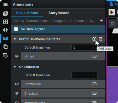
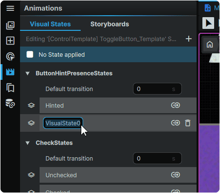
Any custom Visual State can be renamed by double-clicking on it:
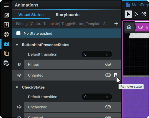
A Custom Visual State can be removed by hovering over it, and clicking the 🗑 (Remove State) icon:
Once Visual States have been created, the transitions between them can be configured through 📑 Visual State Transitions.
Invoking Custom Visual States
One major way in which Custom Visual State Groups and Custom Visual States differ from their 📑 Default Visual States counterparts, is that the conditions through which a Custom Visual State are activated, are also custom-built.
To accomplish this, Custom Visual States can be invoked with any number of 📘 Triggers, by setting a GoToStateAction Action, and selecting the Visual State by name.
Once complete, the Visual State will become activated once the Trigger's conditions are met.