

📘 Behaviors
🏘️ NoesisGUI ▸ 🏠 Noesis Studio ▸ 📘 Working With Interactivity ▸ 📘 Behaviors
Overview
In the framework, Behaviors provide a way to extend the functionality of Elements beyond the capabilities of the original features they provide by default.
Adding a Behavior to a Noesis implementation allows these extra pieces of functionality to be easily applied and spread to Elements directly from Studio without any coding required.
Noesis Studio comes pre-packaged with a selection of 📑 Included Behaviors, as well as the ability for Programmers to create completely custom new ones through NoesisGUI's extensibility features.
Anatomy of a Behavior
Mechanically, Behaviors work by 'attaching' to an Element, which when performed, provides it with the additional functions granted by the Behavior.
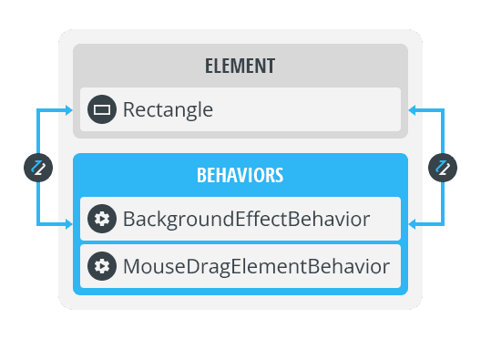
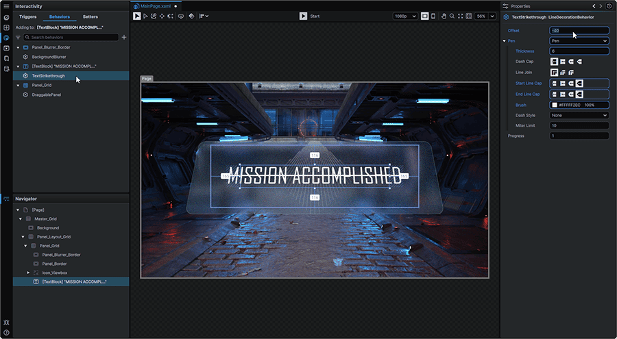
Once a Behavior has been added to an Element, its particular functions can then be customized and fine-tuned through its 📘 Properties Panel.
It is important to note that Behaviors that are added to an Element are bound to it. As such, moving or copying an Element within a Project will carry the Behavior with it. In similar fashion, deleting an Element from any scope will also permanently remove its associated Behaviors.
Behavior Configuration
Creating Behaviors
Any new Behaviors beyond the 📑 Included Behaviors can be created in code-behind, and included into Noesis integrations to be made accessible to Noesis Studio creators via the 'Behaviors' tab of the 📘 Interactivity Panel. From there, they can then be attached to Elements through 📑 Behavior Assignment.
Behaviors can be created following the techniques outlined in 📘 Behaviors Architecture.
Behavior Assignment
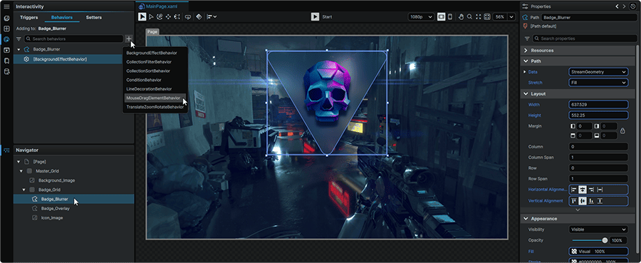
One, or multiple Behaviors can be bound to an Element by selecting the Element on the 📘 Stage or in the 📘 Navigator Panel.
Once selected, from the Behaviors tab found within 📘 Interactivity Panel, the + (Add Behavior) icon can then be clicked to attach a Behavior to the selected Element.
Behavior Properties
Once a Behavior has been assigned to an Element, selecting the Behavior in the 'Behaviors' tab of the Interactivity Panel will unveil a set of Properties in its 📘 Properties Panel, from where it can be customized further.
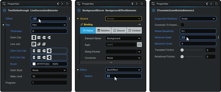
Included Behaviors
Studio comes bundled with a set of Behaviors that can be assigned to Elements in a Noesis interface right out-of-the-box:
BackgroundEffect Behavior
The BackgroundEffect Behavior allows the application of an Effect to a designated area on-screen.
The BackgroundEffect Behavior works through an interaction between two Elements, where:
- One Element is designated as the 'provider' of the Effect. This is the Element that the Behavior is 'attached' to and whose geometry on-screen will be used as the surface area to apply the Effect to as a result of 📑 Behavior Assignment.
- One Element is designated as the 'receiver' of the Effect. This is the Element on which the chosen Effect will be visible.
For example, to blur a 'Background' Element exclusively in the area located under an overlapping 'Panel':
- The BackgroundEffect Behavior is applied to the Panel, and a 'Blur Effect' is chosen as its 'Effect' Property.
- The 'Background' is set as the BackgroundEffect Behavior's 'Source' Property through a Binding.
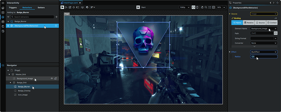
The 🎓 Creating Background Blur Effects in Noesis Studio tutorial can be followed, and covers a practical demonstration of this specific usage scenario.
CollectionFilter Behavior
The CollectionFilter Behavior can be attached to 📘 Collection Elements, and be used to filter out items from a Data-driven array without requiring any modifications to the 📘 Data Sources used.
The CollectionFilter Behavior requires code-behind to leverage its functions.
Learn more about the 📘 CollectionFilterBehavior Class.
CollectionSort Behavior
The CollectionSort Behavior can be attached to 📘 Collection Elements, and be used to sort an array of Data-driven items within the Collection Element without requiring any modifications to the 📘 Data Sources used.
The CollectionSort Behavior requires code-behind to leverage its functions.
Learn more about the 📘 CollectionSortBehavior Class.
LineDecoration Behavior
The LineDecoration Behavior is a special Behavior that is exclusively used on the 📘 TextBlock Element, and allows text to be decorated with a customizable line style that can be used as an underline, an overline, a highlight, a strikethrough, and many other creative applications.
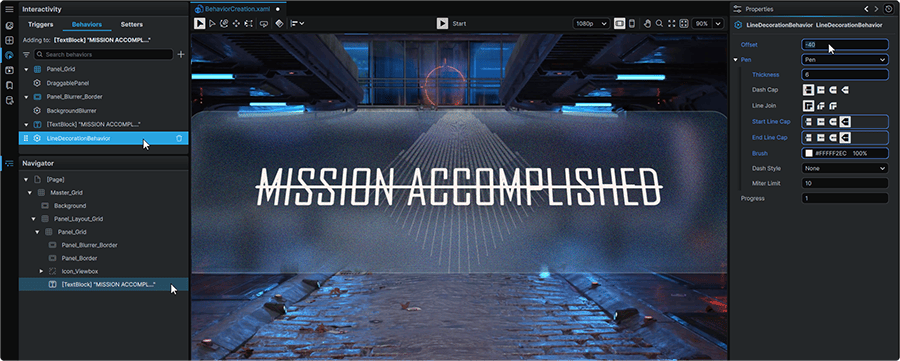
Once attached to a TextBlock, it offers a suite of Properties that allow fine-tuning of its presentation:
Offset
|
• Allows setting the LineDecoration to render at a specific distance in pixels away from the TextBlock's baseline.
• Positive values offset the LineDecoration downwards from the TextBlock's baseline, and negative values upwards.
|
Pen
|
• Allows setting the mechanism through which the LineDecoration is drawn, and by extension, the customization options available for the LineDecoration style.
|
Pen: Thickness
|
• Allows setting the height of the LineDecoration in pixels.
|
Pen: Dash Cap
|
• Allows setting set the Pen 📘 Stroke Dash Cap style.
|
Pen: Line Join
|
• Allows setting the Pen 📘 Stroke Line Join style.
|
Pen: Start Line Cap
Pen: End Line Cap
|
• Allows setting the Pen 📘 Stroke Start Line Cap / Stroke End Line Cap style.
|
Pen: Brush
|
• Allows setting the appearance of the LineDecoration between rendering a Solid Color Brush, a Linear Gradient Brush, a Radial Gradient Brush, an Image Brush, or a Visual Brush.
|
Pen: Dash Style
|
• Allows the LineDecoration to be converted from a solid line into a dashed line.
|
Pen: Miter Limit
|
• Allows setting the Pen 📘 Stroke Miter Limit.
|
Progress
|
• Allows setting the percentage of the LineDecoration drawn relative to its total length, calculated as a percentage value between 0 (0%) and 1 (100%).
• In practice, mechanically similar to adjusting the Path Trim End value of a 📘 Path Trim Start / Path Trim End / Path Trim Offset in the context of a Path.
|
MouseDragElement Behavior
The MouseDragElement Behavior allows designated Elements on-Stage to be dragged around the screen by end-users.
Once attached to an Element, it offers a suite of Properties that allow a fine-tuning of its functions:
Constrain to Parent Element Bounds
|
• When set to 'on', prevents end-users from dragging the designated outside of the bounds of its 'parent' Element.
|
TranslateZoomRotate Behavior
The TranslateZoomRotate Behavior, as the name implies, allows designated Elements on-Stage to be positionally moved, rotated, and/or scaled on-screen by end-users.
Once applied to an Element, it offers a suite of Properties that allow a fine-tuning of its functions:
Supported Gestures
|
• Allows setting which manipulations can take place on the Element the Behavior is attached to, between None, TranslateX, TranslateY, Translate (X and Y), Rotate, Scale, and All.
|
Wheel Sensitivity
|
• Allows setting a rate at which a MouseWheel (Up/Down) input increases or decreases the values of any Properties driven by the TranslateZoomRotate Behavior, as calculated as a value between 0 and ∞ where the higher the value, the higher the sensitivity of the action, resulting in larger and faster increments throughout actuation.
|
Minimum Scale
Maximum Scale
|
• Allows setting the Minimum and Maximum Scale relative to the designated Element's original size, as calculated as a percentage value between 0 and 1 (100%).
• For example, to allow an Element to scale to twice of its original size, a 'Maximum Scale' value of 2 would be set.
|
Translate Friction
|
• Primarily used for touch input, allows setting the 'deceleration rate' of translate transforms applied to the Element.
• Calculated as a value between 0 and 1. The closer the value is to 0, the more the translation will continue upon completion of the interaction. The higher the value, the faster the translation will come to a complete stop.
|
Rotational Friction
|
• Primarily used for touch input, allows setting the 'deceleration rate' of rotational transforms applied to the Element.
• Calculated as a value between 0 and 1. The closer the value is to 0, the more the rotation will continue upon completion of the interaction. The higher the value, the faster the rotation will come to a complete stop.
|
Constrain to Parent Element Bounds
|
• When set to 'on', prevents end-users from dragging, scaling, or rotating the designated Element beyond the bounds of its 'parent' Element.
|