


📘Properties Panel
🏘️ NoesisGUI ▸ 🏠 Noesis Studio ▸ 📘 Properties Panel
Overview
The Properties Panel serves as the central hub within Noesis Studio to inspect, or modify values throughout the creation process, and forms the basis of the intentional crafting of a user interface's presentation and functionality.
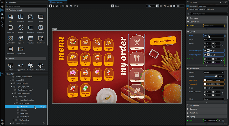
Although a subset of mechanics are universal across the Properties Panel, selecting different item types within the visual editor will all provide their own variety of options to configure; with each tailored to the specific functionality offered by each of Noesis Studio's various feature groups.
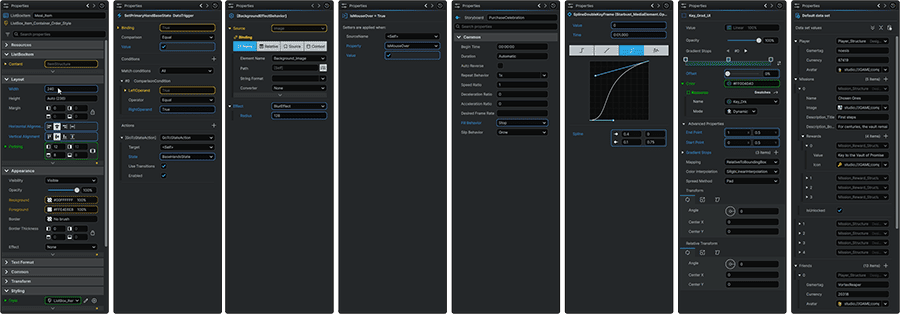
Universal Mechanics
Exposing the Properties Panel
The following items within the application's interface offer their very own Properties Panel when clicked within the visual editor:
Elements clicked in the 📘 Navigator Panel or on the 📘 Stage.
|
Triggers clicked in the 📘 Triggers tab of the 📘 Interactivity Panel.
|
Behaviors clicked in the 📘 Behaviors tab of the 📘 Interactivity Panel.
|
Setters clicked in the 📘 Setters tab of the 📘 Interactivity Panel.
|
Storyboards clicked in the 📘 Storyboards tab of the 📘 Animation Panel.
|
Keyframes clicked in the 📘 Animation Timeline.
|
Resources clicked in the 📘 Resources Panel.
|
Data Structures, Enumerations, and Data Sets clicked in the 📘 Data Panel.
|
Value Source
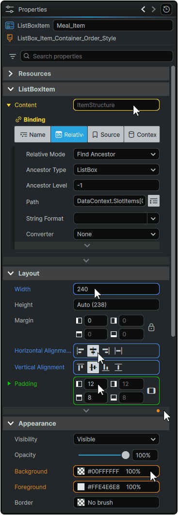
The Properties Panel includes an incredibly useful system of color-coding to help understand the source of any Property's Value:
- Blue: Value comes from a creator-input Local Value
- Yellow: Value comes from a Binding
- Orange: Value comes from a Style
- Green: Value comes from a Resource
The blue and orange color codes signalling that a Local Value or a Style Value is present also applies to expandable/collapsible sections within the Properties Panel. These can be used to easily identify if any Properties within a collapsed section contain Properties values of these types.
Value Overrides
It is important to note that the values displayed in the Properties Panel can be dynamically overridden from other sources. The end-value that is ultimately passed onto the interface is determined by the following order of priority, where sources at the top of list have authority over sources at the bottom of list:
- Animation Value
- Local Value / Binding Value
- Template Trigger Value
- Template Local Value
- Style Trigger Value
- Style Setter Value
- 'Parent' Element-Inherited Value
- Default Value / Fallback Value
Property Value Text Search
Many Property fields come in the form of a searchable dropdown called a ComboBox.
The list of available values to pick from, can be searched by clicking on the field, and typing into it to return a list of values matching the input text, from where an item can be selected.
Numerical Incrementation
In the case of a Property whose values are numerical in nature; in addition to directly inputting a value; they can easily be incremented up or down by clicking on the input field, and scrolling the MouseWheel
- MouseWheel (Up/Down) increments the current value up/down by 1.
- Shift + MouseWheel (Up/Down) increments the current value up/down by 10.
Properties in Animation
When within the 📘 Animation Timeline, with 'recording' mode active, simply changing a Property value in the Properties Panel will automatically create a Keyframe at the current Playhead position with the newly-input value.
Multi-Selection Value Editing
When 📘 Multi-Selecting Elements, any Properties shared between the selected Elements can be edited at once.
When each selected Element share the same value for a Property, their common value will be displayed in their 'shared' Properties Panel.
When the selected Elements contain different values, their 'shared' Properties will display a --- value.
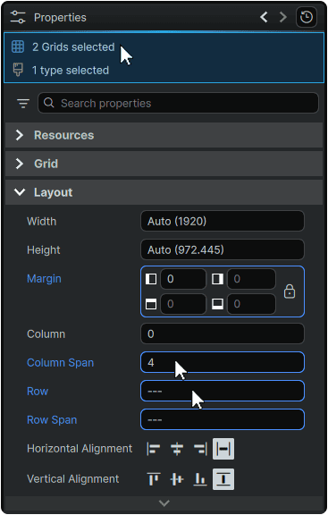
Editing any displayed Property value in this mode will change the them simultaneously across all selected Elements.
Creating, Editing, and Jumping to Resources
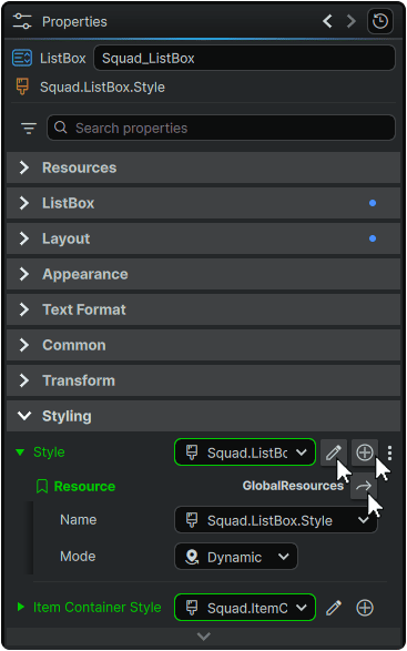
Any Property can be populated by a Resource value.
- The ⊕ (Create New) icon can be selected to create a new Style or Template for the Element (if applicable). Creating a new Resource from here will immediately apply the Resource, and in the case of Styles and Templates, will also open it in-place as a blank Style or Template to begin from.
After applying a Resource as a Property's value, two manipulation options then become available.
- The 🖉 (Edit) icon can be clicked to edit a Style or Template Resource in-place in its current context on the 📘 Stage.
- The ➦ (Go To Resource) icon can be clicked to jump to the Resource's location within the 📘 Resources Panel.
Inline Resources
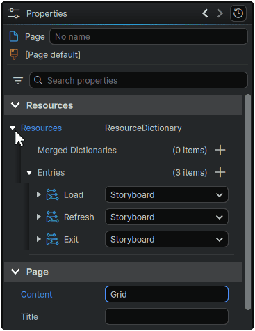
Within the framework, in addition to storing Resources within the 📘 Application GlobalResources Dictionary, and 📘 Self-Managed ResourceDictionaries, it is additionally possible to store Resources as 📘 Page, Component, or Element Level Resources.
In the 'Resources' section of the Properties Panel, these can be directly inspected, added, Merged, or removed without having to perform these operations in the 📘 Resources Panel.
Searching and Filtering
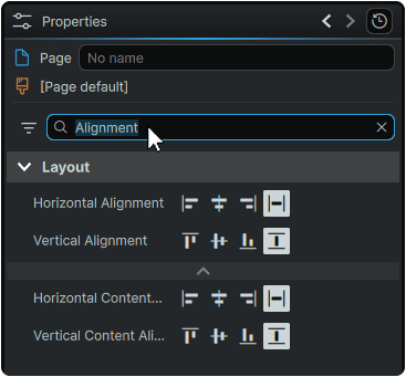
By using the search function at the top of the Properties Panel, the list of Properties visible in the Panel can easily be filtered down by typing in the input field.
This filtering can be cleared at any time by either removing the text from the field, or pressing on the X (Clear Search) icon on the right of the field.
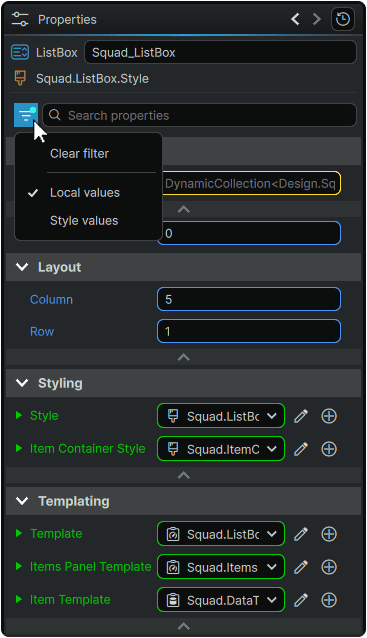
Furthermore, to filter down to Properties in which their values are either Populated by Local values or Style values, the (Filter) icon can be clicked, then selecting a filter type.
This filter be cleared at any time by re-opening the Filter menu, and selecting 'Clear Filter'.
Selection History
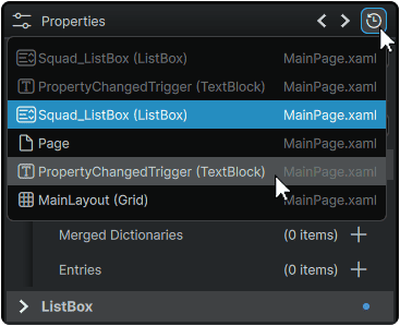
In the header of the Properties Panel can be found a handy feature allowing to retrace the history of Elements that have been selected since the application started. This makes it easy to navigate back-and-forth between visited items in the visual editor.
A list of selected Elements can be found by clicking on the ↺ (Selection History) icon from where any item can be clicked to immediately jump to it.
Alternately, it is possible to jump back and forth chronologically:
- To the previous item in the chronology, by clicking the ❮ (Previous Selection) icon, or by pressing Alt + ArrowKey(Left) on the keyboard.
- To the next item in the chronology, by clicking the ❯ (Next Selection) icon, or by pressing Alt + ArrowKey(Right) on the keyboard.
⋮ (3-Dot) Menu Functions
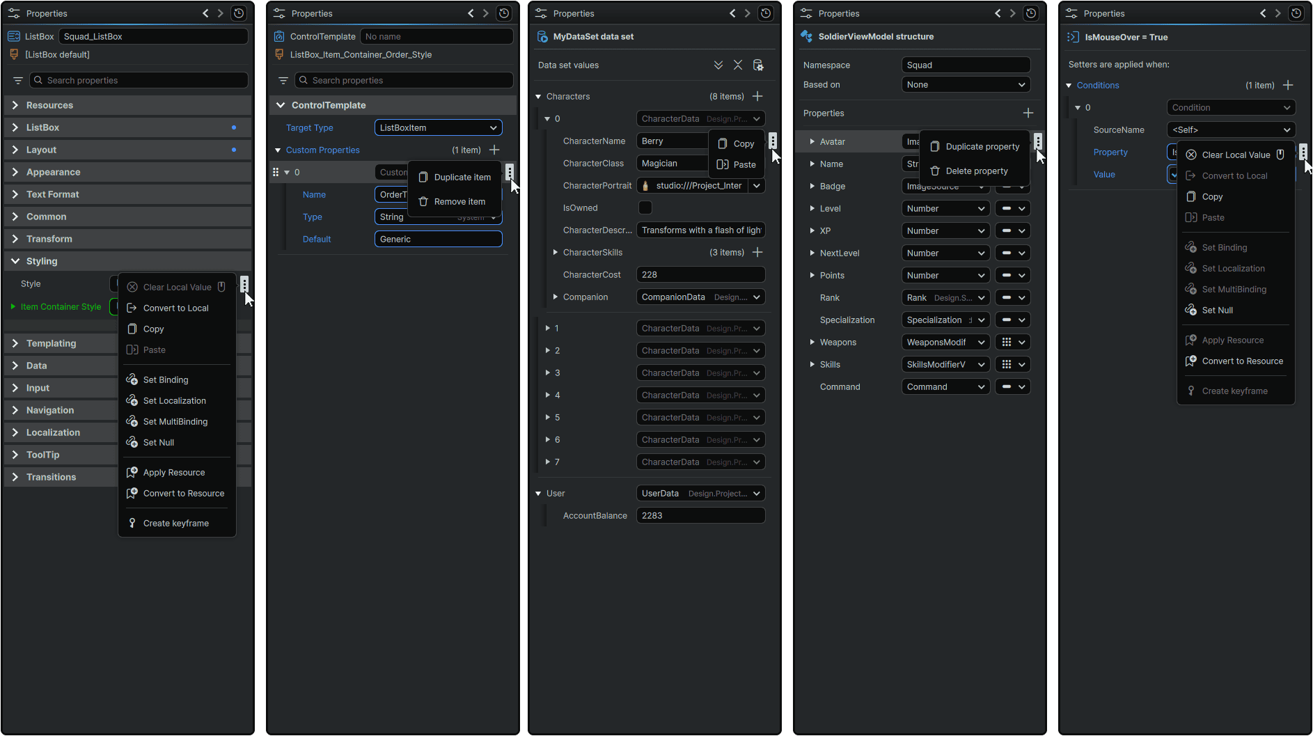
Almost all Properties, sub-Properties, and even certain Property categories in the Properties Panel offer a ⋮ (3-Dot) menu that appears on-hover, and when clicked, displays a context menu packed with a suite of functions that can be employed to directly influence the Property and its value.
The list of available options is always context-dependent, and the options offered will differ based on the selected item in the visual editor.
Clear Local Value
|
• Allows any Property can be returned to its default value.
• Can also be performed by a press of the MiddleMouse whilst hovered over the Property's value.
|
Convert to Local Value
|
• Allows any Property to have its Binding, Style, or Resource link cleared, and converted into a Local Value.
|
Copy
Paste
|
• Allows any Property's or sub-Property's values to be copied into the clipboard, or to have a clipboard value pasted as its new value.
|
Delete
|
• Allows any custom Property entry to be deleted from the list of Properties (if applicable).
|
Duplicate
|
• Allows any custom Property and its values to be duplicated into the same list of Properties.
|
Set Binding
|
Allows a Property's value to be dynamically-populated from a chosen source:
• The Name tab allows a Property's value to be populated from another named Element in the scope.
• The Relative tab allows a Property's value to be populated from one of its own Property values, or from Element Properties above it in its own tree. (for example, if within a Button Template, binding to the Button's 'Content' Property value outside of the Template.)
• The Source tab allows a Property's value to be populated from a 'default' Data Context source, and is most commonly used to set a Resource as the Data Source.
• The Context tab allows a Property's value to be populated from Data Property values set in the Project's active Data Context, as configured in 📘 Working With Data.
|
Set Localization
|
• Allows a Property's value to be set to a Localization key as configured in 📘 Localization.
|
Set MultiBinding
|
• Allows a Property's value to be dynamically populated as a result of multiple Bindings configured to interact with eachother to produce a single output value.
|
Apply Resource
|
• Allows a Property's value to be set from a Resource's value as configured in 📘 Adding Resources.
|
Convert to Resource
|
• Allows a Property's current value to be converted into a re-usable Resource of the same type as the Property's value.
|
Create Keyframe
|
• When within the 📘 Animation Timeline, with 'recording' mode active, creates a Keyframe with the Property's current value at the current Playead position.
|
Set Null Value
|
• Allows a Property's value to be set to {null}, which serves to represent a true 'empty' value for the Property.
In practice, this allows, for example in the case of a numerical Property, a distinction between a value of '0' and 'no value present'.
|
Universal Panels
- 📘 Navigator Panel
- 📘 Properties Panel
- 📘 Toolbox
- 📘 Stage Preview Toolbar
- 📘 View Toolbar
- 📘 Animation Timeline
📍 On this page