


📘 Navigator Panel
🏘️ NoesisGUI ▸ 🏠 Noesis Studio ▸ 📘 Navigator Panel
Overview
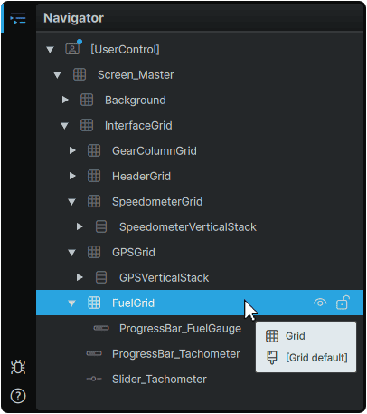
The Navigator Panel, Studio's equivalent to the 'Layers Panel' in many popular design applications, serves as the heart of interface composition within the visual editor, and provides an itemized, hierarchical list of all Elements found within the active document, and by extension, which Elements are present on the 📘 Stage.
Mechanics
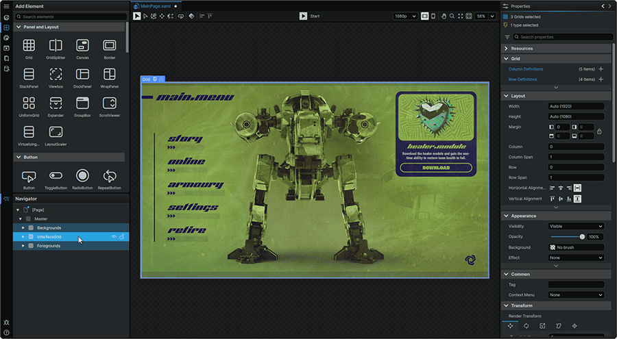
In Noesis Studio, Elements in the Navigator are processed in a way in which the Elements placed in the 'bottom' in the Navigator Panel, are visually rendered at the 'top' on the 📘 Stage.
For example, to render an interface 'sandwiched' between a Background layer and a Foreground overlay; the 'Background' would be placed at the 'back' of the Navigator Panel, the 'Foreground' at the 'front', and the interface in-between.
Element Operations
Adding, Nesting, and Ordering Elements
Elements can be added to a composition by clicking-and-dragging an Element from the 📘 Add Element Panel into the Navigator.
Many Elements within the framework allow Elements to be nested directly within others to create groups of Elements, and where each 'child' Element will be influenced by the particular mechanics of the 'parent' Element it is placed within. Elements can be re-ordered by clicking-and-dragging an Element already present within the hierarchy, into another existing Element.
It is also possible to click-and-drag an Element from the 📘 Add Element Panel directly onto the 📘 Stage. In this scenario, the added Element will be added to the Navigator into the Element whose hitbox it is dropped over on the Stage.
Renaming Elements
Any Element can be renamed by double-clicking on it in the Navigator, and inputting a new name.
This custom name can then be leveraged throughout a Project in the context of powerful Bindings, through which any Element can parse another's 📘 Properties Panel values by referring to it by its given name.
An Element can also be renamed by selecting it, then pressing F2 on the keyboard.
A rename operation can be cancelled at any time during input, and reverted to its previous identifier by pressing Esc whilst the input field is active.
Locking Elements
Locking any Element can be accomplished by hovering over it in the Navigator, then clicking its ⚿ (Lock/Unlock) icon. This will prevent it from being selectable in the Navigator, and on the 📘 Stage. Locking any Element, also applies the lock to any of the 'children' Elements contained within it in the hierarchy.
This function can be especially useful during creation when looking to manipulate Elements by clicking on them directly on the 📘 Stage, without having certain Elements visually placed 'above' them intercept mouse clicks.
Elements can be unlocked at any time by clicking on the ⚿ (Lock/Unlock) icon once again.
Note
Locking an Element only applies to operations in the visual editor, and will not prevent an end-user from interacting with the Element during Playback.
Multi-Selecting Elements
Multiple Elements can be selected at once via two methods:
- Holding Ctrl and clicking on Elements, adds each individually selected Element to the multi-selection.
- Holding Shift and clicking any two Elements will select both clicked Elements, and add all Elements in-between in the hierarchy to the multi-selection.
Design-Time Visibility
Hovering over any Element, and clicking on its 👁 (Hide/Show) icon, will hide the Element on the 📘 Stage until it is clicked back on again.
Toggling an Element's Design-Time Visibility will hide the Element and any of its children during editing, but will not apply during Page Playback when activated via the 📘 Play/Stop function.
If hiding an Element during Playback is desired, setting the Element's 'Visibility' Property via its 📘 Properties Panel to Hidden or Collapsed depending on desired effect on layout, should be used instead.
Element Actions
Right-clicking on any Element in the Navigator will unveil a context menu full of useful actions that can be performed on the selected Element. They are divided into the following categories:
Edit
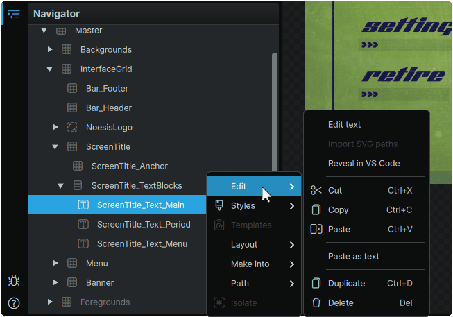
Edit Text
|
• Activates on-Stage Editing for Elements containing a Text/Content field.
|
Import SVG Paths
|
• For Elements capable of receiving children, allows navigation to an SVG file, from where it can be imported it as vector Paths. SVG files should be prepared according to the settings outlined in 📘 Importing From an SVG File.
|
Reveal in VSCode
|
• Opens the current document in VSCode, and navigates to the line of the selected Element.
Recommended to be used in tandem with the ↗️ NoesisGUI XAML Tools VSCode Extension.
|
Cut, Copy, Paste
|
• Allows an Element to be Cut (Copied and Removed), Copied (Copied and Retained), or Pasted from one location in the hierarchy to another.
|
Paste as Text
|
• Pastes any text content currently present in the clipboard as a new 📘 TextBlock Element into the same 'parent' Element as the one the action was initiated from.
|
Duplicate
|
• Duplicates the selected Element, and places it at the bottom of the hierarchy within their common 'parent' Element.
• Elements can additionally be duplicated by selecting one, or many Elements, and pressing Ctrl + D on the keyboard.
|
Delete
|
• Deletes the selected Element from the hierarchy.
• Elements can additionally be deleted by selecting one, or many Elements, and pressing Del on the keyboard.
|
Styles & Templates
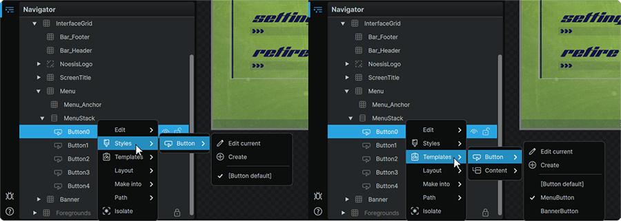
The Styles and the Templates context menus allow for quick creation, assignment, and editing of any Styles or Templates of the Element's type.
Creating a Style or a Template from this menu, will provide a blank Style or Template to begin from. This diverges from the 📑 Make Into option, which for Styles, will create a new Resource with all of the Element's already-populated 📘 Properties Panel values as part of the new Resource.
Layout
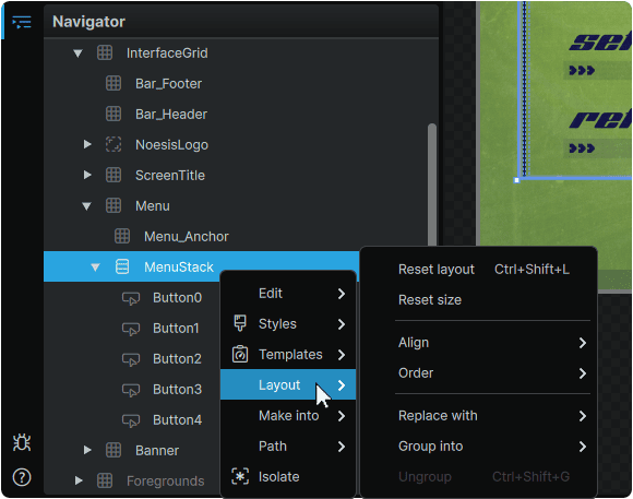
Reset Layout
|
• Resets the Element's Horizontal Alignment, Vertical Alignment, and Margin 📘 Properties Panel values of the Element back to their default values.
• This action can additionally be performed by selecting one, or many Elements, and pressing Ctrl + Shift + L on the keyboard.
|
Reset Size
|
• Resets the Element's Width and Height 📘 Properties Panel values back to their default values.
|
Align
|
• Allows the Element's Horizontal Alignment and Vertical Alignment 📘 Properties Panel values to be set directly from the context menu.
|
Order
|
• Allows an Element to be moved up or down by one position within the hierarchy, or to be sent all the way to the 'back', or all the way to the 'front'.
• These actions can also be performed by selecting one, or many Elements, and pressing on the keyboard:
{ to move an Element down by one, or } to move an Element up by one.
Ctrl + { to move an Element to the 'back' of the hierarchy or Ctrl + } to move an Element to the 'front' of the hierarchy.
|
Replace With
|
• Replaces the selected Element in-place with one of a number of 📘 Panel and Layout Elements.
|
Group Into
|
• Groups one, or many selected Elements into one of a number of 📘 Panel and Layout Elements.
• This action can additionally be performed by selecting one, or many Elements, and pressing Ctrl + G on the keyboard to automatically group them into a 📘 Grid Element.
|
Ungroup
|
• With a 'parent' 📘 Panel and Layout Element selected, removes itself from the hierarchy, leaving all children in-place in the Navigator, whilst conserving their position on the 📘 Stage.
• This action can additionally be performed by selecting a 'parent' 📘 Panel and Layout Element, and pressing Ctrl + Shift + G on the keyboard.
|
Make Into
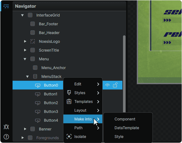
Allows an Element, and any of its children to be directly saved into a Component, Data Template, or a Style, whilst conserving all of their 📘 Properties Panel values.
For Data Templates and Styles, once this action is selected, the ability to name the Resource, and to select a Dictionary to save it within will be offered. These can be then be manipulated at any time from 📘 Resources Panel
Performing this action will automatically transform the Element and any applicable children in the Navigator into the selected type.
Path
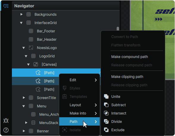
Convert to Path
|
• Converts a selected 📘 Shape into a vector Path in-place.
|
Flatten Transform
|
• Converts the modified Render Transform 📘 Properties Panel values of a 📘 Path Element into the new 'base' values for the Element following the mechanics outlined in 📘 Flattening Transforms.
|
Make Compound Path
Release Compound Path
|
• The Make Compound Path option allows multiple Paths to be selected and converted into a single 📘 Path Element following the mechanics outlined in 📘 Compounding Paths.
• The Release Compound Path option can be used to reverse this operation at any time, and return them to their original individual Paths following the mechanics outlined in 📘 Breaking Up Compound Paths.
|
Make Clipping Path
Release Clipping Path
|
• The Make Clipping Path option allows multiple Paths to be selected, and for one to clip another following the mechanics outlined in 📘 Clipping Paths.
• The Release Clipping Path option can be used to reverse this operation at any time, and return them to their original individual Paths following the mechanics outlined in 📘 Releasing Clipping Paths.
|
Unite
Subtract
Divide
Exclude
|
• When multiple Paths are selected, allows for granular selection of how they are combined into a new composite 📘 Path Element following the mechanics outlined in 📘 Boolean Operations.
|
Isolate
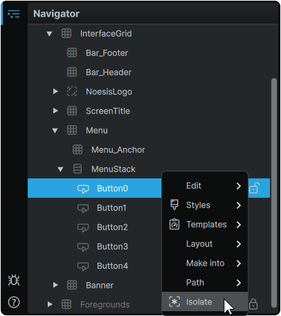
Performs the inverse of the 📑 Locking Elements function, and isolates a selected Element and its 'children', rendering all other Elements not-clickable on the 📘 Stage until either the isolation is toggled off by clicking it again, or by isolating a different Element.
Universal Panels
- 📘 Navigator Panel
- 📘 Properties Panel
- 📘 Toolbox
- 📘 Stage Preview Toolbar
- 📘 View Toolbar
- 📘 Animation Timeline