

📘 Interactivity Panel
🏘️ NoesisGUI ▸ 🏠 Noesis Studio ▸ 📘 Interactivity Panel
Overview
The Interactivity Panel serves as the command center within Studio to create, edit, and manage the interactive layer of any chosen scope, whether at the Page, Element, Template, or Style level.
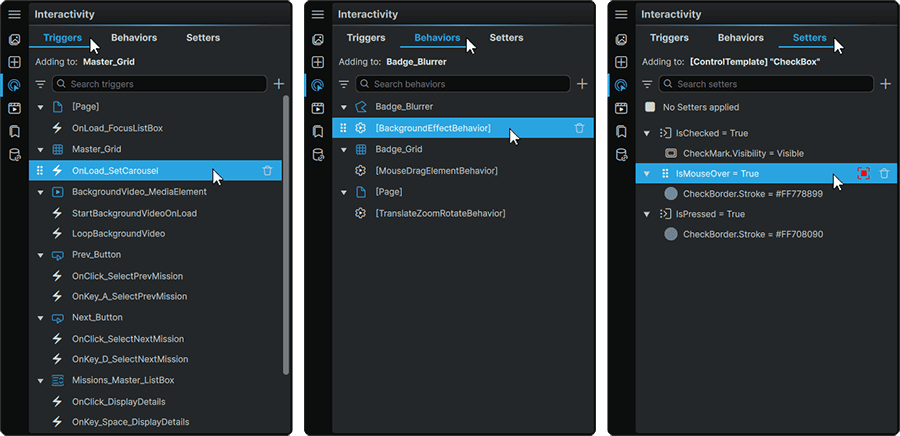
The concept of 'interactivity' in the framework not only applies to provoking changes in the UI as the result of end-user-driven interactions (such as a mouse-click or key press), but also includes the configuration of how the interface changes and adapts against itself (such as when encountering a specific Data Value, or detecting a particular screen size).
The Interactivity Panel offers three different tabs, each serving a distinct feature-set:
- 📑 Triggers allow the creation of custom events which can produce changes within the current scope.
- 📑 Behaviors can be used to extend the functionality of Elements without the need to write any code.
- 📑 Setters can be used to change a Property value within a Template or Style, as a result of change to a monitored Property value or Data Value.
Triggers
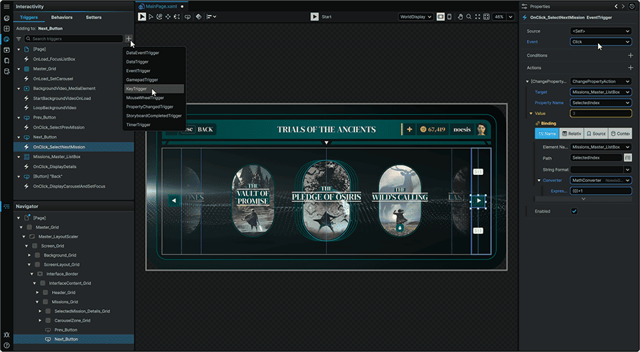
📘 Triggers are applied to individual Elements within a scope, and allow various 📘 Trigger Types to be added to them.
Once a Trigger Type is selected, the Trigger can be configured to produce a change in the UI or in the Project's Data, in the form of 📘 Action Types which will fire off once both the Trigger and any optional 📘 Conditions have been met.
Triggers can be set up or modified following the steps outlined in 📘 Trigger Configuration.
Note
Triggers are bound to the Element they have been added to. As such, moving or copying an Element within a Project will carry the Trigger with it. In similar fashion, deleting an Element from any scope, will also permanently remove its associated Triggers.
Behaviors
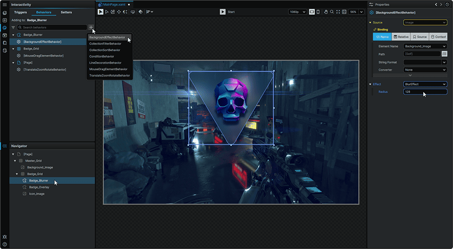
📘 Behaviors provide a powerful suite of mechaninisms that can be used to extend the suite of functionality offered by Elements without the need to write any code. They can either be applied to Elements directly, or within a Style, using the principles outlined in 📘 Behaviors Architecture.
In Noesis Studio, Behaviors can be set up or modified following the steps outlined in 📘 Behavior Configuration.
To add or to edit an Element-based Behavior, an Element must first be selected on the 📘 Stage or in the 📘 Navigator.
Within a Style, a new Behavior can be added at any time whilst within the Style, visible by the orange outline around the 📘 Stage.
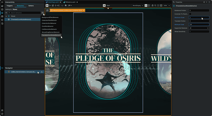
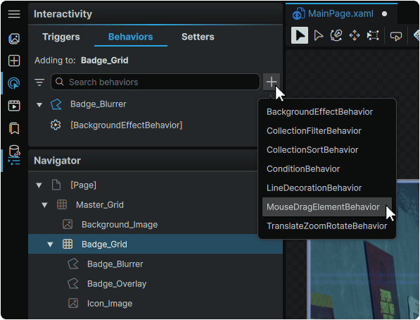
Whether on an Element, or within a Style, a Behavior can then be added by clicking the + (Add Behavior) icon at the top of the tab, and selecting the type of Behavior to add.
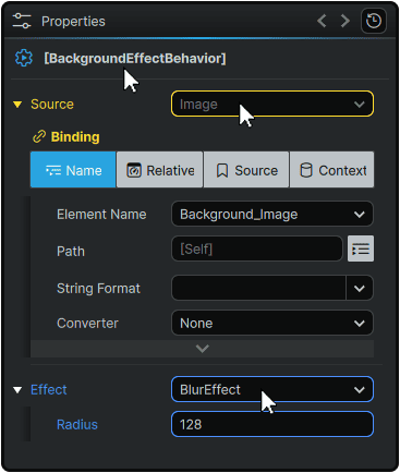
Once a Behavior has been added, and selected in the listing, it can then be fully customized through its 📘 Properties Panel.
Note
Behaviors that are added to an Element, are bound to it. As such, moving or copying an Element within a Project will carry the Behavior with it. In similar fashion, deleting an Element from any scope, will also permanently remove its associated Behaviors.
Setters
📘 Setters are exclusively available within Element Templates and Element Styles, and allow for changes to Property values to take place within the current scope, either when a monitored Element's Property changes, or when a specific change in Data is detected.
Setters can be set up or modified following the steps outlined in 📘 Setter Configuration.
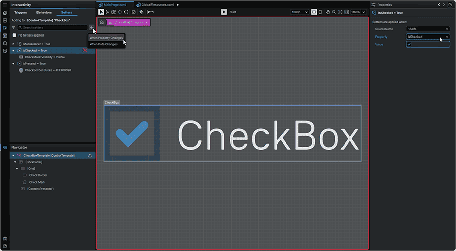
Selecting a Setter from the listing will produce two results:
- The on-screen changes dictated by the Setter if its conditions are met, will be displayed on the 📘 Stage.
- The Setter will be set into 'Recording Mode', and the 📘 Stage will be adorned with a red outline. Similar to when keying changes within 📘 Visual States, when in this mode, any changes made within an Element's 📘 Properties Panel or made directly on-Stage using any of the 📘 Toolbox tools, will be 'keyed' as a new Property value in the Setter. As a result of this configuration, these values will change on-screen if and when the Setter's conditions are met.
Note
Setters are only available to use within Templates and Styles.
Universal Interactivity Operations
Although the functions available across the 📑 Triggers, 📑 Behaviors, and 📑 Setters differ from tab-to-tab, they share a suite of mechanics common across them:
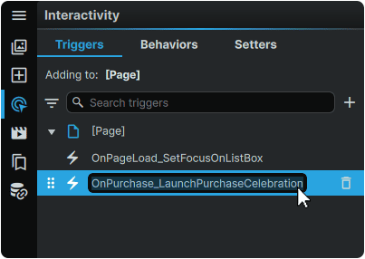
Renaming Items
Any Trigger, Behavior, or Setter can be renamed at any time by double-clicking on it, and inputting a custom name. This name can then be used when 📑 Filtering Items By Name
Filtering Items by Name
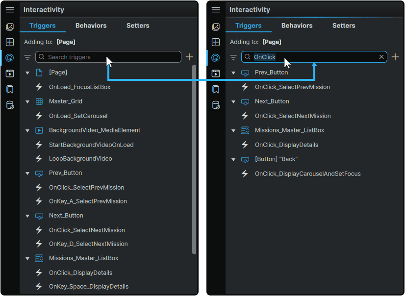
Any Trigger, Behavior, or Setter listing can be filtered to only display the items whose names include the searched term.
This can be performed by clicking on each tab's input field, and typing the text to use as a Filter. Upon input, only the items containing the query will be displayed in the Trigger, Behavior, or Setter listing respectively.
Note
The 'Triggers', 'Behaviors', and 'Setters' tabs each contain their own Filter field, and an input performed in one tab, will not carry over to another.
Filtering Items by Type
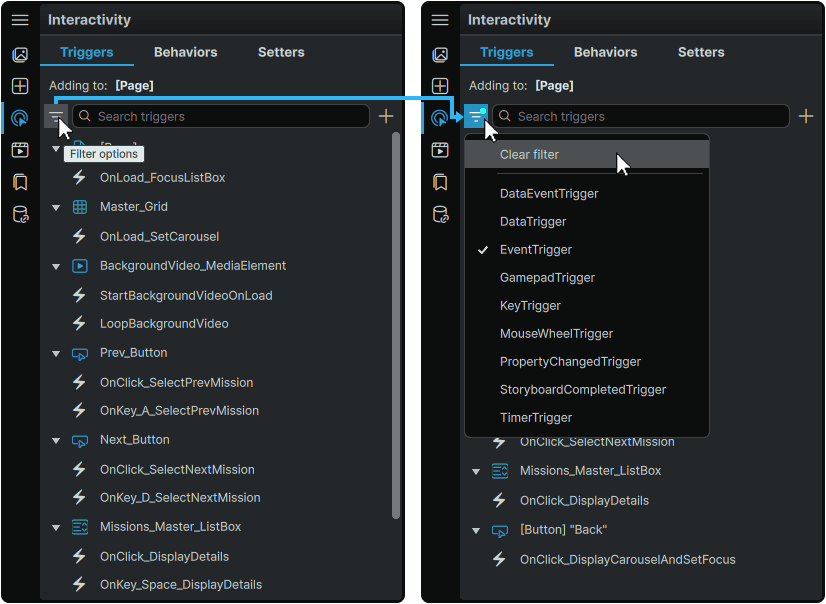
At the top of the each Interactivity Panel tab, the ▽ (Filter Options) menu can be opened, from where a Filter can be set to only display the selected Trigger, Behavior, or Setter type respectively within their tab's listing.
If a Filter type is active, a blue dot will be displayed on the ▽ (Filter Options) icon, demonstrating that a Filter is being applied to the list.
The filter can be cleared to restore the entire list of items for the current tab, by opening the ▽ (Filter Options) menu, and selecting 'Clear Filter'.
Note
Filtering Items by Name and Filtering Items by Type can both be active at the same time, allowing for a hyper-filtering of the items listing.
Deleting Items
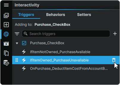
Any Trigger, Behavior, or Setter can be deleted by hovering over any item in their respective listings, and clicking its 🗑 (Remove) icon.
Function Panels
- 📘 Assets Panel
- 📘 Add Element Panel
- 📘 Interactivity Panel
- 📘 Animation Panel
- 📘 Resources Panel
- 📘 Data Panel