

📘 Animation Panel
🏘️ NoesisGUI ▸ 🏠 Noesis Studio ▸ 📘 Animation Panel
Overview
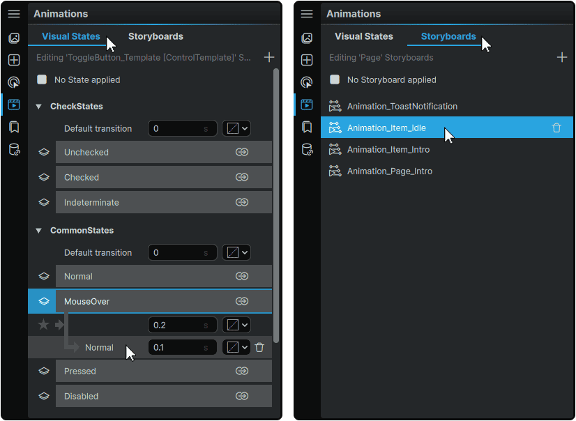
The Animation Panel serves as the primary access point to Noesis Studio's motion graphics features across both of its tabs:
- 📑 Visual States can be used to easily set up variants of Element configurations within a Page, or within an Element Template. They can also be used to design the animations that occur whilst each variant is active, and the animations transitioning from one variant to another.
- 📑 Storyboards can be used to create general-purpose animations whose conditions for playback can be custom-configured with 📘 Triggers or 📘 Timeline Events in conjunction with a ControlStoryboardAction Action.
Both Visual States and Storyboards are managed through the Animation Panel, and are both composed using 📘 Keyframe Operations within their own 📘 Animation Timeline.
Universal Animation Operations
Although the features offered by Visual States and Storyboards differ, they share many similarities in how they are used within the Animation Panel, including a slew of common functions:
Selection Mechanics
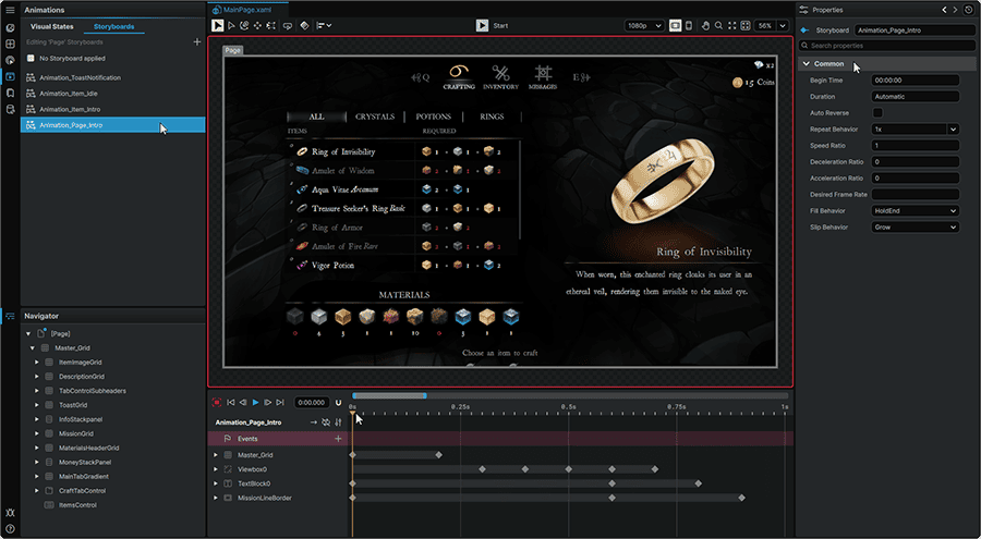
Selecting any Visual State, Visual State Transition, or Storyboard item from the Animation Panel will produce the following results:
- The item's Properties will display in the 📘 Properties Panel.
- The item's 📘 Keyframe Graph will reveal itself and display all the included changes to Property values as Keyframes. The values keyed at the current 📘 Playhead position within the Keyframe Graph will also be visually reflected on the 📘 Stage.
- The selected item will be set into 'Recording Mode', and the Stage will be adorned with a red outline. In this mode, any changes made within an Element's 📘 Properties Panel or directly on-Stage using any of the 📘 Toolbox tools will be 'keyed' as values in the Keyframe Graph at the current Playhead position.
Item Context Menu
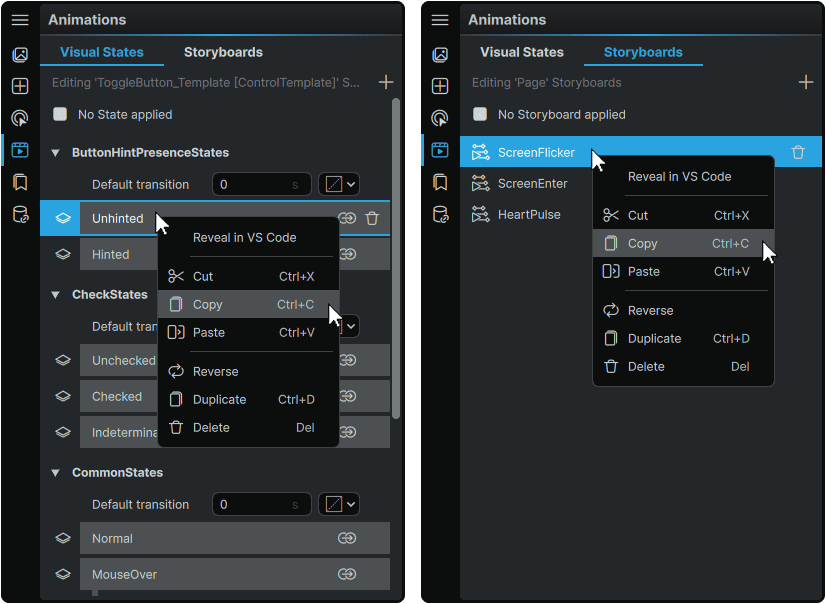
When a Visual State, a Visual State Transition, or a Storyboard is right-clicked in the Animation Panel, multiple options are offered:
Reveal in VSCode
|
• Opens the current document in VSCode, and navigates to the line where the selected item is declared in the current scope.
Recommended to be used in tandem with the ↗️ NoesisGUI XAML Tools VSCode Extension.
|
Cut
Copy
Paste
|
• Allows the entirety of an item's 📘 Keyframe Graph contents to be Cut (Copied and Removed) or Copied (Copied and Retained) into the clipboard.
• Using the Paste function then allows all Cut or Copied Keyframes to be placed within another item's Keyframe Graph.
|
Reverse
|
• Reverses the direction of all Keyframes within the item's 📘 Keyframe Graph.
For example, reversing a Timeline will make what was originally the first Keyframe in the sequence, become the last, and also reverse everything in-between the first and last Keyframe in the process.
|
Duplicate
|
• Allows the duplication of individual 📘 Custom Visual States and 📘 Storyboards.
• Duplicating a Custom Visual State will place its copy within the same Visual State Group as itself.
• 📑 Default Visual States and 📑 Visual State Transitions cannot be duplicated. Their Keyframes can however be freely copy-pasted between items.
|
Delete
|
• Deletes the selected item from the scope.
|
Renaming Items
Any Custom Visual State Group, Custom Visual State, or Storyboard can be renamed at any time by double-clicking on it in the Animation Panel, and inputting a new name.
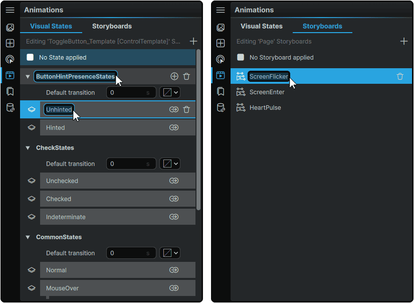
Beyond just serving as an organizational tool, the name given to any Visual State or Storyboard can be directly used in the context of invoking it through a Trigger's 📘 Actions or through 📘 Timeline Events, using either the GoToStateAction or ControlStoryboardAction respectively.
Note
📑 Default Visual States cannot be renamed.
Deleting Items
Deleting any Custom Visual State Group, Custom Visual State, Visual State Transition, or Storyboard can be performed by hovering over any of the items in the Animation Panel, then clicking its associated 🗑 (Delete) icon.
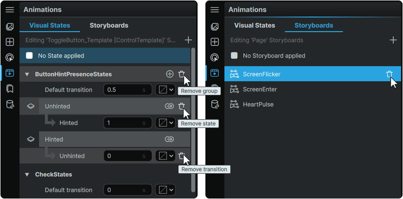
Note
📑 Default Visual States cannot be deleted.
Visual States
📘 Visual States can exist within any Page or Element Template and allow creators to craft a series of distinct variants of Elements and their Property values, that can swap between each other within the chosen scope.
Visual States come in two main flavors within the Animation Panel:
- 📑 Default Visual States, which come built-in and already-functional as a part of many of the Element Templates offered within Studio. These typically include handling of all of the most common interaction states for Elements, such as MouseOver, Pressed, Checked, Unchecked, Disabled, and many more.
- 📑 Custom Visual States, which allow for an unlimited number of permutations of Elements to be stored as individual Visual States. However, unlike the Default Visual States, Custom Visual States require manual configuration of 📘 Triggers or 📘 Timeline Events to specify the conditions under which a Visual State should activate, or deactivate.
In the Animation Panel, both Default Visual States and Custom Visual States are contained within 📘 Visual State Groups.
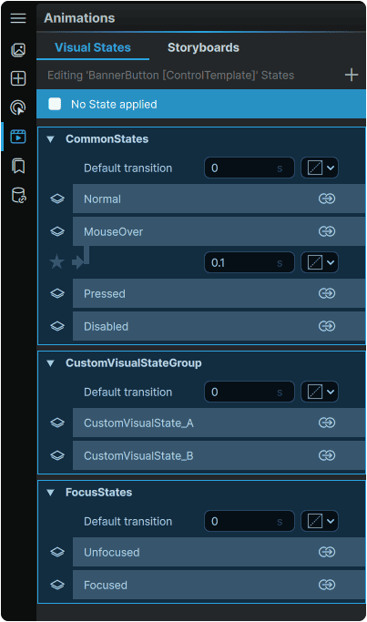
Within a single Visual State Group, only one Visual State can be active at once. However, at runtime, multiple Visual States from different Visual State Groups can be active at once, provided their simultaneous activation produces no conflict from defining different values for the same Element Properties at once.
What each Visual State looks like when it is 'activated' is expressed in the 📘 Keyframe Graph as a collection of individual Keyframes, each of which adjusts an Element's Property value when it is reached throughout playback.
A Visual State will play for as long as the Visual State is active, or for as long as the Visual State's animation lasts; whichever comes first.
Default Visual States
Many of the Element Templates included in Noesis Studio come pre-populated with a range of their own 📘 Default Visual States that include many of the expected interaction patterns for each particular Element, and also come completely-functional right out-of-the-box, without any need to manually configure any dispatchers responsible for invoking each one.
In the example of a 📘 Button Element 'MouseOver' state, the pre-built MouseOver Visual State only needs to be visually designed, with all logic of engaging the MouseOver state already being natively handled by the Button Element itself.
Note
Default Visual States cannot be renamed or removed from an Element's Template.
Custom Visual States
In addition to the Default Visual State Groups offered by many Element Templates, it is also possible, in either a Page or an Element Template, to create 📘 Custom Visual State Groups, that can contain an unlimited number of 📘 Custom Visual States.
Custom Visual State Groups can be created by clicking on the + (Add Visual State Group) icon in the upper right of the Visual States Panel:
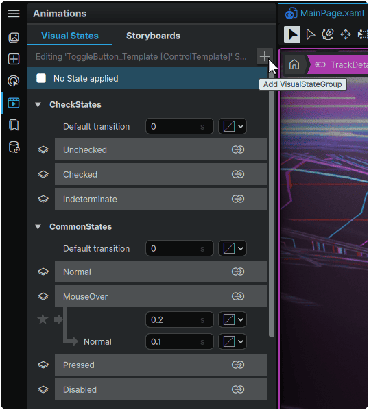
Custom Visual States can then be created by hovering over any Custom Visual State Group, and clicking on its ⊕ (Add State) icon.
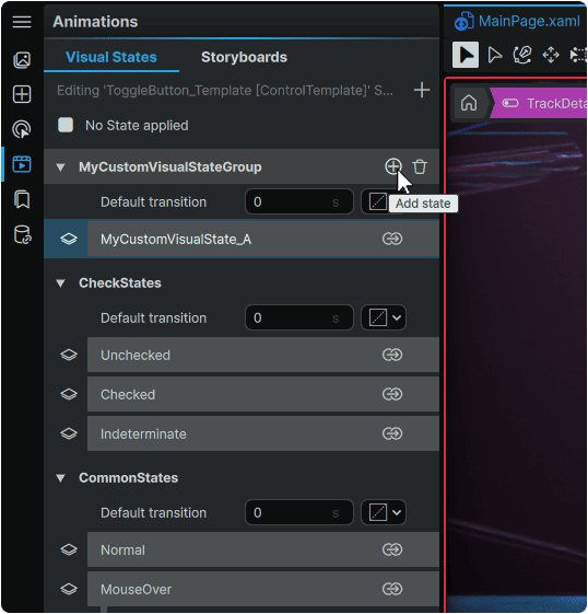
Once created, the Custom Visual State can then be selected to expose its 📘 Animation Timeline, from where the content of the Visual State can be fully customized using 📘 Keyframe Operations.
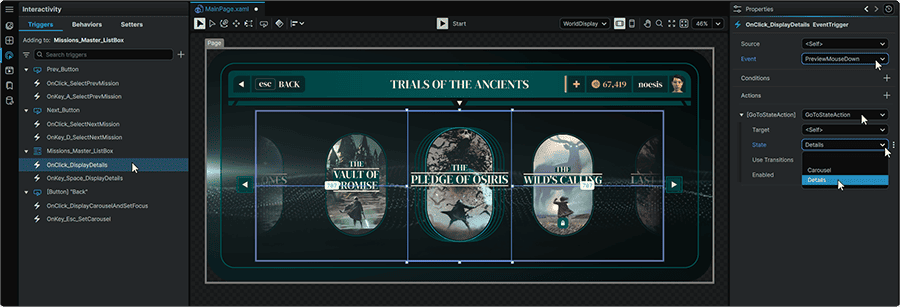
It is important to note that unlike 📑 Default Visual States that come functional out-of-the-box, Custom Visual States require manual configuration of the conditions to be met for them to display, as outlined in 📘 Invoking Custom Visual States.
Visual State Transitions
When configured, 📘 Visual State Transitions allow creators to define how one Visual State transitions to another Visual State within the same Visual State Group using either:
- Automatic Transitions, which procedurally interpolate between 📘 Visual States of the same Visual State Group when the active Visual State is changed.
- Custom State-to-State Transitions which can each leverage their own 📘 Animation Timeline to control how one Visual State transitions to another within the same Visual State Group. These are built by placing Keyframes on the Transition's 📘 Keyframe Graph.
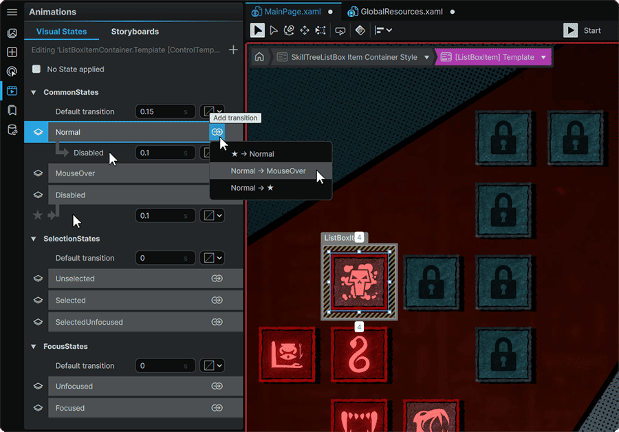
Transitions between two Visual States within the Visual State Group can be set up by clicking a Visual State's ⇴ ('Add transition') icon, then selecting the specific Visual State pairing to create a transition for.
Note
In the context of Transitions, the '★' icon serves as shorthand for 'any other Visual State from the same Visual State Group'.
Therefore, a ★ → MouseOver transition represents 'from any other Visual State in the Visual State Group to the 'MouseOver' Visual State'.
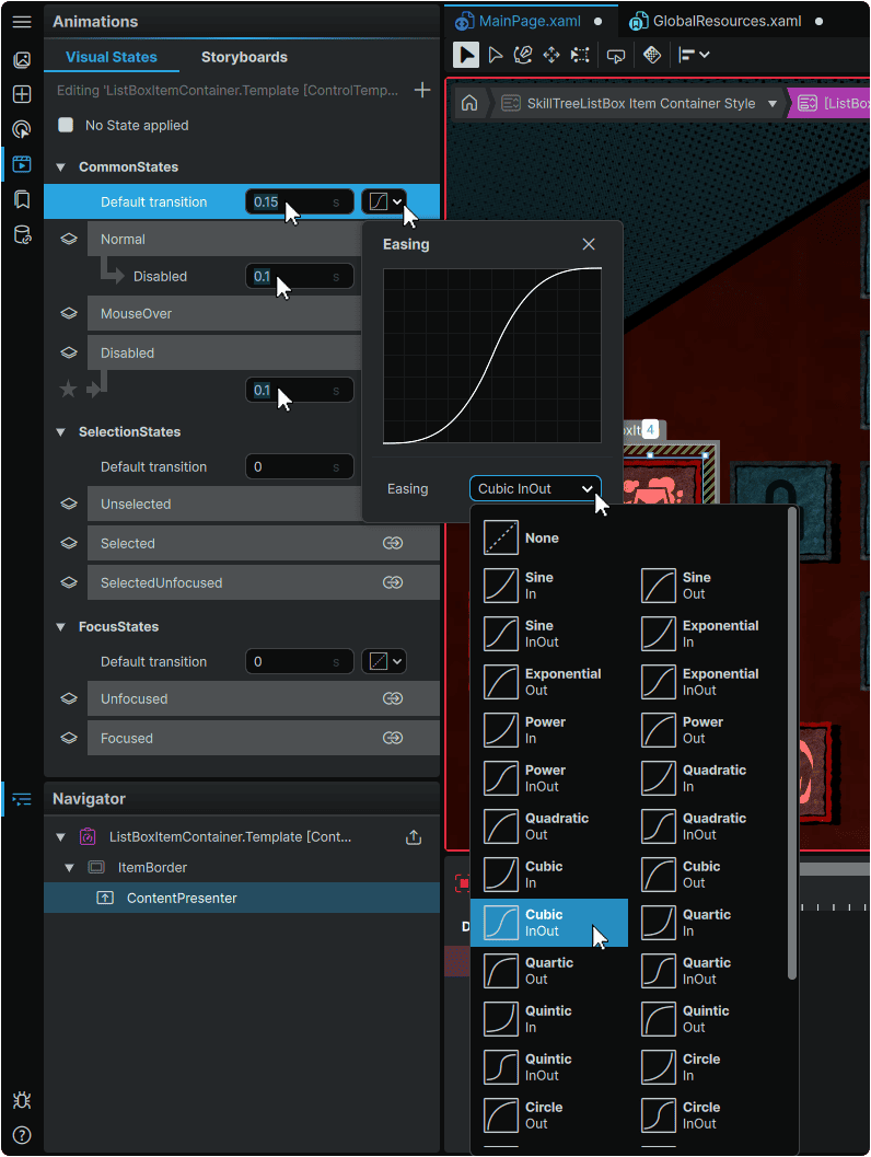
Each Visual State Group, and each Transition row offers two customization options used in the context of Automatic Transitions between Visual States in the same Visual State Group:
- The Transition Time field allows setting how long the Automatic Transition between each Visual State within a Visual State Group should last.
- The Easing option allows setting a method through which Visual State Keyframes interpolate between each other through a selection of Easing Presets.
Note
Within both the Transition Time and the Easing options, Timings or Easings applied directly to Keyframes in the Keyframe Graph have authority over the Transition's options, and the Transition's options have authority over the Visual State Group's options.
To design the content of a Custom State-To-State Transition, the Transition itself can be directly clicked from the Animation Panel. This will reveal its 📘 Keyframe Graph, from where it can be previewed, or customized through 📘 Keyframe Operations.
Storyboards
Within the framework, Storyboards serve as standalone sets of motion graphics sequences within a Page or an Element Template.
Storyboards are a great choice for any animation that is to be run in an independent, ad-hoc manner without relying on, and being driven by the same mechanics as 📑 Visual States.
Creating Storyboards
New Storyboards can be created by clicking on the + (Add Storyboard) icon at the top of the Storyboards tab.
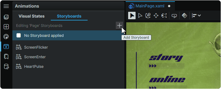
Creating a Storyboard will automatically select it, display its 📘 Animation Timeline, and set itself into 'Recording Mode' where any changes made within an Element's 📘 Properties Panel or directly on-Stage using any of the 📘 Toolbox tools, will be 'keyed' in the Storyboard's 📘 Keyframe Graph.
When Storyboards are created in the Animation Panel, they are concurrently saved as Resources within the Page, or Element Template in which they were created. Once created, Storyboards can be viewed and managed from the 📘 Resources Panel.
Invoking Storyboards
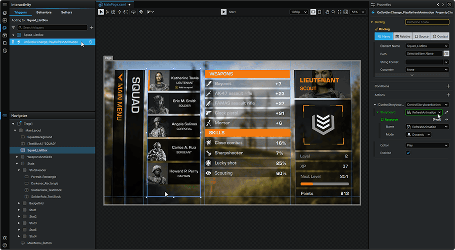
Unlike 📑 Default Visual States that automatically engage throughout various end-user interactions with Elements, controlling a Storyboard requires either:
- Adding 📘 Triggers to a scope, which dictate the rules surrounding a particular Storyboard's Playback.
- 📘 Adding Event Keyframes to a Timeline, set to control the Playback of a designated Storyboard, when the ■ (Event Keyframe) is encountered in the Timeline.
Through either method, Storyboards can be controlled using the ControlStoryboardAction options offered through the 📘 Action Types.
Function Panels
- 📘 Assets Panel
- 📘 Add Element Panel
- 📘 Interactivity Panel
- 📘 Animation Panel
- 📘 Resources Panel
- 📘 Data Panel